TYPOGRAPHICA 15
New Series
Herbert Spencer [Editor]
First edition [New Series]. First edition [New Series]. Slim quarto. Printed thick wrappers. Printed dust jacket. 58 pp. Elaborately illustrated text and advertisements printed on multiple paper stocks. Cover Design by Crosby/Fletcher/Forbes. Spencer's legendary experimental typographic journal is coveted by multiple constituencies since Spencer vocally championed emerging trends such as Concrete Poetry, Semiotics and avant-garde Book Design.Interior unmarked and very clean. Jacket lightly sunned to spine, so a fine copy in a nearly fine dust jacket.
9.5 x 12.25 magazine with 58 pages printed on a variety of paper stocks. Reproduction techniques for this issue include letterpress and offset-lithography. Paper stocks include matte and uncoated.
Contents:
Paul van Ostaijen by Edward Wright
Paul van Ostaijen: Lyric Poetry-- Instructions for Use by Paul Vincent
Objects Count by Crosby/Fletcher/Forbes [Theo Crosby, Alan Fletcher, Colin Forbes]. Sixteen page quirky and beautifully-printed insert at vernacular English objects.
Spanish Street Lettering by Alan Bartram
England was ablaze with creative activity in the early Sixties. Before our very eyes and ears The Beatles were transmogrified from a funky Liverpool group into an international musical life force. The satiric revue "Beyond the Fringe" launched Jonathan Miller, Alan Bennett, Dudley Moore and Peter Cook as comics and social critics. Mary Quant was influencing the way women designed themselves. And you’d better believe that Graphic design was part of the cultural explosion, and Fletcher, Forbes and Gill were at the forefront.
In the early Sixties, Alan Fletcher and Colin Forbes formalized their working relationship with American graphic designer Bob Gill, and Fletcher/Forbes/Gill was born. They pooled their clients, rented a studio in a mews house off Baker Street and became the most fashionable designers in town -- their avant-garde fusion of type and image was unprecedented in the rather stuffy confines of British graphic design. Praised within London’s fledgling design community, Fletcher, Forbes and Gill were among the first graphic designers to make their mark outside it – notably being featured in Vogue magazine – and admiring clients clamoured for their services.
In 1965 Fletcher/Forbes/Gill became Crosby/Fletcher/Forbes, when Bob Gill left and the architect Theo Crosby arrived. The impetus for Crosby’s arrival was a design project for Shell, which Fletcher and Forbes hoped to extend from corporate identity into the structure of garage forecourt. The Shell project, as well as the 1965 Triennale in Milan led the architect and the three graphic designers to join forces. "Whoever needed a letterhead or a brochure," Forbes said, "probably had an office, shop or showroom. Whoever wanted new offices probably needed mailing pieces."
Like an ever-expanding amoeba Crosby/Fletcher/Forbes added Mervyn Kurlansky and Kenneth Grange to the masthead and eventually rechristened themselves 'Pentagram.' You might have heard of them.
Typographica was the brainchild of founder, editor, designer and renowned typographer Herbert Spencer (Great Britain, 1924 – 2002), and had a brief life, totalling 32 issues published between 1949 and 1967. But its influence stretched and stretches far beyond its modest distribution and print runs of the time. For many graphic designers, Typographica is something of an obsession, to be collected if and when found, savored, and poured over for designs, and techniques not seen since.
Spencer never intended to turn a profit, so no expenses were spared in production (just like Alexey Brodovitch's Portfolio). Different papers, letterpress, tip-ins, and more were all employed in the presentation of an eclectic range of subject matter: Braille, locomotive lettering, sex and typography, typewriter faces, street lettering, matches, and avant-garde poetry all found their way into the magazine.
Spencer never intended to turn a profit, so no expenses were spared in production (just like Alexey Brodovitch's Portfolio). Different papers, letterpress, tip-ins, and more were all employed in the presentation of an eclectic range of subject matter: Braille, locomotive lettering, sex and typography, typewriter faces, street lettering, matches, and avant-garde poetry all found their way into the magazine.
Urbane, prolific and unfailingly modest, Spencer was a reformer dedicated to improving standards of design in a field dominated by the printing industry's outdated conventions. But he was also an aesthete with a connoisseur's eye for the wild modernist innovations with letterforms and layout of the 1920s. Spencer launched the seminal publication, Typographica, in 1949, when he was 25, and edited, designed and sometimes wrote for it for 18 years. Equally at home publishing one of the first articles in Britain about concrete poetry (then an international phenomenon), or an illustrated study of the design challenges presented by Braille, he was a new kind of designer-editor, able to think both visually and verbal
TYPOGRAPHICA 15
New Series
Herbert Spencer [Editor]
First edition [New Series]. First edition [New Series]. Slim quarto. Printed thick wrappers. Printed dust jacket. 58 pp. Elaborately illustrated text and advertisements printed on multiple paper stocks. Cover Design by Crosby/Fletcher/Forbes. Spencer's legendary experimental typographic journal is coveted by multiple constituencies since Spencer vocally championed emerging trends such as Concrete Poetry, Semiotics and avant-garde Book Design.Interior unmarked and very clean. Jacket lightly sunned to spine, so a fine copy in a nearly fine dust jacket.
9.5 x 12.25 magazine with 58 pages printed on a variety of paper stocks. Reproduction techniques for this issue include letterpress and offset-lithography. Paper stocks include matte and uncoated.
Contents:
Paul van Ostaijen by Edward Wright
Paul van Ostaijen: Lyric Poetry-- Instructions for Use by Paul Vincent
Objects Count by Crosby/Fletcher/Forbes [Theo Crosby, Alan Fletcher, Colin Forbes]. Sixteen page quirky and beautifully-printed insert at vernacular English objects.
Spanish Street Lettering by Alan Bartram
England was ablaze with creative activity in the early Sixties. Before our very eyes and ears The Beatles were transmogrified from a funky Liverpool group into an international musical life force. The satiric revue "Beyond the Fringe" launched Jonathan Miller, Alan Bennett, Dudley Moore and Peter Cook as comics and social critics. Mary Quant was influencing the way women designed themselves. And you’d better believe that Graphic design was part of the cultural explosion, and Fletcher, Forbes and Gill were at the forefront.
In the early Sixties, Alan Fletcher and Colin Forbes formalized their working relationship with American graphic designer Bob Gill, and Fletcher/Forbes/Gill was born. They pooled their clients, rented a studio in a mews house off Baker Street and became the most fashionable designers in town -- their avant-garde fusion of type and image was unprecedented in the rather stuffy confines of British graphic design. Praised within London’s fledgling design community, Fletcher, Forbes and Gill were among the first graphic designers to make their mark outside it – notably being featured in Vogue magazine – and admiring clients clamoured for their services.
In 1965 Fletcher/Forbes/Gill became Crosby/Fletcher/Forbes, when Bob Gill left and the architect Theo Crosby arrived. The impetus for Crosby’s arrival was a design project for Shell, which Fletcher and Forbes hoped to extend from corporate identity into the structure of garage forecourt. The Shell project, as well as the 1965 Triennale in Milan led the architect and the three graphic designers to join forces. "Whoever needed a letterhead or a brochure," Forbes said, "probably had an office, shop or showroom. Whoever wanted new offices probably needed mailing pieces."
Like an ever-expanding amoeba Crosby/Fletcher/Forbes added Mervyn Kurlansky and Kenneth Grange to the masthead and eventually rechristened themselves 'Pentagram.' You might have heard of them.
Typographica was the brainchild of founder, editor, designer and renowned typographer Herbert Spencer (Great Britain, 1924 – 2002), and had a brief life, totalling 32 issues published between 1949 and 1967. But its influence stretched and stretches far beyond its modest distribution and print runs of the time. For many graphic designers, Typographica is something of an obsession, to be collected if and when found, savored, and poured over for designs, and techniques not seen since.
Spencer never intended to turn a profit, so no expenses were spared in production (just like Alexey Brodovitch's Portfolio). Different papers, letterpress, tip-ins, and more were all employed in the presentation of an eclectic range of subject matter: Braille, locomotive lettering, sex and typography, typewriter faces, street lettering, matches, and avant-garde poetry all found their way into the magazine.
Spencer never intended to turn a profit, so no expenses were spared in production (just like Alexey Brodovitch's Portfolio). Different papers, letterpress, tip-ins, and more were all employed in the presentation of an eclectic range of subject matter: Braille, locomotive lettering, sex and typography, typewriter faces, street lettering, matches, and avant-garde poetry all found their way into the magazine.
Urbane, prolific and unfailingly modest, Spencer was a reformer dedicated to improving standards of design in a field dominated by the printing industry's outdated conventions. But he was also an aesthete with a connoisseur's eye for the wild modernist innovations with letterforms and layout of the 1920s. Spencer launched the seminal publication, Typographica, in 1949, when he was 25, and edited, designed and sometimes wrote for it for 18 years. Equally at home publishing one of the first articles in Britain about concrete poetry (then an international phenomenon), or an illustrated study of the design challenges presented by Braille, he was a new kind of designer-editor, able to think both visually and verbal

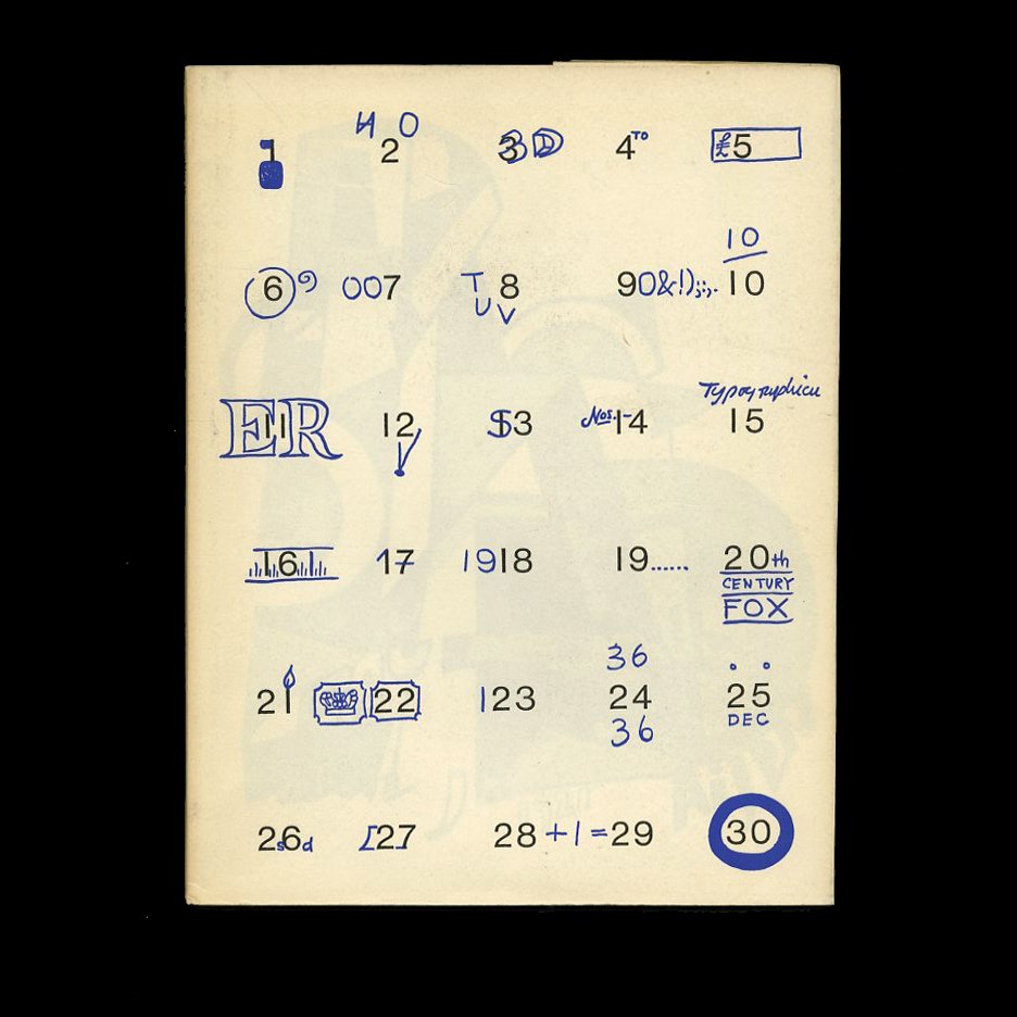 Image 1 of 16
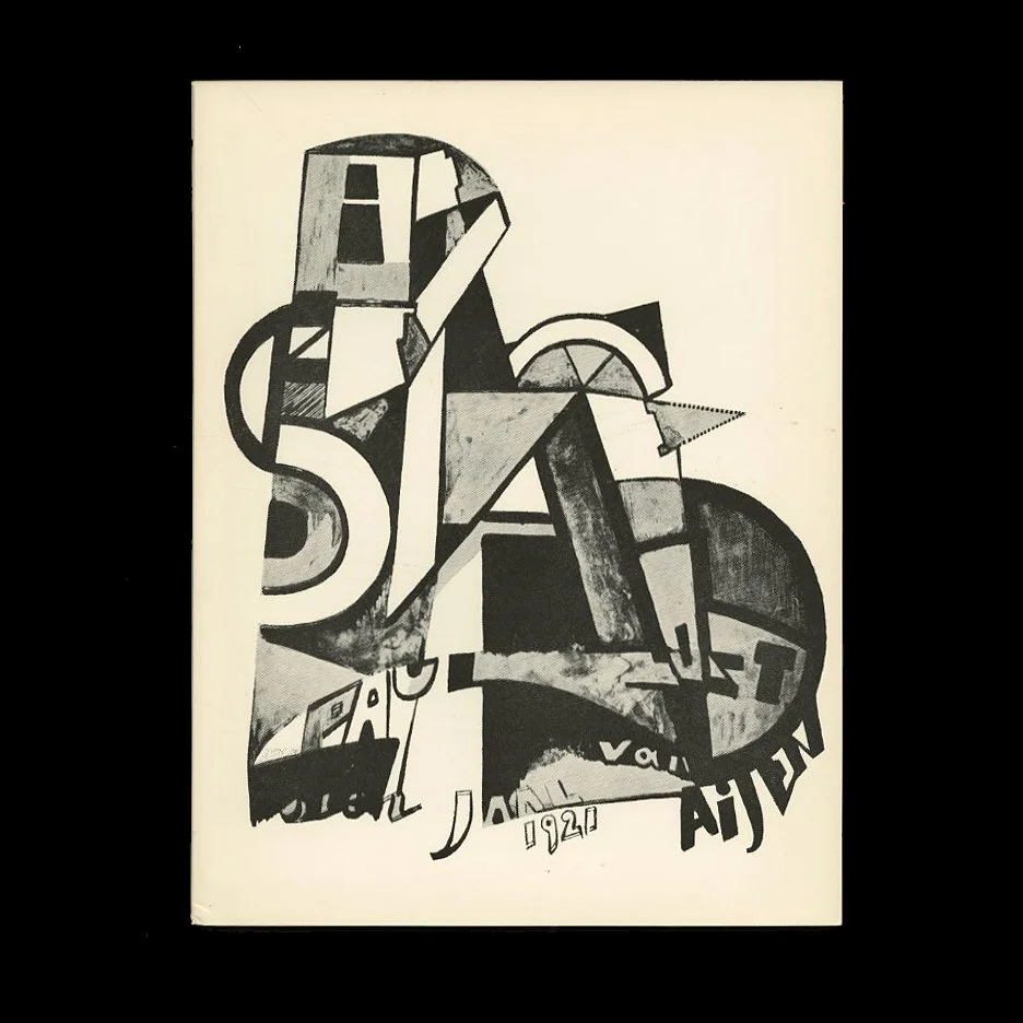 Image 2 of 16
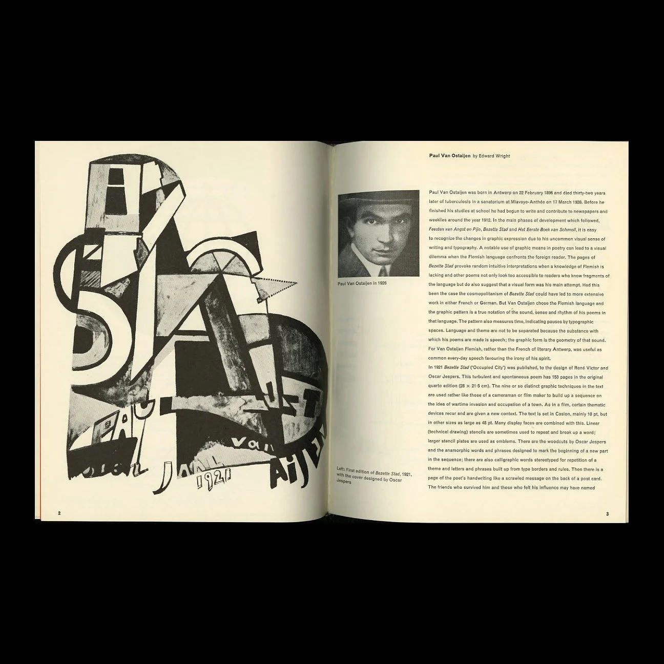 Image 3 of 16
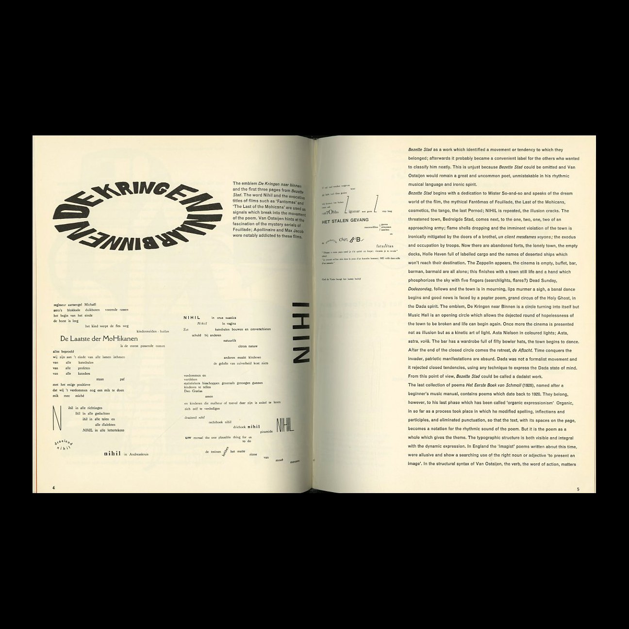 Image 4 of 16
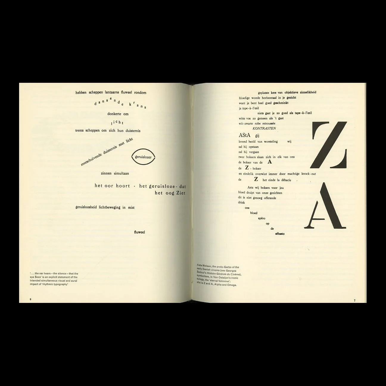 Image 5 of 16
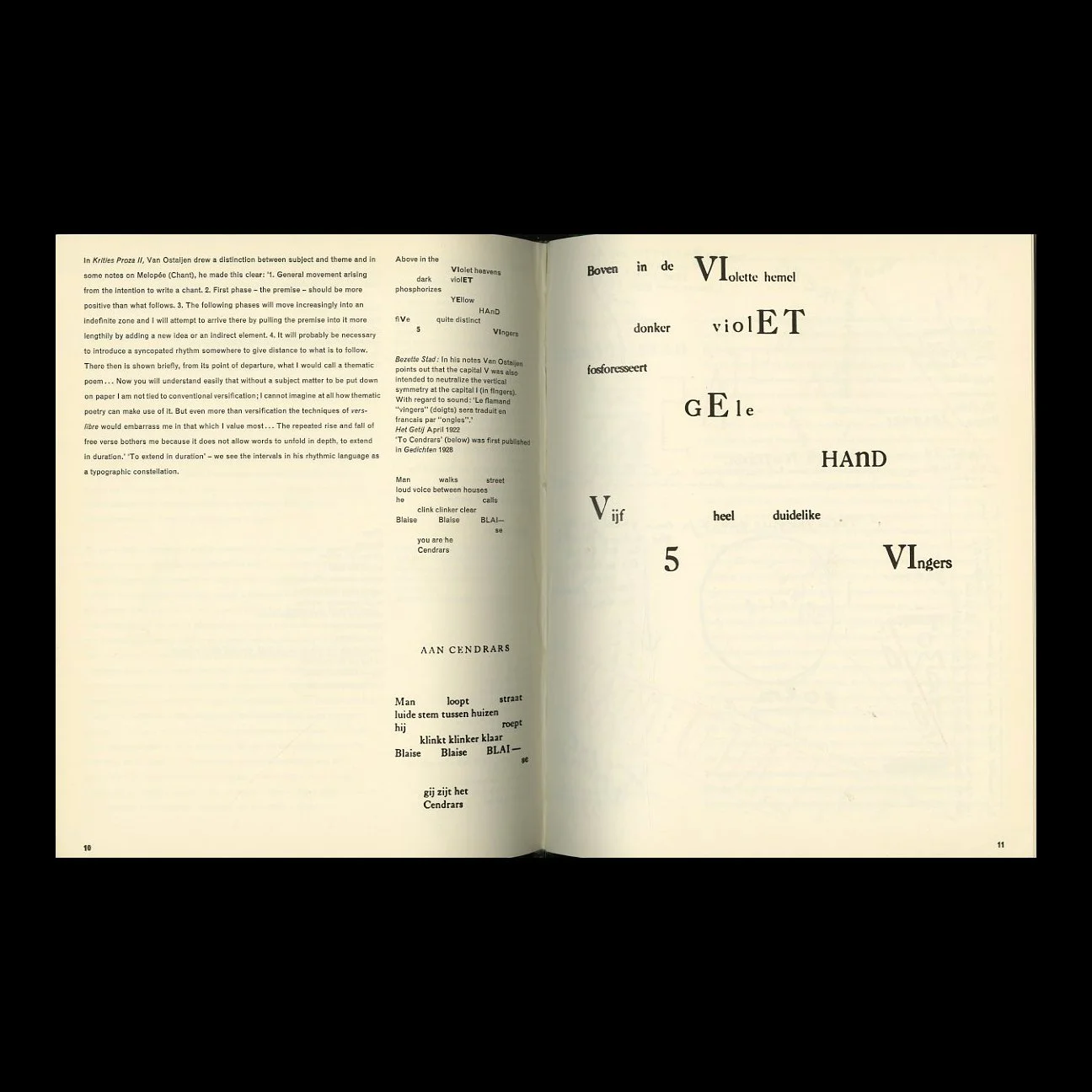 Image 6 of 16
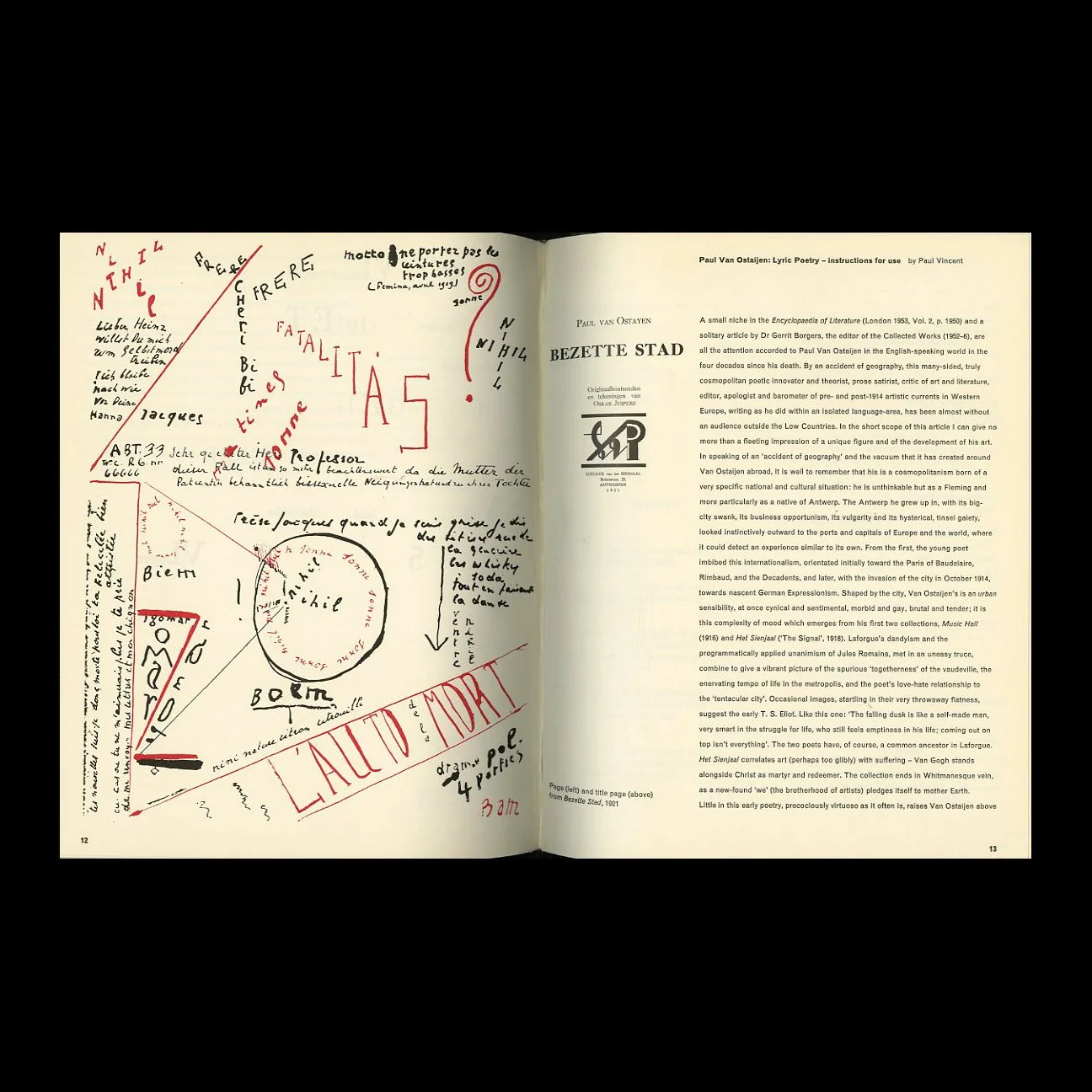 Image 7 of 16
 Image 8 of 16
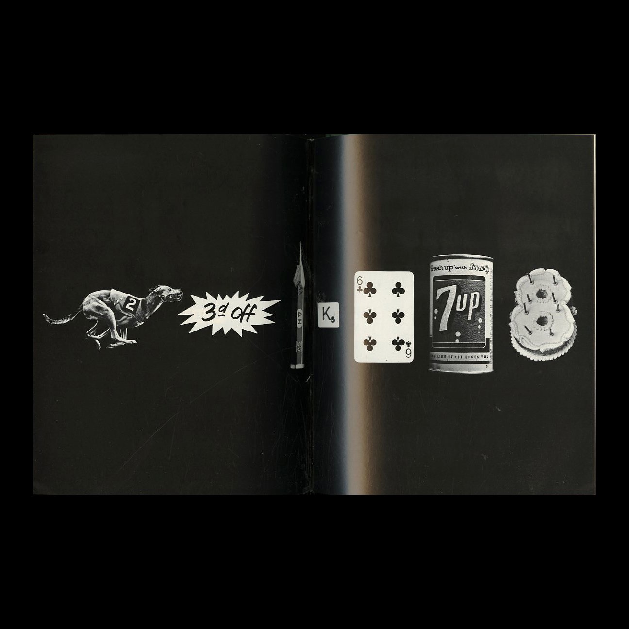 Image 9 of 16
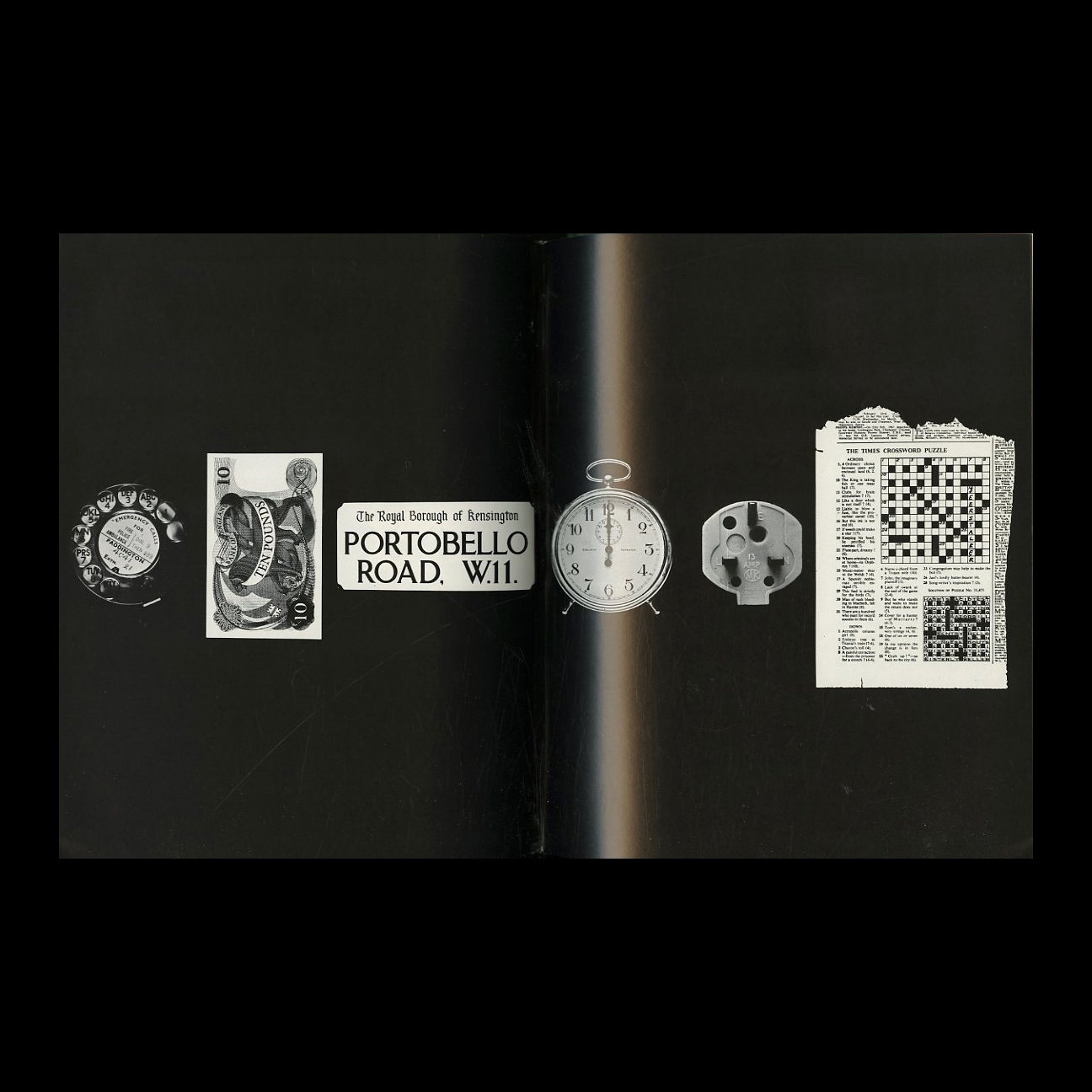 Image 10 of 16
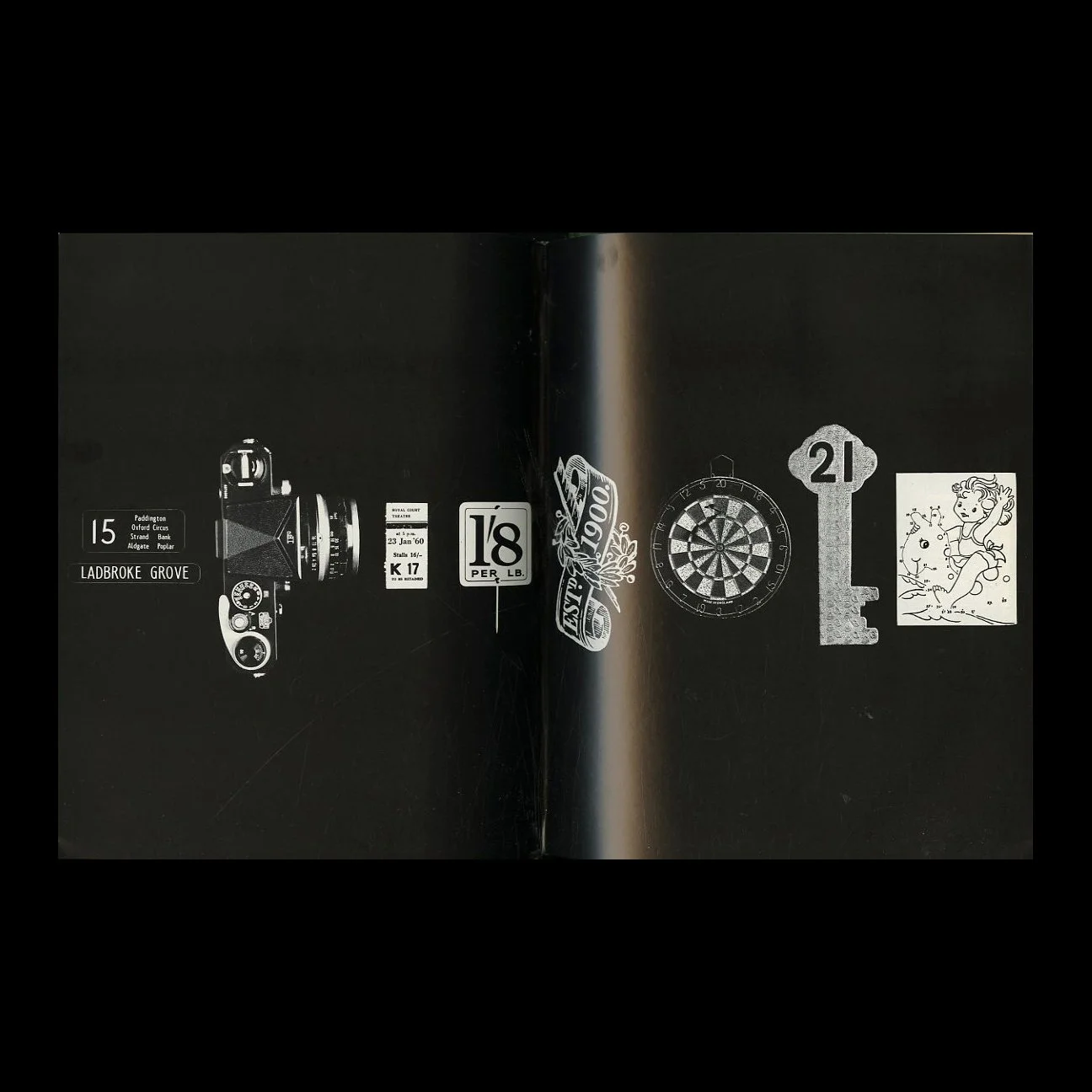 Image 11 of 16
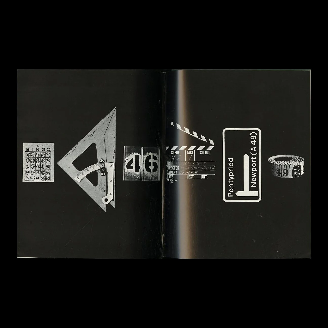 Image 12 of 16
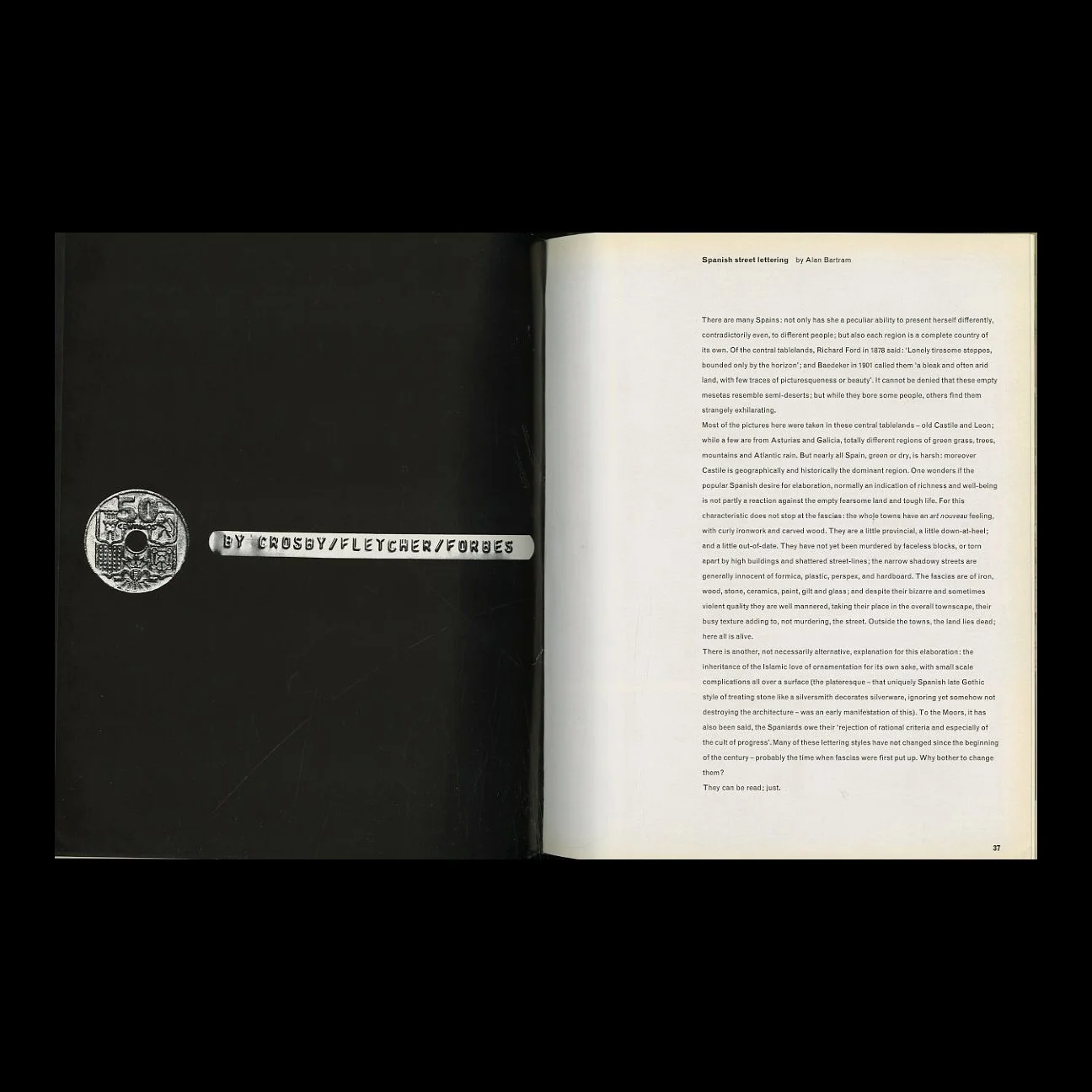 Image 13 of 16
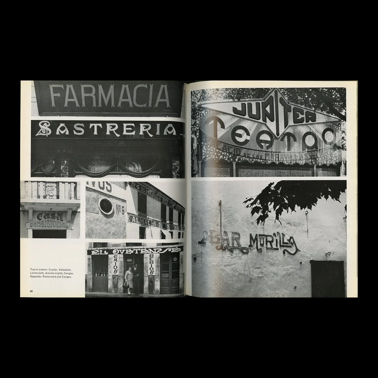 Image 14 of 16
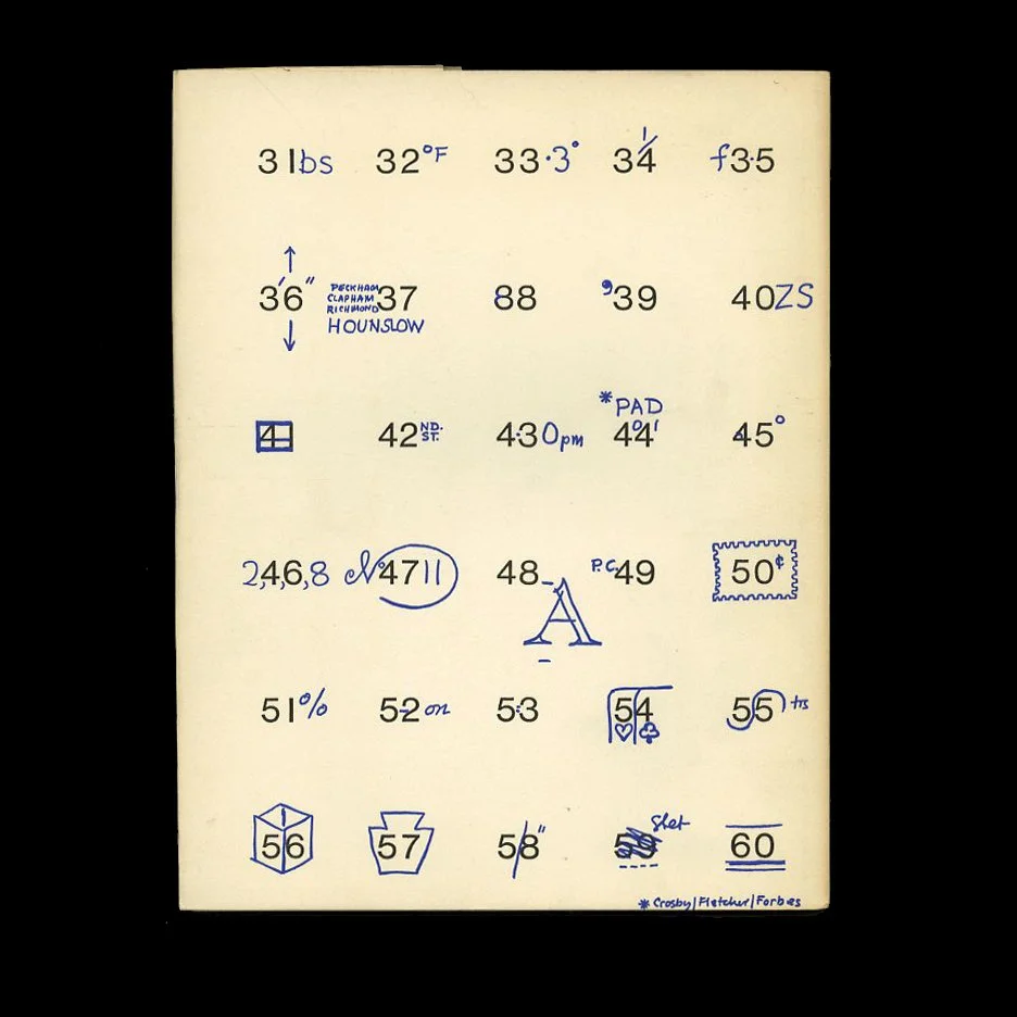 Image 15 of 16
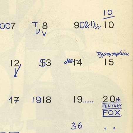 Image 16 of 16