TYPOGRAPHICA 12
New Series
Herbert Spencer [Editor]
London: Lund Humphries, December 1965. First edition [New Series]. Slim quarto. Printed thick wrappers. Printed dust jacket. 76 pp. Elaborately illustrated text and advertisements printed on multiple paper stocks. Spencer's legendary experimental typographic journal is coveted by multiple constituencies since Spencer vocally championed emerging trends such as Concrete Poetry, Semiotics and avant-garde Book Design. Jacket spine slightly sunned, otherwise a fine copy in a fine dust jacket
8.25 x 10.75 magazine with 76 pages printed on a variety of paper stocks. Reproduction techniques for this issue include letterpress and offset-lithography. Paper stocks include matte and uncoated. Custom Binding includes tipped-in printed vellum fold-out by Diter Rot.
Contents:
The Nymph and the Grot: the revival of the sans-serif letter by James Mosley
Fishing Figures by Barbara Jones
The Living Symbol by Aloisio Magalhaes
Art on the Assembly Line by Ann Gould
Diter Rot: Book Review with folding insert of a sheet from the Copley Foundation Diter Rot mongraph
Emphatic fist, informative arrow by Edward Wright
The Arrow in China by K. P. Mayer
Typographica was the brainchild of founder, editor, designer and renowned typographer Herbert Spencer (Great Britain, 1924 – 2002), and had a brief life, totalling 32 issues published between 1949 and 1967. But its influence stretched and stretches far beyond its modest distribution and print runs of the time. For many graphic designers, Typographica is something of an obsession, to be collected if and when found, savored, and poured over for designs, and techniques not seen since.
Spencer never intended to turn a profit, so no expenses were spared in production (just like Alexey Brodovitch's Portfolio). Different papers, letterpress, tip-ins, and more were all employed in the presentation of an eclectic range of subject matter: Braille, locomotive lettering, sex and typography, typewriter faces, street lettering, matches, and avant-garde poetry all found their way into the magazine.
Spencer never intended to turn a profit, so no expenses were spared in production (just like Alexey Brodovitch's Portfolio). Different papers, letterpress, tip-ins, and more were all employed in the presentation of an eclectic range of subject matter: Braille, locomotive lettering, sex and typography, typewriter faces, street lettering, matches, and avant-garde poetry all found their way into the magazine.
Urbane, prolific and unfailingly modest, Spencer was a reformer dedicated to improving standards of design in a field dominated by the printing industry's outdated conventions. But he was also an aesthete with a connoisseur's eye for the wild modernist innovations with letterforms and layout of the 1920s. Spencer launched the seminal publication, Typographica, in 1949, when he was 25, and edited, designed and sometimes wrote for it for 18 years. Equally at home publishing one of the first articles in Britain about concrete poetry (then an international phenomenon), or an illustrated study of the design challenges presented by Braille, he was a new kind of designer-editor, able to think both visually and verbally, and to fuse images and words in meaningful new relationships.
TYPOGRAPHICA 12
New Series
Herbert Spencer [Editor]
London: Lund Humphries, December 1965. First edition [New Series]. Slim quarto. Printed thick wrappers. Printed dust jacket. 76 pp. Elaborately illustrated text and advertisements printed on multiple paper stocks. Spencer's legendary experimental typographic journal is coveted by multiple constituencies since Spencer vocally championed emerging trends such as Concrete Poetry, Semiotics and avant-garde Book Design. Jacket spine slightly sunned, otherwise a fine copy in a fine dust jacket
8.25 x 10.75 magazine with 76 pages printed on a variety of paper stocks. Reproduction techniques for this issue include letterpress and offset-lithography. Paper stocks include matte and uncoated. Custom Binding includes tipped-in printed vellum fold-out by Diter Rot.
Contents:
The Nymph and the Grot: the revival of the sans-serif letter by James Mosley
Fishing Figures by Barbara Jones
The Living Symbol by Aloisio Magalhaes
Art on the Assembly Line by Ann Gould
Diter Rot: Book Review with folding insert of a sheet from the Copley Foundation Diter Rot mongraph
Emphatic fist, informative arrow by Edward Wright
The Arrow in China by K. P. Mayer
Typographica was the brainchild of founder, editor, designer and renowned typographer Herbert Spencer (Great Britain, 1924 – 2002), and had a brief life, totalling 32 issues published between 1949 and 1967. But its influence stretched and stretches far beyond its modest distribution and print runs of the time. For many graphic designers, Typographica is something of an obsession, to be collected if and when found, savored, and poured over for designs, and techniques not seen since.
Spencer never intended to turn a profit, so no expenses were spared in production (just like Alexey Brodovitch's Portfolio). Different papers, letterpress, tip-ins, and more were all employed in the presentation of an eclectic range of subject matter: Braille, locomotive lettering, sex and typography, typewriter faces, street lettering, matches, and avant-garde poetry all found their way into the magazine.
Spencer never intended to turn a profit, so no expenses were spared in production (just like Alexey Brodovitch's Portfolio). Different papers, letterpress, tip-ins, and more were all employed in the presentation of an eclectic range of subject matter: Braille, locomotive lettering, sex and typography, typewriter faces, street lettering, matches, and avant-garde poetry all found their way into the magazine.
Urbane, prolific and unfailingly modest, Spencer was a reformer dedicated to improving standards of design in a field dominated by the printing industry's outdated conventions. But he was also an aesthete with a connoisseur's eye for the wild modernist innovations with letterforms and layout of the 1920s. Spencer launched the seminal publication, Typographica, in 1949, when he was 25, and edited, designed and sometimes wrote for it for 18 years. Equally at home publishing one of the first articles in Britain about concrete poetry (then an international phenomenon), or an illustrated study of the design challenges presented by Braille, he was a new kind of designer-editor, able to think both visually and verbally, and to fuse images and words in meaningful new relationships.

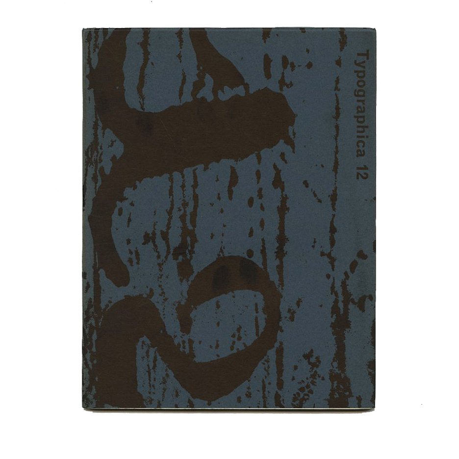 Image 1 of 9
 Image 2 of 9
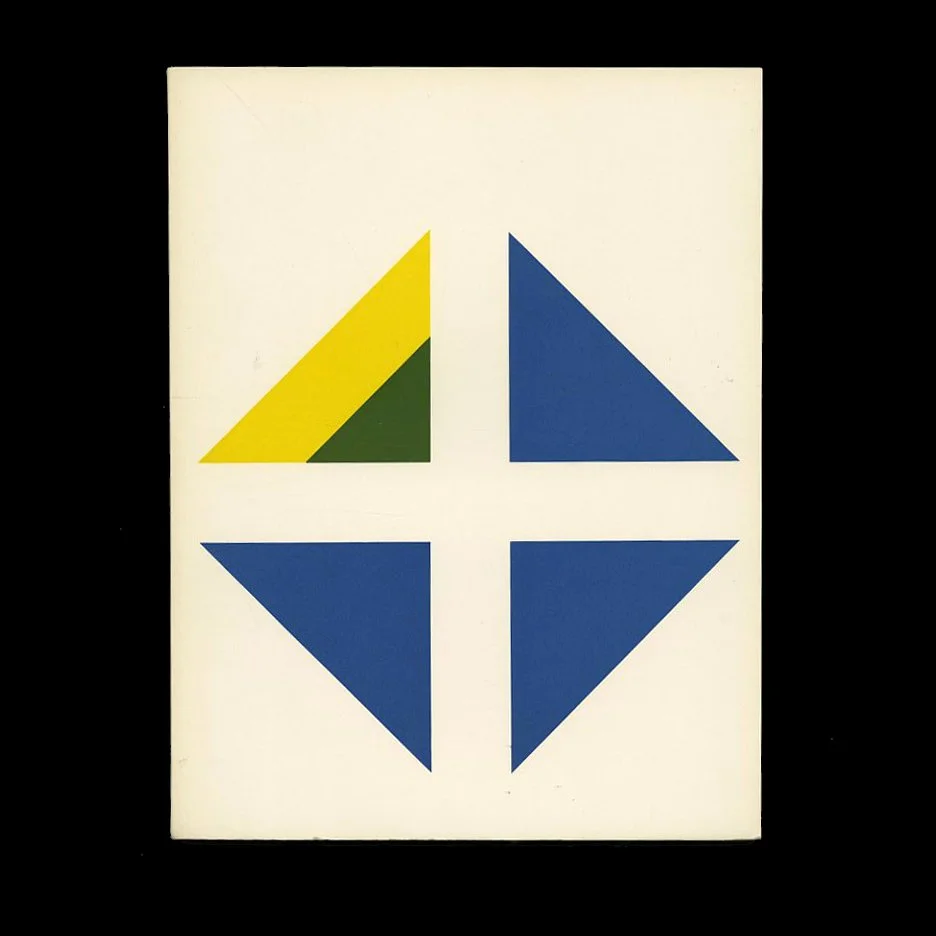 Image 3 of 9
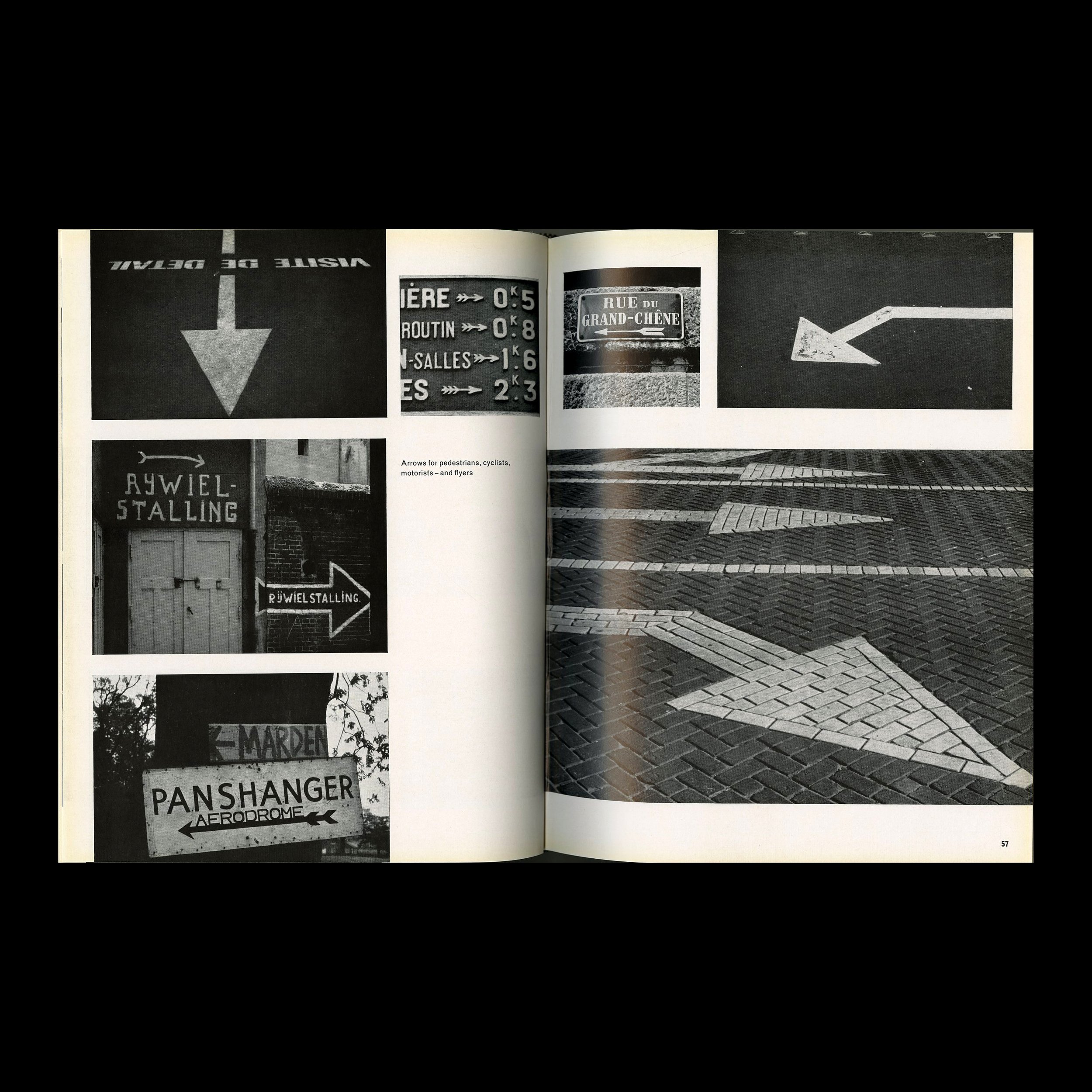 Image 4 of 9
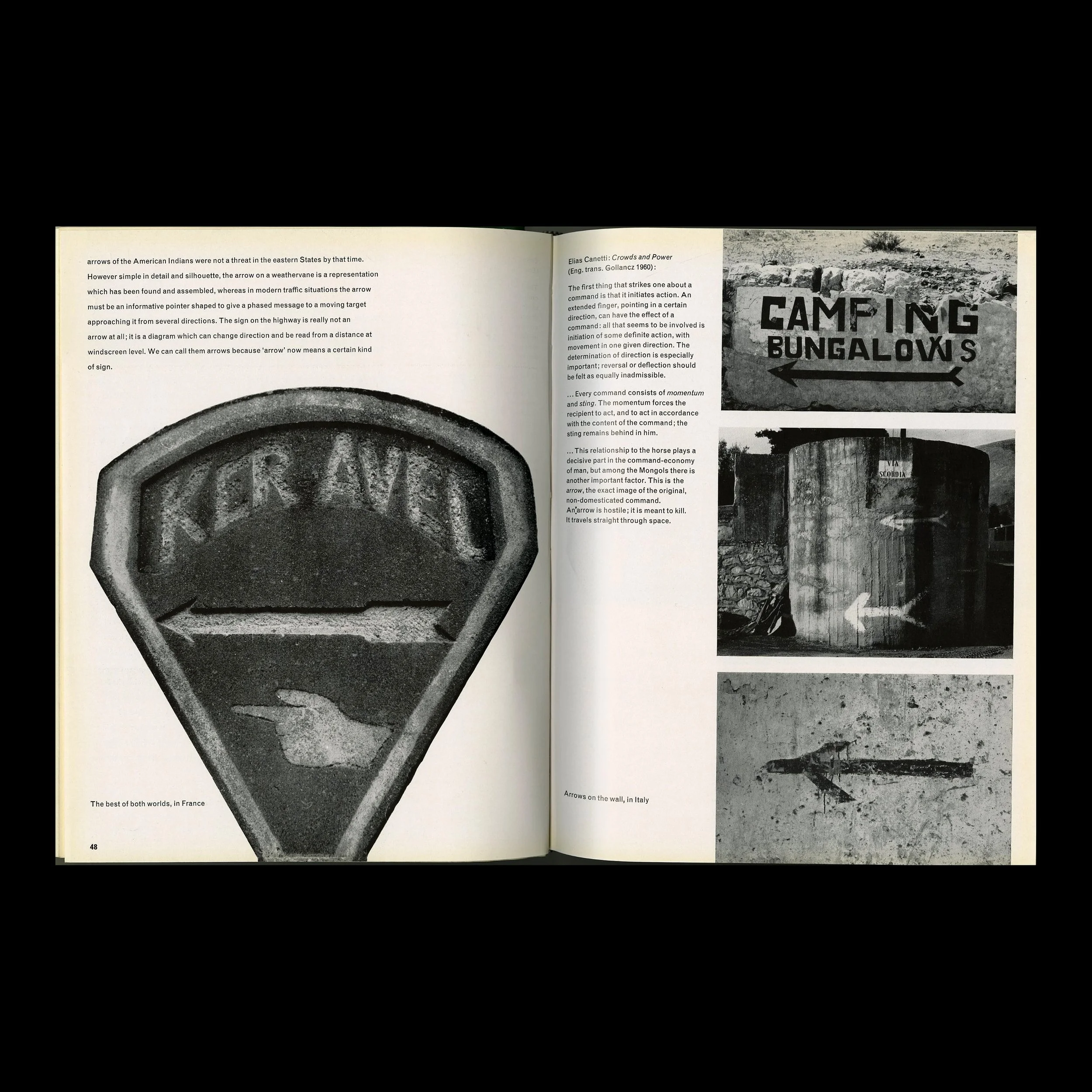 Image 5 of 9
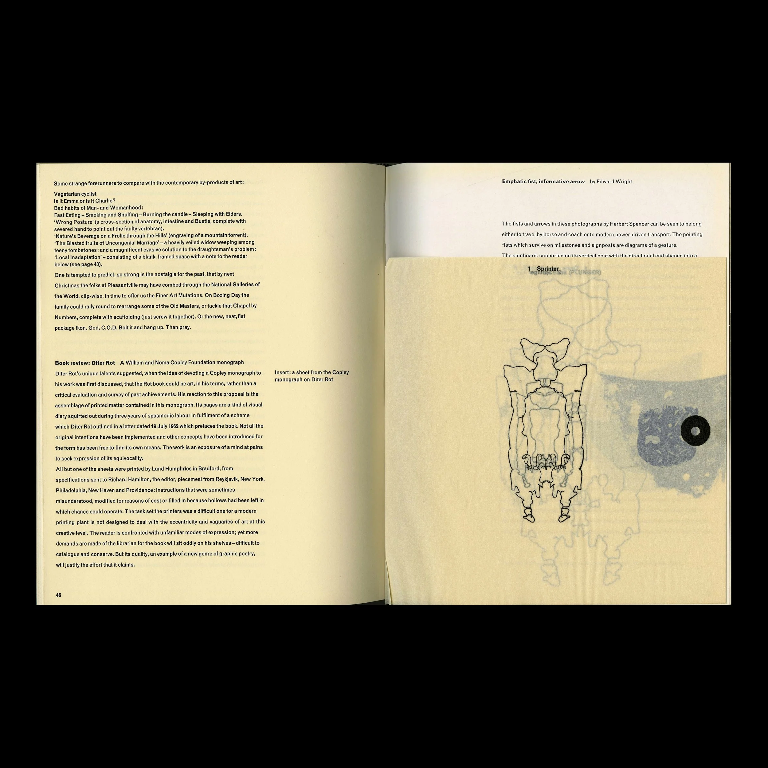 Image 6 of 9
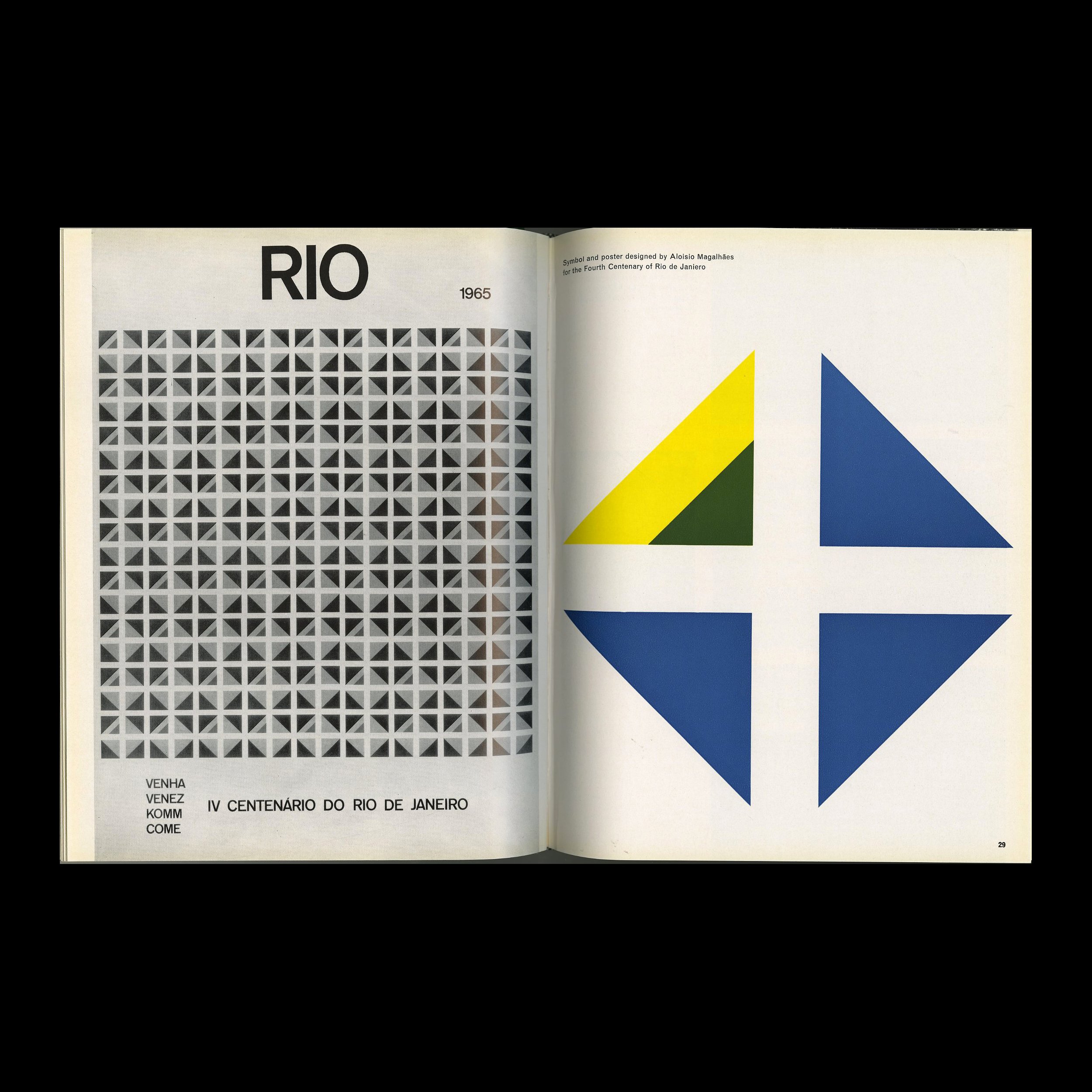 Image 7 of 9
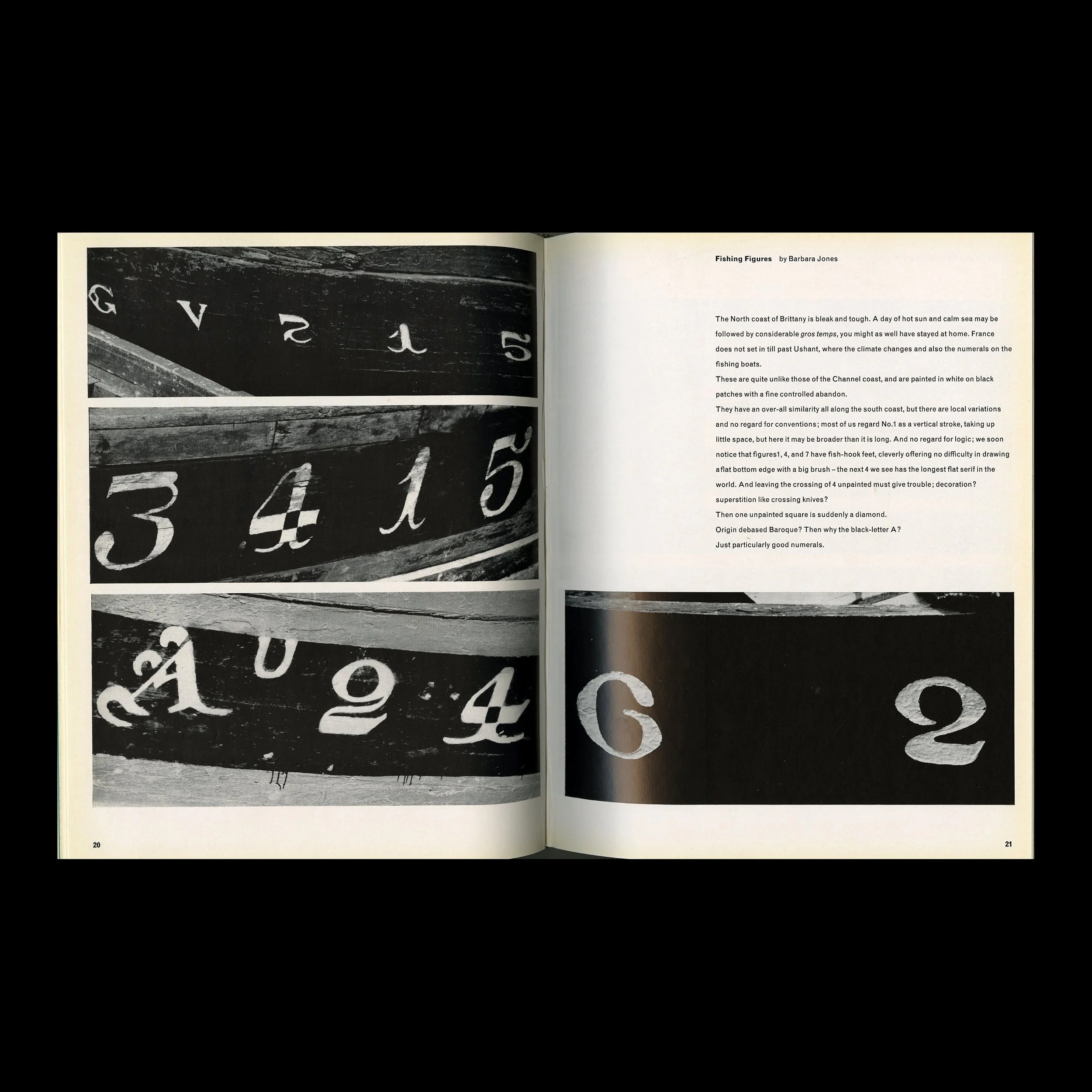 Image 8 of 9
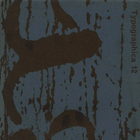 Image 9 of 9