
 Image 1 of 6
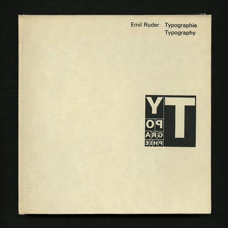 Image 2 of 6
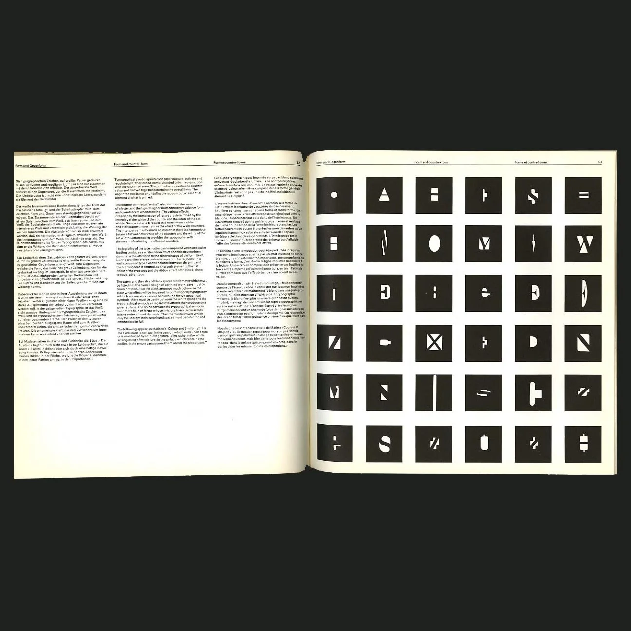 Image 3 of 6
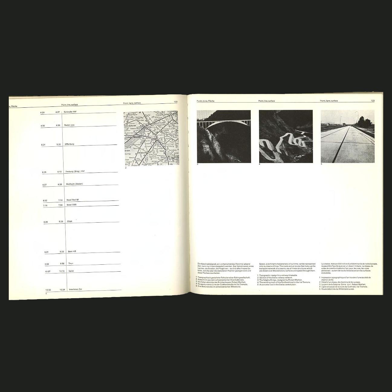 Image 4 of 6
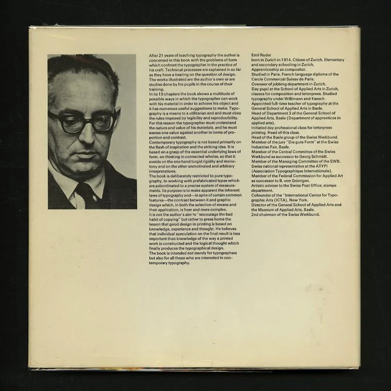 Image 5 of 6
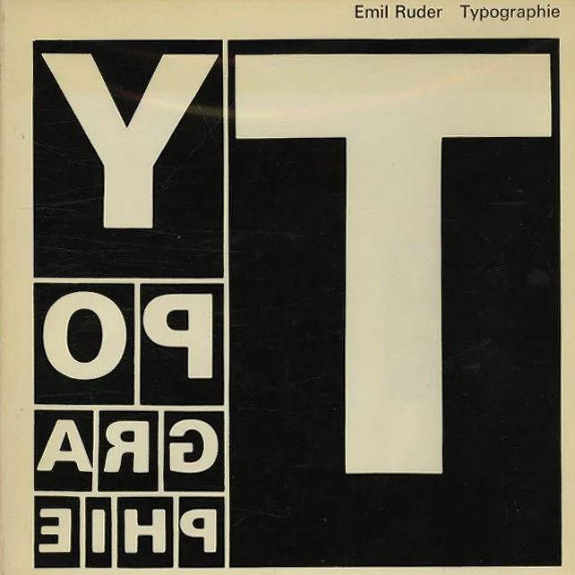 Image 6 of 6
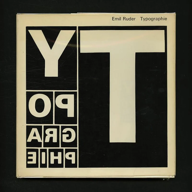
Ruder, Emil: TYPOGRAPHIE: EIN GESTALTUNGSLEHRBUCH [Typography: A Manual Of Design / Typographie: Un Manuel De Creation]. Teufen AR: Verlag Arthur Niggli, 1967.
TYPOGRAPHIE: EIN GESTALTUNGSLEHRBUCH
Typography: A Manual Of Design / Typographie: Un Manuel De Creation
Emil Ruder
Teufen AR: Verlag Arthur Niggli, 1967. First edition. Text in German, English and French. Square quarto. White cloth stamped in black. Printed dust jacket. 274 pp. Two fold outs. Black and white illustrations throughout, with occasional spot colors in red, yellow and blue. Book design by the author. Remarkably well preserved: a fine copy in a fine dust jacket, rare thus.
9.25 x 9.75 hardcover book with 274 pages and many black and white and 2-color illustrations from studies by the author or by students in the Typography Course of the AGS Basel. Every conceivable typographic problem in relation to texture, weight, color, legibility spacing and leading is explained in 19 chapters.
This classic work of modern typography offers one of the most intelligent and attractive treatises on the design of typography for contemporary use. A great, and increasingly scarce, exploration of experimental typography.
Contents:
Introduction "More than graphic design, typography is an expression of technology, precision and good order."
Writing and printing "A good designer must refrain from mixing writing and printing."
Function and form "The typographer clothes the word with visible form and preserves it for the future. "
Form and counter-form "The various effects obtained by the compination of letters are determind by the interplay of the white of the counter and the white of the set width. "
The techniques of typography "It is in this unchanging appearance of all the letters that the beauty of typography resides; its essential nature lies in the repetition of the type characters and the repetition inherent in the printing process. "
Arrangements "The aim of all good typography is form subordinated to legibility."
Geometrical, optical and organic aspects "Optical illusions cannot simply be dismissed as fancies, and every creative artist must reckon with the problems they pose. "
Proportions "No system of ratios, however ingenious, can relieve the typographer of deciding how one value should be related to another."
Point, line, surface "Everything is movement: the dot moves and gives rise to the line, the line moves and produces a plane surface, and plane surfaces come together and create a body."
Contrasts "The relationship between the printed and the unprinted area must be one of tension, and this tension comes about through contrasts. "
Shades of grey "The smallest quantity of black consumes white; it takes white away and lies at a lower level than the white surface. "
Colour "There should be tension between a bright colour and black, and this tension should be clearly apparent in the first draft of a printed work. "
Unity of text and form "The large number of typefaces available to the typographer today is not so much a sign of a hight level of culutrual activity as rather evidence of a lack of international coordination and the resultant frittering away of effort."
Rhythm "Handwriting can be seen to underlie any good typeface. "
Spontaneity and fortuity "Time and again, however,we find printed works which make no claim to formal beauty and yet have a distinctive charm for all their technical shortcomings. "
Integral design "A book must be consistently designed throughout, including the title-page and, if possible, the cover title."
Variations "Variation involves singling out a mean value and calls for the ability to put this mean value through as many transformations as possible."
Kinetics "Runs of movement can embody the following themes: increase and decrease of value or increase and decrease of size; loosening up of compact elements and gathering together of scattered values into a compact form; eccentric and concentric movements; movements running from top to bottom and from bottom to top; movements from left to right and from right to left; movements from inside out and vice versa; movements along a diagonal or through an angle, etc."
Lettering and illustration "There are two different approaches to the problem of achieving harmony between printing type and picture. One way is to seek the closest possible formal combination between test and picture, and the other is to seek a contrast between them. "
Hiebert wrote "The Swiss school is concerned that design be more than a frivolous cluttering of the environment. " Sounds good to me!
Emil Ruder (Switzerland, 1914 – 1970) was a typographer and graphic designer, who with Armin Hofmann joined the faculty of the Schule für Gestaltung Basel (Basel School of Design), where he established himself as one of the masters of the so called Swiss Style of design.
Ruder is distinguishable in the field of typography for developing a holistic approach to designing and teaching that consisted of philosophy, theory and a systematic practical methodology. He expressed lofty aspirations for graphic design, writing that part of its function was to promote "the good and the beautiful in word and image and to open the way to the arts." He taught that typography's purpose was to communicate ideas through writing, as well as placing a heavy importance on Sans-serif typefaces. No other designer since Jan Tschichold was as committed as Ruder to the discipline of letterpress typography or wrote about it with such conviction.
The Swiss Style (as a conditional continuation of International Typographic Style) was developed after WWII in Switzerland, and was defined by the use of sans-serif typefaces, and employed a page grid for structure, producing asymmetrical layouts. By the 1960s, the grid had become the routine procedure for organizing page layouts. Ruder demonstrated a grid of nine squares as the basis for different sizes of image, with 24 possible positions and shapes of the image.
Also stressed was the combination of typography and photography as a means of visual communication. The primary influential works were developed as posters, which were seen to be the most effective means of communication.
Emil Ruder was born in Zurich, Switzerland on March 20, 1914. He was trained as a typesetter in Basel (1929-1933), and studied in Paris from 1938-1939. Ruder published a basic grammar of typography entitled, Typographie. The text was published in German, English and French, by Swiss publisher Arthur Niggli in 1967. The book helped spread and propagate the Swiss Style, and became a basic text for graphic design and typography programs in Europe and North America. In 1962 he helped to found the International Center for the Typographic Arts (ICTA) in New York.
Ruder began his education in design at the age of fifteen when he took a compositor's apprenticeship. By his late twenties, he began attending the Kunstgewerbeschule Zürich where the principles of Bauhaus and Tschichold's new typography were taught.
Ruder first began teaching in 1942 at the Allgemeine Gewerbeschule in the Swiss city of Basel. There, he was in charge of typography for trade students. He became the head of the Department of Apprentices in Applied arts by 1947. In 1947 Ruder met the artist-printer Armin Hofmann. Their teaching achieved an international reputation by the mid-1950s. He was a contributing writer and editor for Typografische Monatsblätter (Typographic Monthly), which was a popular trade publication of the time.
During the post war years when, in almost every field of applied art, there was still no sign of transition to a new form of expression better fitted to the times, Emil Ruder was one of the first pioneers to discard all of the conventional rules of traditional typography and to establish new laws of composition more in accord with the modern era. In spite of his love for pictorial thinking, he was never tempted to indulge in merely playful designs in which the actual purpose of printing - legibility - would be lost. Ruder's insistence that the primary aim of typography was communication did not exclude aesthetic effects.
After twenty-five years of teaching, Ruder published a heavily illustrated book capturing his ideas, methods and approach. The book, Typographie: A Manual for Design, represents a critical reflection on Ruder’s teaching and practice as well as a lifetime of accumulated knowledge. Other than publishing his book Typographie, he is known for his use of the grid system in Swiss Style design as well as his poster designs.
TYPOGRAPHIE: EIN GESTALTUNGSLEHRBUCH
Typography: A Manual Of Design / Typographie: Un Manuel De Creation
Emil Ruder
Teufen AR: Verlag Arthur Niggli, 1967. First edition. Text in German, English and French. Square quarto. White cloth stamped in black. Printed dust jacket. 274 pp. Two fold outs. Black and white illustrations throughout, with occasional spot colors in red, yellow and blue. Book design by the author. Remarkably well preserved: a fine copy in a fine dust jacket, rare thus.
9.25 x 9.75 hardcover book with 274 pages and many black and white and 2-color illustrations from studies by the author or by students in the Typography Course of the AGS Basel. Every conceivable typographic problem in relation to texture, weight, color, legibility spacing and leading is explained in 19 chapters.
This classic work of modern typography offers one of the most intelligent and attractive treatises on the design of typography for contemporary use. A great, and increasingly scarce, exploration of experimental typography.
Contents:
Introduction "More than graphic design, typography is an expression of technology, precision and good order."
Writing and printing "A good designer must refrain from mixing writing and printing."
Function and form "The typographer clothes the word with visible form and preserves it for the future. "
Form and counter-form "The various effects obtained by the compination of letters are determind by the interplay of the white of the counter and the white of the set width. "
The techniques of typography "It is in this unchanging appearance of all the letters that the beauty of typography resides; its essential nature lies in the repetition of the type characters and the repetition inherent in the printing process. "
Arrangements "The aim of all good typography is form subordinated to legibility."
Geometrical, optical and organic aspects "Optical illusions cannot simply be dismissed as fancies, and every creative artist must reckon with the problems they pose. "
Proportions "No system of ratios, however ingenious, can relieve the typographer of deciding how one value should be related to another."
Point, line, surface "Everything is movement: the dot moves and gives rise to the line, the line moves and produces a plane surface, and plane surfaces come together and create a body."
Contrasts "The relationship between the printed and the unprinted area must be one of tension, and this tension comes about through contrasts. "
Shades of grey "The smallest quantity of black consumes white; it takes white away and lies at a lower level than the white surface. "
Colour "There should be tension between a bright colour and black, and this tension should be clearly apparent in the first draft of a printed work. "
Unity of text and form "The large number of typefaces available to the typographer today is not so much a sign of a hight level of culutrual activity as rather evidence of a lack of international coordination and the resultant frittering away of effort."
Rhythm "Handwriting can be seen to underlie any good typeface. "
Spontaneity and fortuity "Time and again, however,we find printed works which make no claim to formal beauty and yet have a distinctive charm for all their technical shortcomings. "
Integral design "A book must be consistently designed throughout, including the title-page and, if possible, the cover title."
Variations "Variation involves singling out a mean value and calls for the ability to put this mean value through as many transformations as possible."
Kinetics "Runs of movement can embody the following themes: increase and decrease of value or increase and decrease of size; loosening up of compact elements and gathering together of scattered values into a compact form; eccentric and concentric movements; movements running from top to bottom and from bottom to top; movements from left to right and from right to left; movements from inside out and vice versa; movements along a diagonal or through an angle, etc."
Lettering and illustration "There are two different approaches to the problem of achieving harmony between printing type and picture. One way is to seek the closest possible formal combination between test and picture, and the other is to seek a contrast between them. "
Hiebert wrote "The Swiss school is concerned that design be more than a frivolous cluttering of the environment. " Sounds good to me!
Emil Ruder (Switzerland, 1914 – 1970) was a typographer and graphic designer, who with Armin Hofmann joined the faculty of the Schule für Gestaltung Basel (Basel School of Design), where he established himself as one of the masters of the so called Swiss Style of design.
Ruder is distinguishable in the field of typography for developing a holistic approach to designing and teaching that consisted of philosophy, theory and a systematic practical methodology. He expressed lofty aspirations for graphic design, writing that part of its function was to promote "the good and the beautiful in word and image and to open the way to the arts." He taught that typography's purpose was to communicate ideas through writing, as well as placing a heavy importance on Sans-serif typefaces. No other designer since Jan Tschichold was as committed as Ruder to the discipline of letterpress typography or wrote about it with such conviction.
The Swiss Style (as a conditional continuation of International Typographic Style) was developed after WWII in Switzerland, and was defined by the use of sans-serif typefaces, and employed a page grid for structure, producing asymmetrical layouts. By the 1960s, the grid had become the routine procedure for organizing page layouts. Ruder demonstrated a grid of nine squares as the basis for different sizes of image, with 24 possible positions and shapes of the image.
Also stressed was the combination of typography and photography as a means of visual communication. The primary influential works were developed as posters, which were seen to be the most effective means of communication.
Emil Ruder was born in Zurich, Switzerland on March 20, 1914. He was trained as a typesetter in Basel (1929-1933), and studied in Paris from 1938-1939. Ruder published a basic grammar of typography entitled, Typographie. The text was published in German, English and French, by Swiss publisher Arthur Niggli in 1967. The book helped spread and propagate the Swiss Style, and became a basic text for graphic design and typography programs in Europe and North America. In 1962 he helped to found the International Center for the Typographic Arts (ICTA) in New York.
Ruder began his education in design at the age of fifteen when he took a compositor's apprenticeship. By his late twenties, he began attending the Kunstgewerbeschule Zürich where the principles of Bauhaus and Tschichold's new typography were taught.
Ruder first began teaching in 1942 at the Allgemeine Gewerbeschule in the Swiss city of Basel. There, he was in charge of typography for trade students. He became the head of the Department of Apprentices in Applied arts by 1947. In 1947 Ruder met the artist-printer Armin Hofmann. Their teaching achieved an international reputation by the mid-1950s. He was a contributing writer and editor for Typografische Monatsblätter (Typographic Monthly), which was a popular trade publication of the time.
During the post war years when, in almost every field of applied art, there was still no sign of transition to a new form of expression better fitted to the times, Emil Ruder was one of the first pioneers to discard all of the conventional rules of traditional typography and to establish new laws of composition more in accord with the modern era. In spite of his love for pictorial thinking, he was never tempted to indulge in merely playful designs in which the actual purpose of printing - legibility - would be lost. Ruder's insistence that the primary aim of typography was communication did not exclude aesthetic effects.
After twenty-five years of teaching, Ruder published a heavily illustrated book capturing his ideas, methods and approach. The book, Typographie: A Manual for Design, represents a critical reflection on Ruder’s teaching and practice as well as a lifetime of accumulated knowledge. Other than publishing his book Typographie, he is known for his use of the grid system in Swiss Style design as well as his poster designs.