
 Image 1 of 5
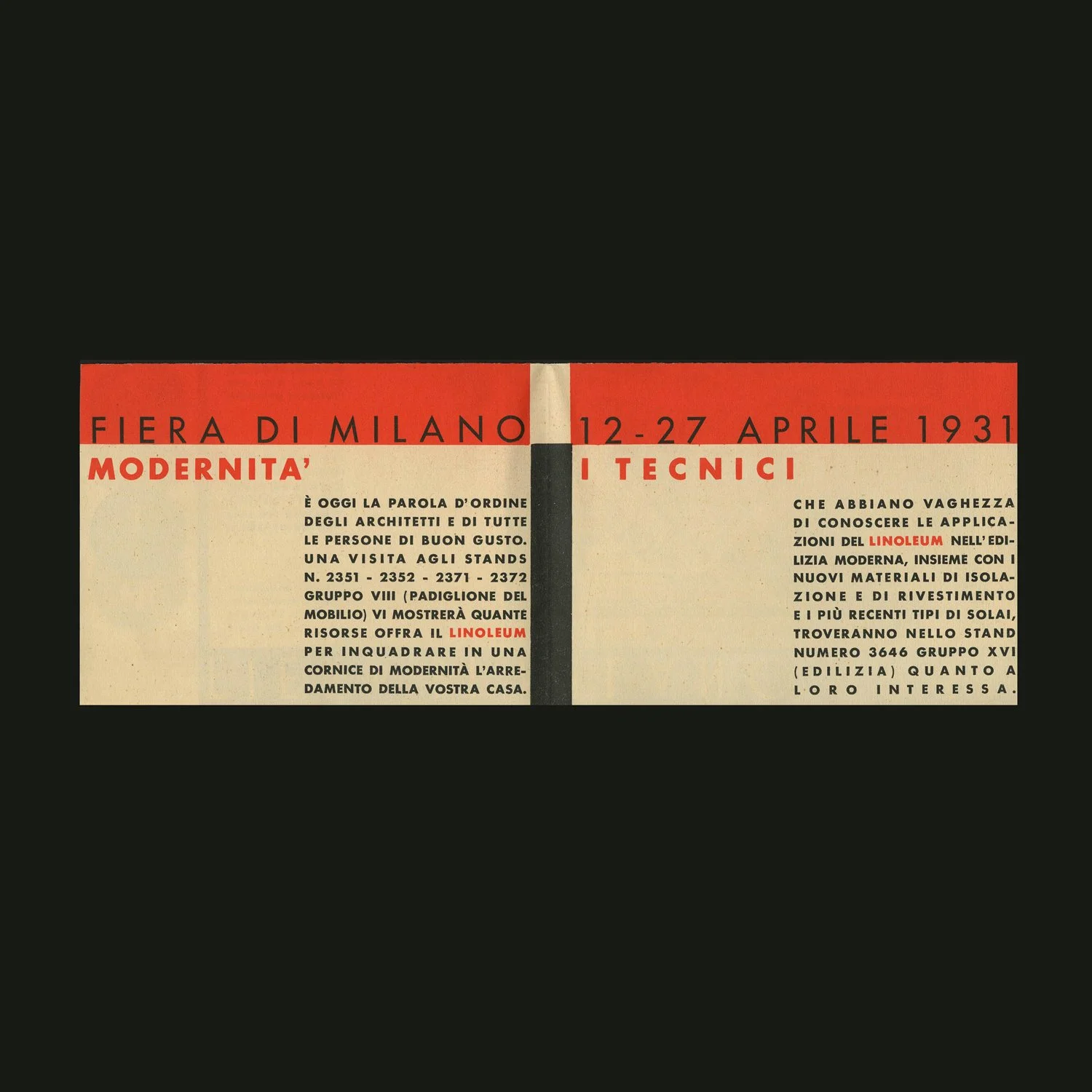 Image 2 of 5
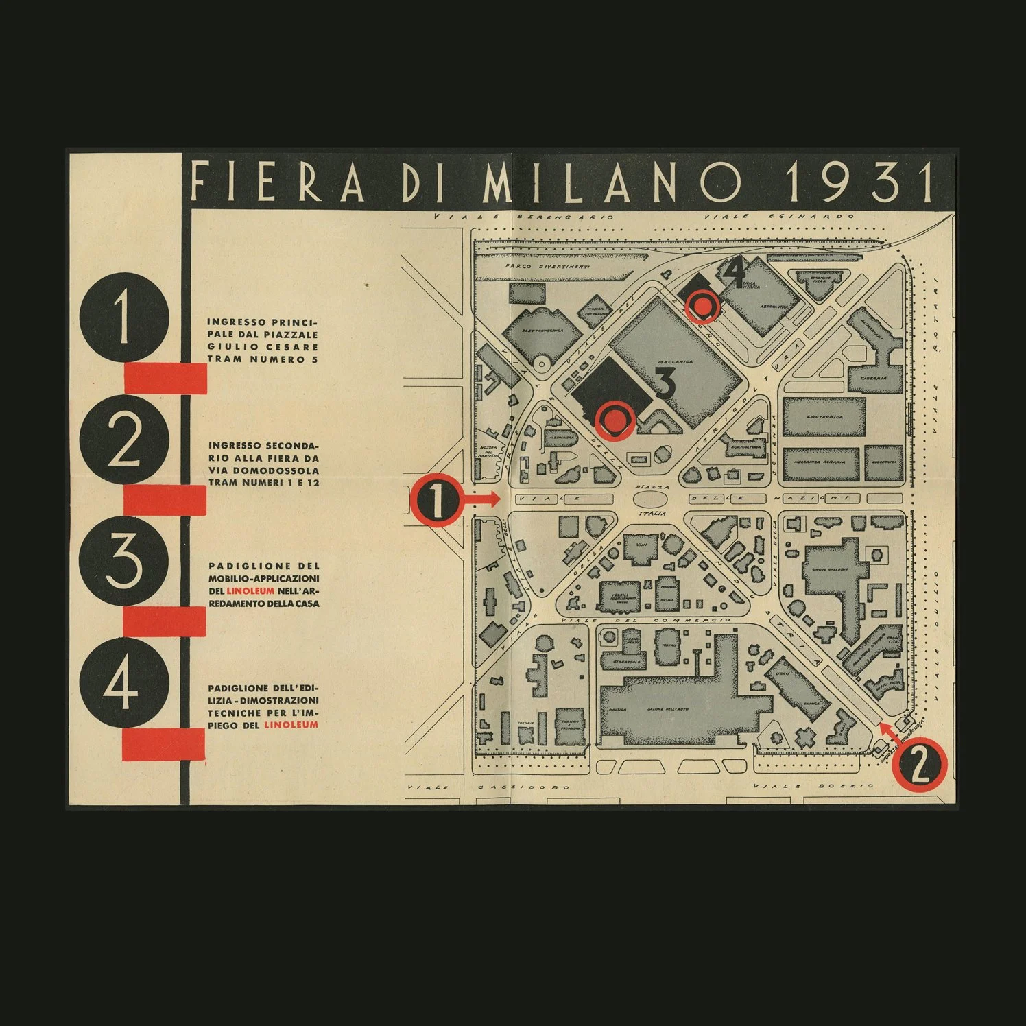 Image 3 of 5
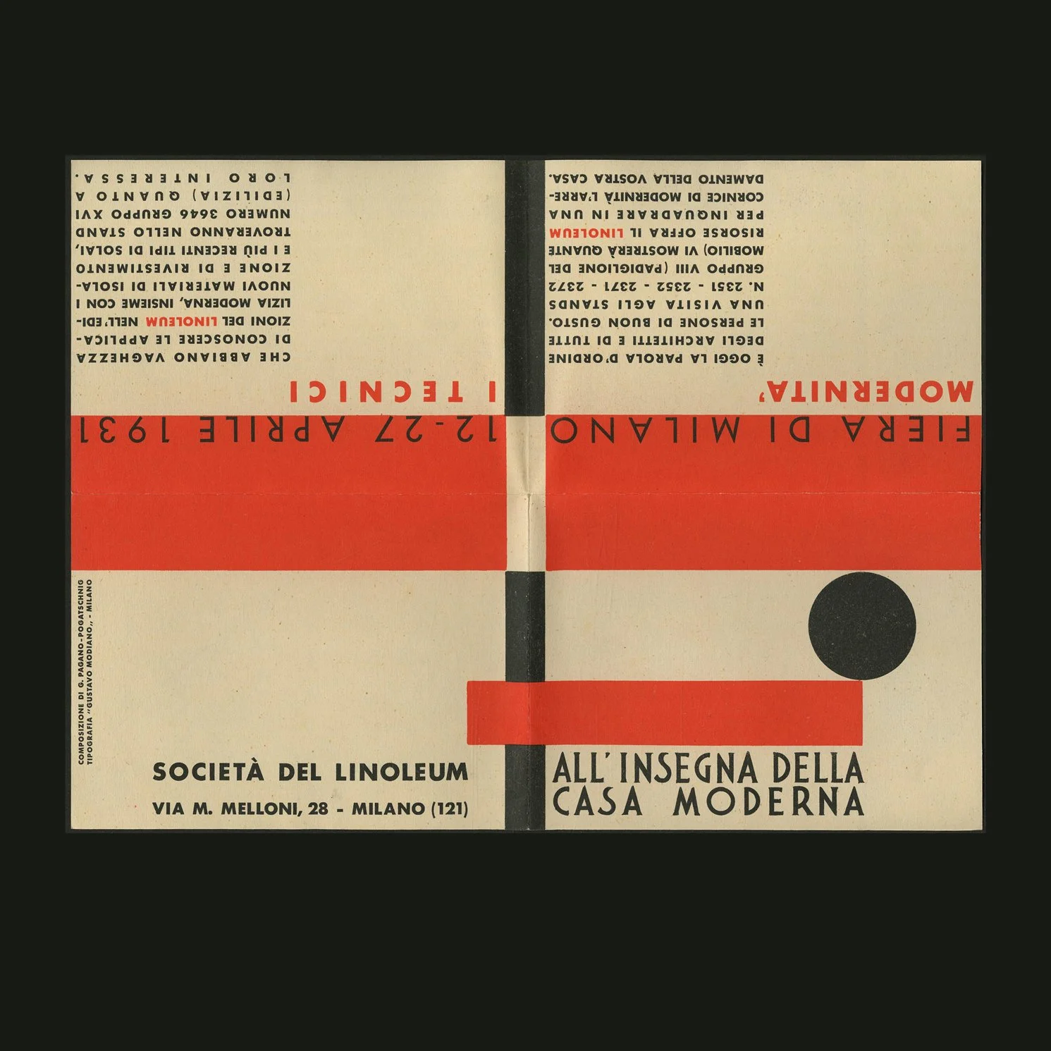 Image 4 of 5
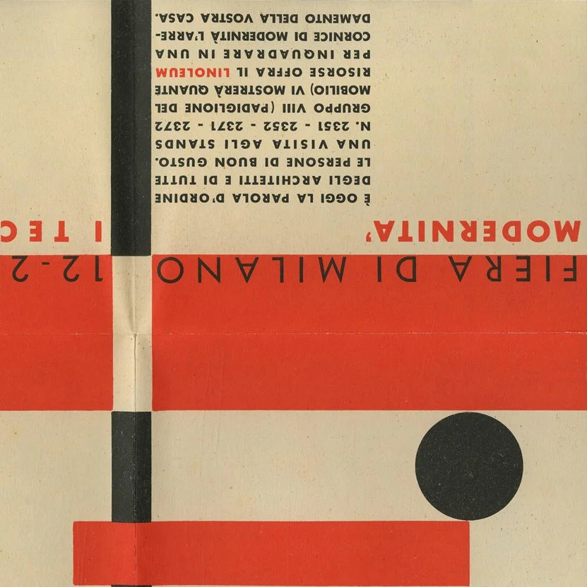 Image 5 of 5
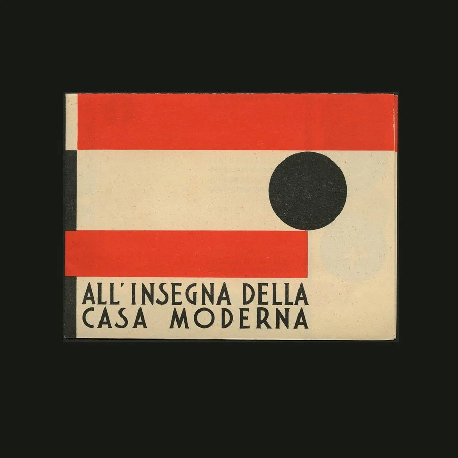
Milano, Società Italiana del Linoleum (Tipografia Gustavo Modiano), 1931. 12mo. Text in Italian. Machine folded in quarters [as issued], printed in three colors for the Milan Fair, 1931. A fine example.
6.5 x 4.85-inches (folded) to 12.75 x 9.5-inches (open) advertising leaflet produced for the 1931 Milan Fair, printed in three colors (black, orange, grey) and folded into quarters, featuring a topographic map of the Fair. An excellent example of Italian Rational—or Functional—graphic design that parallels these movements in Italian Architecture.
“Modernity is today the watchword of architects and of all people of good taste. A visit to stands no. 2351 - 2352 - 2371 - 2372 group VIII (Furniture Pavilion) will show you how many resources Linoleum offers to frame the furnishing of your home within a modern context.”
Giuseppi Pagano wrote “The Evolution of Typography in Italy” and H. K. Frenzel published it in Gebrauchsgraphik, October 1937; here is the English translation:
“In no other country was the development of typography so strongly influenced by tradition during the nineteenth century as in Italy, where, however it was not so much a case of an inner traditional tie as of more external influence and stimulus with regard to form. The taste for the neo-classical (i. e. variations of 15th century models and Bodoni’s style) was most noticeable in practice immediately after the War and until a few years ago. This movement performed a twofold service, for in the first place it exercised the effect of a healthy repercussion on the degenerate symptoms of the “Liberty period” and, secondly, it also provided the best typographists with a secure basis for exercising the craftsmanship of their vocation.
“This movement, however, also had the disadvantage that it restricted the development of contemporary typography. The restrictive effect was all the more difficult to overcome because, in addition to all the influences of tradition and of the typographical examples provided by England and Germany, development was still hampered by dialectical misunderstanding, so that it was only the neo-classical style that could give typography a pronounced Italian Stamp.
“The controversy between the upholders of neo-classicism and the advocates of a modern typographical taste still continues, but the contrasts between the style of graphic expression of earlier centuries and the requirements of the present day are being increasingly recognized both by the public and by the graphic artists themselves.
“In order to strengthen an animated style of typography in Italy fresh forces were required which were not subject to the limitations of technique and which were supported by the experiences in other fields of art. For this reason the most remarkable work was also produced in Italy at the incentive and with the participation of architects, painters and art experts familiar with the achievements of progressive architecture and sculptors. Proof of this is provided by the leading position occupied by periodicals for architects in particular among periodical publications. Modern typography is now so esteemed that no form of propaganda would venture to ignore or neglect its forms of expression; it would now be inconceivable to publish a catalogue of motor cars in romantic style or in that of a missal. Italian typography is now generally architectural in style, which is clearly expressed in the forms of script, the arrangement of the space, and the entire constructive work.
“The natural appreciation of the Italian genius for balance and moderation leaves no room for an extremely plastic style of expression, and even in the treatment of figures there is an obvious endeavor to remain in a strictly graphic atmosphere, which finds expression, for instance, in a preference for photography as against sketches, or in providing stimuli by abstract plastic work and not by picturesque impression.
“This undeniable architectural trend is, however, proof of typographical vitality, and, especially, an intelligent interpretation of the traditions of the Italian Renaissance and of Bodoni’s style.”
Milano, Società Italiana del Linoleum (Tipografia Gustavo Modiano), 1931. 12mo. Text in Italian. Machine folded in quarters [as issued], printed in three colors for the Milan Fair, 1931. A fine example.
6.5 x 4.85-inches (folded) to 12.75 x 9.5-inches (open) advertising leaflet produced for the 1931 Milan Fair, printed in three colors (black, orange, grey) and folded into quarters, featuring a topographic map of the Fair. An excellent example of Italian Rational—or Functional—graphic design that parallels these movements in Italian Architecture.
“Modernity is today the watchword of architects and of all people of good taste. A visit to stands no. 2351 - 2352 - 2371 - 2372 group VIII (Furniture Pavilion) will show you how many resources Linoleum offers to frame the furnishing of your home within a modern context.”
Giuseppi Pagano wrote “The Evolution of Typography in Italy” and H. K. Frenzel published it in Gebrauchsgraphik, October 1937; here is the English translation:
“In no other country was the development of typography so strongly influenced by tradition during the nineteenth century as in Italy, where, however it was not so much a case of an inner traditional tie as of more external influence and stimulus with regard to form. The taste for the neo-classical (i. e. variations of 15th century models and Bodoni’s style) was most noticeable in practice immediately after the War and until a few years ago. This movement performed a twofold service, for in the first place it exercised the effect of a healthy repercussion on the degenerate symptoms of the “Liberty period” and, secondly, it also provided the best typographists with a secure basis for exercising the craftsmanship of their vocation.
“This movement, however, also had the disadvantage that it restricted the development of contemporary typography. The restrictive effect was all the more difficult to overcome because, in addition to all the influences of tradition and of the typographical examples provided by England and Germany, development was still hampered by dialectical misunderstanding, so that it was only the neo-classical style that could give typography a pronounced Italian Stamp.
“The controversy between the upholders of neo-classicism and the advocates of a modern typographical taste still continues, but the contrasts between the style of graphic expression of earlier centuries and the requirements of the present day are being increasingly recognized both by the public and by the graphic artists themselves.
“In order to strengthen an animated style of typography in Italy fresh forces were required which were not subject to the limitations of technique and which were supported by the experiences in other fields of art. For this reason the most remarkable work was also produced in Italy at the incentive and with the participation of architects, painters and art experts familiar with the achievements of progressive architecture and sculptors. Proof of this is provided by the leading position occupied by periodicals for architects in particular among periodical publications. Modern typography is now so esteemed that no form of propaganda would venture to ignore or neglect its forms of expression; it would now be inconceivable to publish a catalogue of motor cars in romantic style or in that of a missal. Italian typography is now generally architectural in style, which is clearly expressed in the forms of script, the arrangement of the space, and the entire constructive work.
“The natural appreciation of the Italian genius for balance and moderation leaves no room for an extremely plastic style of expression, and even in the treatment of figures there is an obvious endeavor to remain in a strictly graphic atmosphere, which finds expression, for instance, in a preference for photography as against sketches, or in providing stimuli by abstract plastic work and not by picturesque impression.
“This undeniable architectural trend is, however, proof of typographical vitality, and, especially, an intelligent interpretation of the traditions of the Italian Renaissance and of Bodoni’s style.”