
 Image 1 of 4
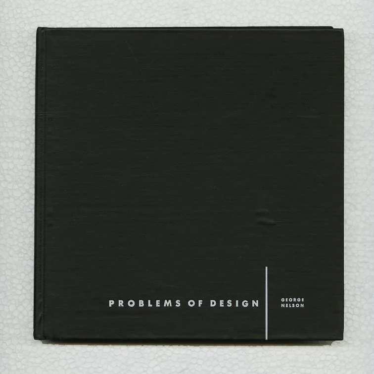 Image 2 of 4
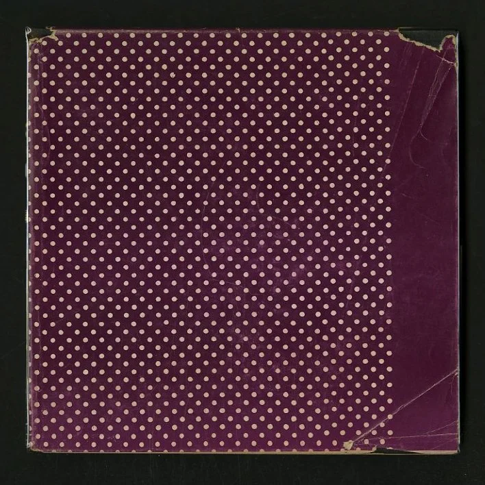 Image 3 of 4
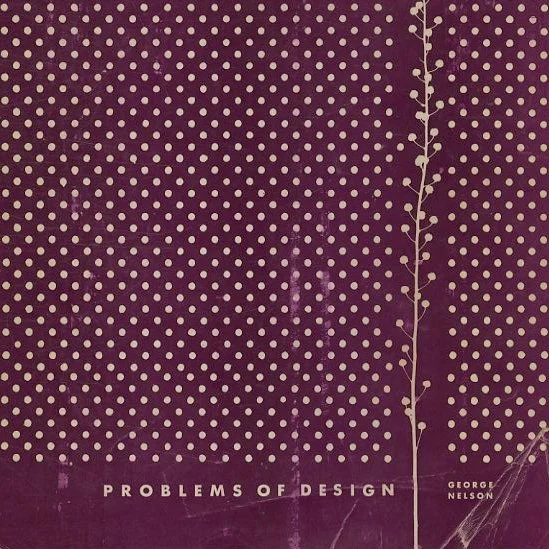 Image 4 of 4
Nelson, George: PROBLEMS OF DESIGN. New York: Whitney Publications, 1957.
PROBLEMS OF DESIGN
George Nelson
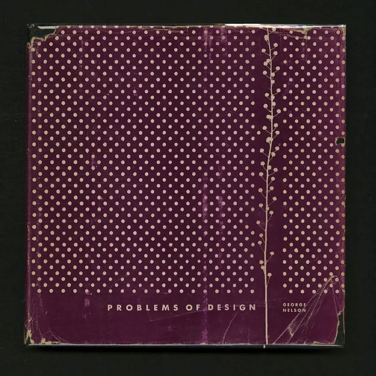
First edition. Square quarto. Black fabricoid covered boards embossed and titled in white. Printed dust jacket. 204 pp. Multiple paper stocks. 26 essays illustrated in black and white. Unclipped dust jacket lightly rubbed with edgewear including chipping with loss to both spine crown and heel, and a couple of faint creases and chipping to folds. Black fabricoid with a small, faint bubble [?] to front panel. An uncomon title in hardcover, and uncommon in this condition: a very good or better copy in a very good dust jacket.
8.5 x 8.5 hardcover book with 204 pages and over 100 black and white photographs, illustrations and diagrams. An anthology of 26 essays by the ever-erudite Nelson, culled from a variety of sources, including Interiors, Industrial Design, Holiday, Fortune, Architectural Forum, House and Garden, American Fabrics, the Philips Academy Bulletin (!) and others. Foreward by Arthur Drexler. Book design credited to George Nelson and Company: Carl Ramirez, John Pile, Don Ervin and Herbert Lee.
Nelson tackles the problems of design in the following categories: Art, Architecture, Houses, Planning and Interiors.
PROBLEMS OF DESIGN
Design as Communication
Good Design: what is it for?
Art X—the Georgia Experiment
Captive Designer vs. independent Designer
Ends and means
Obsolescence
A new Profession?
Structure and Fabric
The Enlargement of Vision
The Designer in the modern world
High time to experiment
ART
Some notes on relations between the visual arts
Venus, persephone and September Morn.
ARCHITECTURE
Classic holiday house
Wright's houses
Stylistic trends in contemporary architecture
HOUSES
Down with housekeeping
the japanese House
Prefabrication
After the modern house
The Second house
PLANNING
Planning with you
Main Street
INTERIORS
The dead-end room
Modern Decoration
Notes on the new subscape
Contains work by the following designers, artists, photographers: Charles Eames, Le Corbusier, Frank Lloyd Wright, Mies van der Rohe, Eero Saarinen, Philip Johnson, Hedrich-Blessing, Julius Shulman, Ezra Stoller and many others.
"George Nelson was an outstanding designer. We all know that. But my hunch is that, in a hundred years, he'll be even better remembered for his thinking and writing about design.' — Stanley Abercrombie, architect and writer
George Nelson (American, 1908 – 1986) possessed one of the most inventive minds of the 20th century. Nelson was one of those rare people who could envision what isn’t there yet. Nelson described his creative abilities as a series of “zaps” – flashes of inspiration and clarity that he turned into innovative design ideas.
One such “zap” came in 1942 when Nelson conceived the first-ever pedestrian shopping mall – now a ubiquitous feature of our architectural landscape – detailed in his “Grass on Main Street” article. Soon after, he pioneered the concept of built-in storage with the storage wall, a system of storage units that rested on slatted platform benches. The first modular storage system ever, it was showcased in Life magazine and caused an immediate sensation in the furniture industry.
In 1946, Nelson became director of design at Herman Miller, a position he held until 1972. While there, Nelson recruited other seminal modern designers, including Charles Eames and Isamu Noguchi. He also developed his own designs, including the Marshmallow Sofa, the Nelson Platform Bench and the first L-shaped desk, a precursor to the present-day workstation. He also created a series of boldly graphic wall clocks and a series of bubble lamps made of self-webbing plastic.
Nelson felt that designers must be “aware of the consequences of their actions on people and society and thus cultivate a broad base of knowledge and understanding.” He was an early environmentalist, one of the first designers to take an interest in new communications technology and a powerful writer and teacher. Perhaps influenced by his friend, Buckminster Fuller, Nelson’s ultimate goal as a designer was “to do much more with much less.”
“Imagining a sheet of paper as building site will give you a good sense for Irving Harper’s (American, 1916–2015) approach to graphic design. As the Swiss magazine Graphis noted in a 1953 survey of his print work for the Nelson Office, it’s an approach not dissimilar to that of an architect. “The page on which to print is regarded as a site on which to build…. Pictorial material, often broken into fragments, is organized by asymmetrical harmonies.” From his start working with Nelson in 1947 through his tenure as design director at the office until 1963, Harper brought a visual coherence and energy to everything he created—from furniture, to ads, to clocks—but it's in the printed collateral that his approach to design as a total experience is most easily gleaned. Be it evoking three-dimensional spatial gestures into a two-dimensional magazine spread, for example, or turning a functional object like a clock into a graphic abstraction, or giving a simple typographic treatment the textural quality of a swath of fabric, everything he designs has a deeper sense of dimension.
“Formally trained as an architect, Harper studied in his native New York at Brooklyn College and Cooper Union and eventually landed his first architectural job for Morris B. Sanders, who had been invited to design the Arkansas pavilion for the 1939-40 World's Fair. He put Harper in charge of interiors, thus inadvertently altering the course of his career. As he recalled to Julie Lasky in an interview for her book Irving Harper: Works In Paper, “‘[I] found design much more interesting because it was entrepreneurial.’ In an architecture office, ‘it’s hard to rise to the top.’ And ‘design work is more varied. Everything is a first-time thing. You learn a lot more.’” Harper’s early foundational work for Sanders and then for Gilbert Rohde, the illustrator-turned-product designer who had a hand in shepherding American furniture design into the 20th century through his work with Herman Miller and Heywood-Wakefield, helped solidify Harper’s position as a designer. It also helped him land the job at the Nelson Office: Ernest Farmer, an old colleague from Rohde’s office, had moved on to work for Nelson, and it was he who convinced Nelson to hire Harper to design graphics for the office. This early foundation in 3D design informed so much of Harper’s compositional predilections at the Nelson Office, and unlike many of the furniture pieces he designed there, his advertisements—especially the collateral work for Herman Miller, for whom George Nelson was design director—were often credited to him by name.
“When Nelson undertook his debut furniture collection as design director for Herman Miller, he was also tasked with creating the graphics and advertising work to support its sale. This included a new trademark that could be heat-stamped into the wood furniture. Nelson had initially approached Paul Rand, one of the most sought after graphic designers at the time (and well revered for his identity work, most notably the IBM logo) to create the mark, but when Rand backed out of the project, the job went in-house and ultimately landed in the hands of Harper. The first ad for the collection was to be printed in 1946, prior to any tangible furniture to photograph or illustrate and was limited to a two-color printing process. But like any good designer or architect might, Harper took note of his limitations, and building around them, fashioned a monumental, French-curved M in bold red, set against a black and white wood-grain texture. Harper later called it the century's least expensive corporate branding, but even despite the mark’s humble beginnings, the bones of that original M (minus the wood grain) have endured as Herman Miller’s logo—a testament to both Harper’s skill as a designer and the company’s belief in the clarity of his vision.” — Amber Bravo
PROBLEMS OF DESIGN
George Nelson
First edition. Square quarto. Black fabricoid covered boards embossed and titled in white. Printed dust jacket. 204 pp. Multiple paper stocks. 26 essays illustrated in black and white. Unclipped dust jacket lightly rubbed with edgewear including chipping with loss to both spine crown and heel, and a couple of faint creases and chipping to folds. Black fabricoid with a small, faint bubble [?] to front panel. An uncomon title in hardcover, and uncommon in this condition: a very good or better copy in a very good dust jacket.
8.5 x 8.5 hardcover book with 204 pages and over 100 black and white photographs, illustrations and diagrams. An anthology of 26 essays by the ever-erudite Nelson, culled from a variety of sources, including Interiors, Industrial Design, Holiday, Fortune, Architectural Forum, House and Garden, American Fabrics, the Philips Academy Bulletin (!) and others. Foreward by Arthur Drexler. Book design credited to George Nelson and Company: Carl Ramirez, John Pile, Don Ervin and Herbert Lee.
Nelson tackles the problems of design in the following categories: Art, Architecture, Houses, Planning and Interiors.
PROBLEMS OF DESIGN
Design as Communication
Good Design: what is it for?
Art X—the Georgia Experiment
Captive Designer vs. independent Designer
Ends and means
Obsolescence
A new Profession?
Structure and Fabric
The Enlargement of Vision
The Designer in the modern world
High time to experiment
ART
Some notes on relations between the visual arts
Venus, persephone and September Morn.
ARCHITECTURE
Classic holiday house
Wright's houses
Stylistic trends in contemporary architecture
HOUSES
Down with housekeeping
the japanese House
Prefabrication
After the modern house
The Second house
PLANNING
Planning with you
Main Street
INTERIORS
The dead-end room
Modern Decoration
Notes on the new subscape
Contains work by the following designers, artists, photographers: Charles Eames, Le Corbusier, Frank Lloyd Wright, Mies van der Rohe, Eero Saarinen, Philip Johnson, Hedrich-Blessing, Julius Shulman, Ezra Stoller and many others.
"George Nelson was an outstanding designer. We all know that. But my hunch is that, in a hundred years, he'll be even better remembered for his thinking and writing about design.' — Stanley Abercrombie, architect and writer
George Nelson (American, 1908 – 1986) possessed one of the most inventive minds of the 20th century. Nelson was one of those rare people who could envision what isn’t there yet. Nelson described his creative abilities as a series of “zaps” – flashes of inspiration and clarity that he turned into innovative design ideas.
One such “zap” came in 1942 when Nelson conceived the first-ever pedestrian shopping mall – now a ubiquitous feature of our architectural landscape – detailed in his “Grass on Main Street” article. Soon after, he pioneered the concept of built-in storage with the storage wall, a system of storage units that rested on slatted platform benches. The first modular storage system ever, it was showcased in Life magazine and caused an immediate sensation in the furniture industry.
In 1946, Nelson became director of design at Herman Miller, a position he held until 1972. While there, Nelson recruited other seminal modern designers, including Charles Eames and Isamu Noguchi. He also developed his own designs, including the Marshmallow Sofa, the Nelson Platform Bench and the first L-shaped desk, a precursor to the present-day workstation. He also created a series of boldly graphic wall clocks and a series of bubble lamps made of self-webbing plastic.
Nelson felt that designers must be “aware of the consequences of their actions on people and society and thus cultivate a broad base of knowledge and understanding.” He was an early environmentalist, one of the first designers to take an interest in new communications technology and a powerful writer and teacher. Perhaps influenced by his friend, Buckminster Fuller, Nelson’s ultimate goal as a designer was “to do much more with much less.”
“Imagining a sheet of paper as building site will give you a good sense for Irving Harper’s (American, 1916–2015) approach to graphic design. As the Swiss magazine Graphis noted in a 1953 survey of his print work for the Nelson Office, it’s an approach not dissimilar to that of an architect. “The page on which to print is regarded as a site on which to build…. Pictorial material, often broken into fragments, is organized by asymmetrical harmonies.” From his start working with Nelson in 1947 through his tenure as design director at the office until 1963, Harper brought a visual coherence and energy to everything he created—from furniture, to ads, to clocks—but it's in the printed collateral that his approach to design as a total experience is most easily gleaned. Be it evoking three-dimensional spatial gestures into a two-dimensional magazine spread, for example, or turning a functional object like a clock into a graphic abstraction, or giving a simple typographic treatment the textural quality of a swath of fabric, everything he designs has a deeper sense of dimension.
“Formally trained as an architect, Harper studied in his native New York at Brooklyn College and Cooper Union and eventually landed his first architectural job for Morris B. Sanders, who had been invited to design the Arkansas pavilion for the 1939-40 World's Fair. He put Harper in charge of interiors, thus inadvertently altering the course of his career. As he recalled to Julie Lasky in an interview for her book Irving Harper: Works In Paper, “‘[I] found design much more interesting because it was entrepreneurial.’ In an architecture office, ‘it’s hard to rise to the top.’ And ‘design work is more varied. Everything is a first-time thing. You learn a lot more.’” Harper’s early foundational work for Sanders and then for Gilbert Rohde, the illustrator-turned-product designer who had a hand in shepherding American furniture design into the 20th century through his work with Herman Miller and Heywood-Wakefield, helped solidify Harper’s position as a designer. It also helped him land the job at the Nelson Office: Ernest Farmer, an old colleague from Rohde’s office, had moved on to work for Nelson, and it was he who convinced Nelson to hire Harper to design graphics for the office. This early foundation in 3D design informed so much of Harper’s compositional predilections at the Nelson Office, and unlike many of the furniture pieces he designed there, his advertisements—especially the collateral work for Herman Miller, for whom George Nelson was design director—were often credited to him by name.
“When Nelson undertook his debut furniture collection as design director for Herman Miller, he was also tasked with creating the graphics and advertising work to support its sale. This included a new trademark that could be heat-stamped into the wood furniture. Nelson had initially approached Paul Rand, one of the most sought after graphic designers at the time (and well revered for his identity work, most notably the IBM logo) to create the mark, but when Rand backed out of the project, the job went in-house and ultimately landed in the hands of Harper. The first ad for the collection was to be printed in 1946, prior to any tangible furniture to photograph or illustrate and was limited to a two-color printing process. But like any good designer or architect might, Harper took note of his limitations, and building around them, fashioned a monumental, French-curved M in bold red, set against a black and white wood-grain texture. Harper later called it the century's least expensive corporate branding, but even despite the mark’s humble beginnings, the bones of that original M (minus the wood grain) have endured as Herman Miller’s logo—a testament to both Harper’s skill as a designer and the company’s belief in the clarity of his vision.” — Amber Bravo