
 Image 1 of 4
 Image 2 of 4
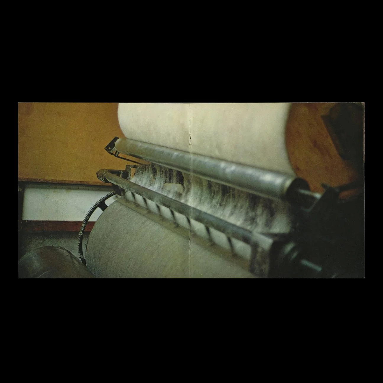 Image 3 of 4
 Image 4 of 4
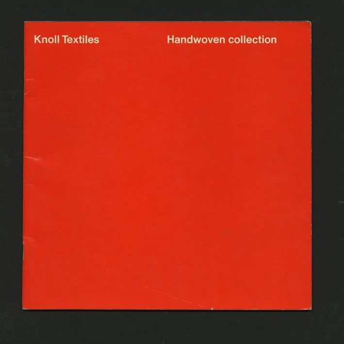
New York: Knoll International / Chanticleer Press, 1967. Slim square quarto. Printed duplex saddle stitched self wrappers. 20 pp. Full page, full bleed photography by Robert Cadwallader designed by Massimo Vignelli/ Unimark. Wrappers lightly crimped at spine and fore edge lifting, but a very good copy.
8.25 x 8.25 saddle stitched booklet with 20 pages of color photography by Robert Cadwallader of the Maute Mill in Germany. Originally published as part of the Knoll “Handwoven” Sample Kit in 1967 [Martin, 236-237, fig 5.11]. One of the earliest examples of Massimo Vignelli’s Knoll Corporate Identity that supplanted Herbert Matter’s 1947 vision.
In 1940, Hans Knoll founded a company in New York that soon earned a reputation for its progressive line of furniture. Florence Schust joined the firm and helped establish its interior design division, the Knoll Planning Unit. In 1947, the year after their marriage, Hans and Florence Knoll added a third division, Knoll Textiles, which brought textile production in line with a modern sensibility that used color and texture as primary design elements. In the early years, the company hired leading proponents of modern design as well as young, untried designers to create textile patterns. The division thrived in the late 1940s through 1960s and, in the following decade, adopted a more international outlook as design direction shifted to Europe. In the late 1970s and 1980s, Knoll tapped fashion designers and architects to bolster its brand. The pioneering use of new materials and a commitment to innovative design have remained Knoll's hallmarks to the present day.
Massimo Vignelli and wife Lella served as graphic and advertising design consultants to Knoll during the 1970s. They championed a graphic design for Knoll, which made them famous worldwide, and which continues to inform the company's work. Mr.Vignelli once described the Knoll assignment as "the most exciting, rewarding" of his professional career. The Vignelli work provided the foundation for all basic communication needs, including stationery, business cards, stickers, tags, boxes, brochures and four-color ads for trade magazines and publications like The New Yorker, Vogue and Fortune.
Massimo Vignelli (Italy, 1931 – 2014) recalls the exact day that he found the design language that he would be known for. It was 1963, he had a studio in Milan, Lella & Massimo Vignelli Design & Architecture, where he designed in a reductive manner using Helvetica, black rules, and solid colored backgrounds. He put this into practice for Sansoni designing formats for scores of series and hundreds of books until leaving Italy for American in 1965. Today he uses more Bodoni, but hasn’t changed his basic design attitude one iota. He made his early reputation by designing strict formats for series like these.
"I always worked like this from the very beginning, I never had another way but this structural approach," admits Vignelli proudly. "My aim was always to reach maximum impact, so I used Helvetica on white or solid color backgrounds, which stood out — boom — from the texture of all the other books on the shelves. I designed many series this way, I had some books with only white covers with type raining down and some with a black and white illustration on bottom. We wanted to develop standards to avoid gratuitous criticism by publisher’s wives or secretaries and sales people. First and foremost we were searching for objectivity. So we convinced the publisher that a book was like a soap box. The publisher’s brand was the important thing, so each book looked alike. We played safe with the illustration by using things from the past. Who could argue with Rembrandt and Durer?"
New York: Knoll International / Chanticleer Press, 1967. Slim square quarto. Printed duplex saddle stitched self wrappers. 20 pp. Full page, full bleed photography by Robert Cadwallader designed by Massimo Vignelli/ Unimark. Wrappers lightly crimped at spine and fore edge lifting, but a very good copy.
8.25 x 8.25 saddle stitched booklet with 20 pages of color photography by Robert Cadwallader of the Maute Mill in Germany. Originally published as part of the Knoll “Handwoven” Sample Kit in 1967 [Martin, 236-237, fig 5.11]. One of the earliest examples of Massimo Vignelli’s Knoll Corporate Identity that supplanted Herbert Matter’s 1947 vision.
In 1940, Hans Knoll founded a company in New York that soon earned a reputation for its progressive line of furniture. Florence Schust joined the firm and helped establish its interior design division, the Knoll Planning Unit. In 1947, the year after their marriage, Hans and Florence Knoll added a third division, Knoll Textiles, which brought textile production in line with a modern sensibility that used color and texture as primary design elements. In the early years, the company hired leading proponents of modern design as well as young, untried designers to create textile patterns. The division thrived in the late 1940s through 1960s and, in the following decade, adopted a more international outlook as design direction shifted to Europe. In the late 1970s and 1980s, Knoll tapped fashion designers and architects to bolster its brand. The pioneering use of new materials and a commitment to innovative design have remained Knoll's hallmarks to the present day.
Massimo Vignelli and wife Lella served as graphic and advertising design consultants to Knoll during the 1970s. They championed a graphic design for Knoll, which made them famous worldwide, and which continues to inform the company's work. Mr.Vignelli once described the Knoll assignment as "the most exciting, rewarding" of his professional career. The Vignelli work provided the foundation for all basic communication needs, including stationery, business cards, stickers, tags, boxes, brochures and four-color ads for trade magazines and publications like The New Yorker, Vogue and Fortune.
Massimo Vignelli (Italy, 1931 – 2014) recalls the exact day that he found the design language that he would be known for. It was 1963, he had a studio in Milan, Lella & Massimo Vignelli Design & Architecture, where he designed in a reductive manner using Helvetica, black rules, and solid colored backgrounds. He put this into practice for Sansoni designing formats for scores of series and hundreds of books until leaving Italy for American in 1965. Today he uses more Bodoni, but hasn’t changed his basic design attitude one iota. He made his early reputation by designing strict formats for series like these.
"I always worked like this from the very beginning, I never had another way but this structural approach," admits Vignelli proudly. "My aim was always to reach maximum impact, so I used Helvetica on white or solid color backgrounds, which stood out — boom — from the texture of all the other books on the shelves. I designed many series this way, I had some books with only white covers with type raining down and some with a black and white illustration on bottom. We wanted to develop standards to avoid gratuitous criticism by publisher’s wives or secretaries and sales people. First and foremost we were searching for objectivity. So we convinced the publisher that a book was like a soap box. The publisher’s brand was the important thing, so each book looked alike. We played safe with the illustration by using things from the past. Who could argue with Rembrandt and Durer?"