
 Image 1 of 18
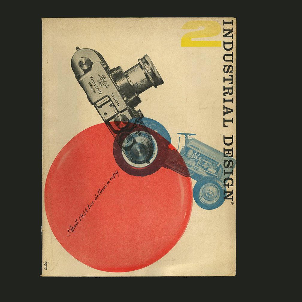 Image 2 of 18
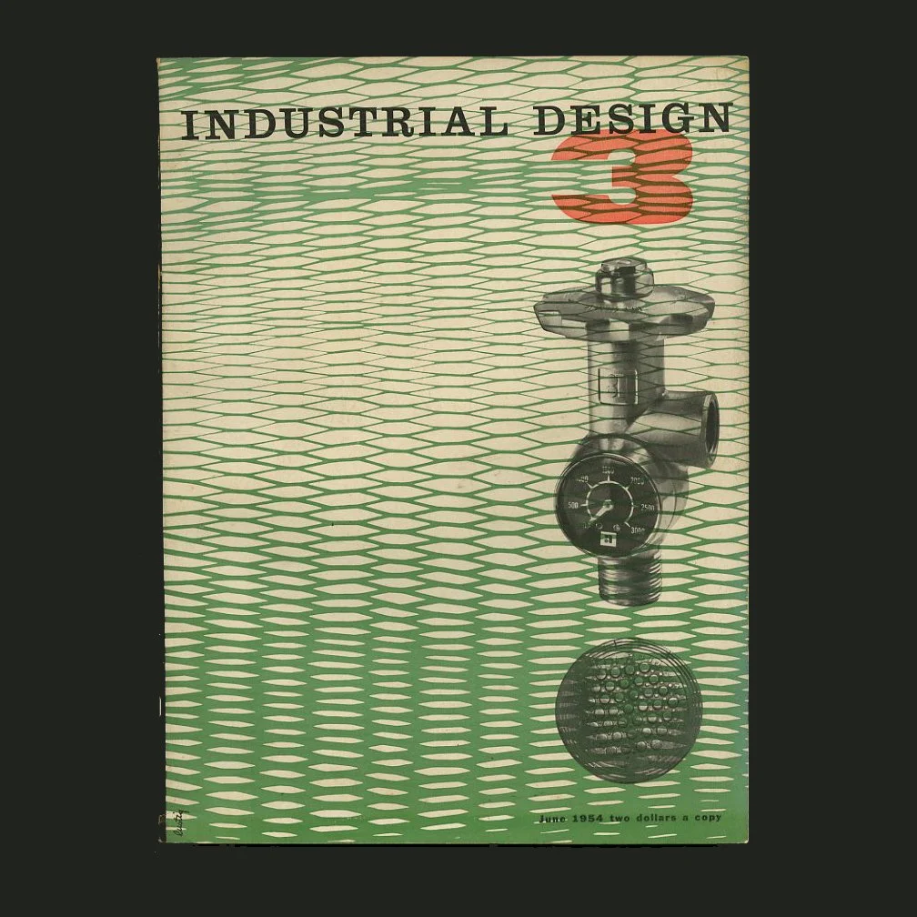 Image 3 of 18
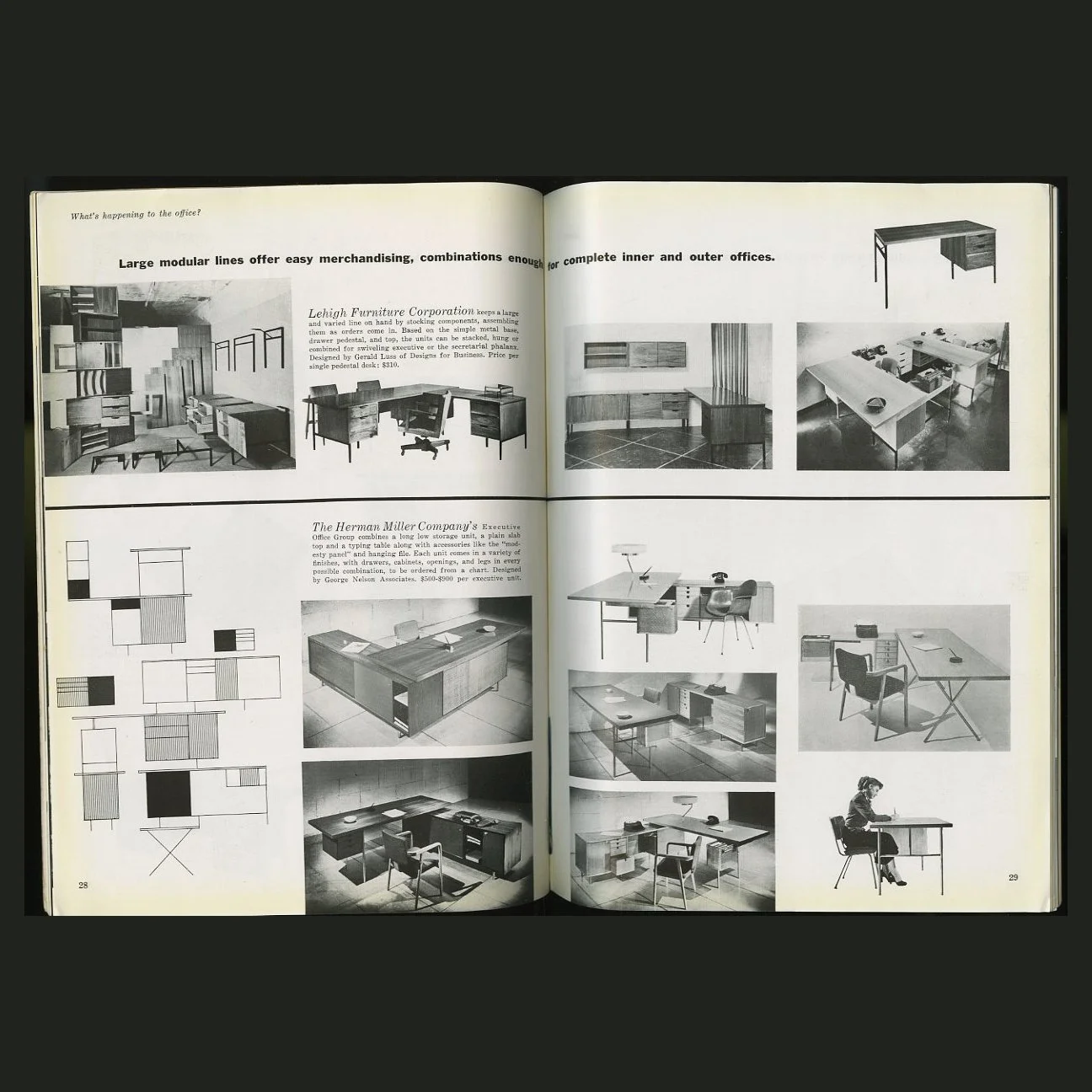 Image 4 of 18
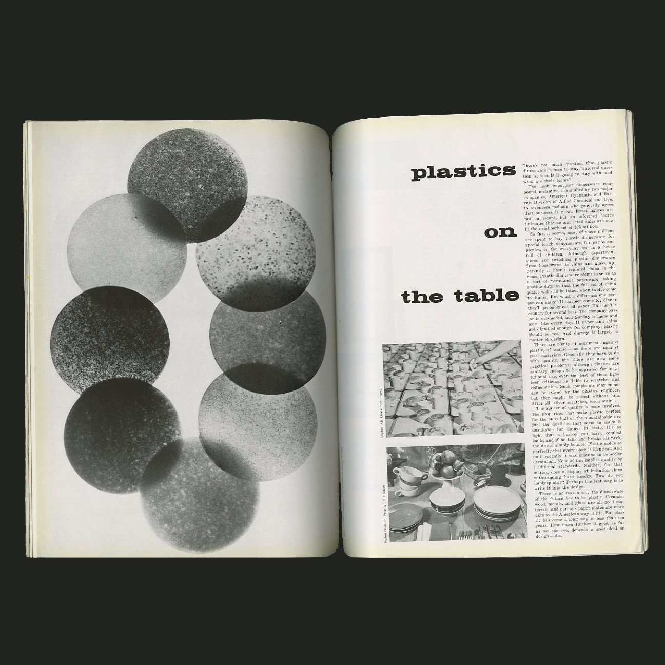 Image 5 of 18
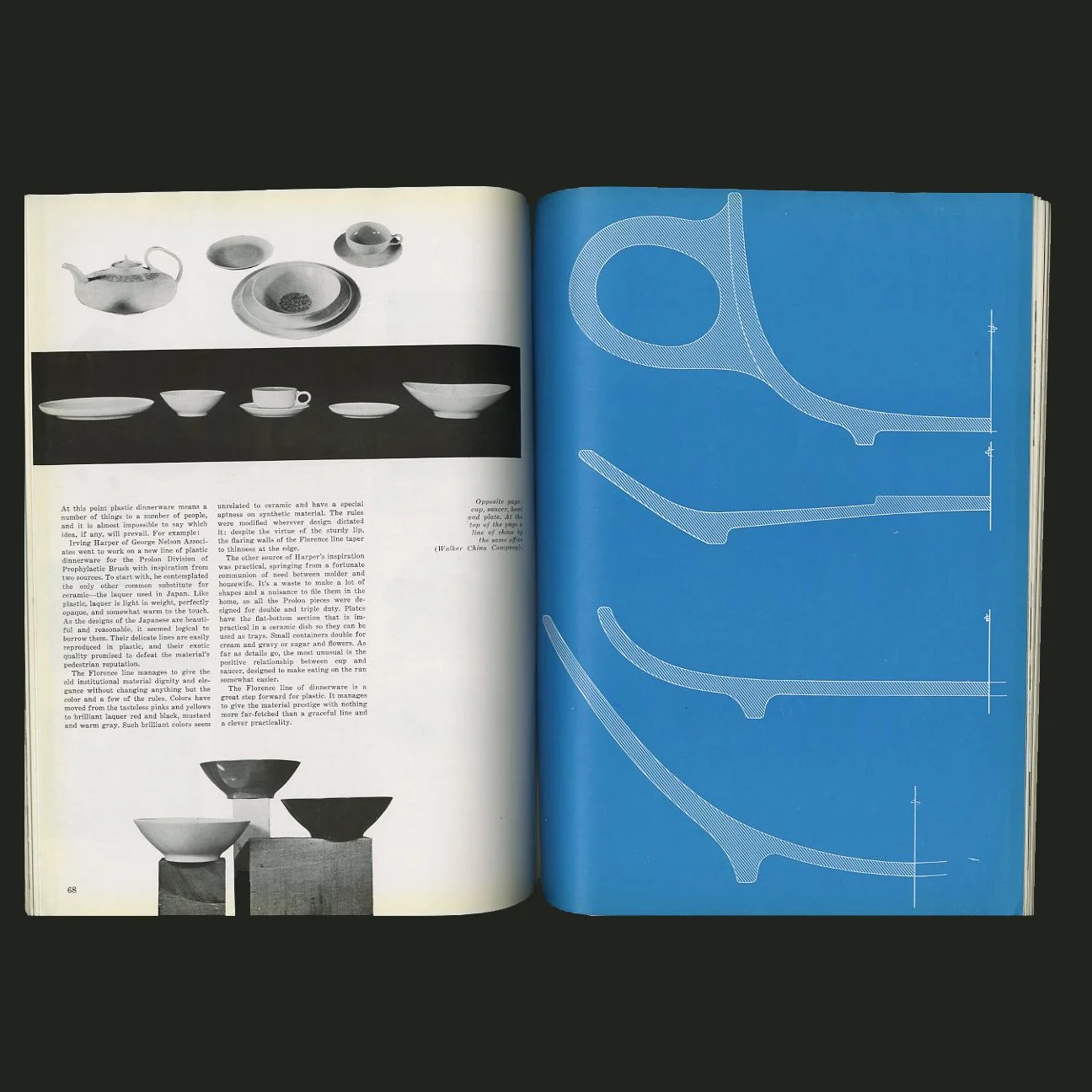 Image 6 of 18
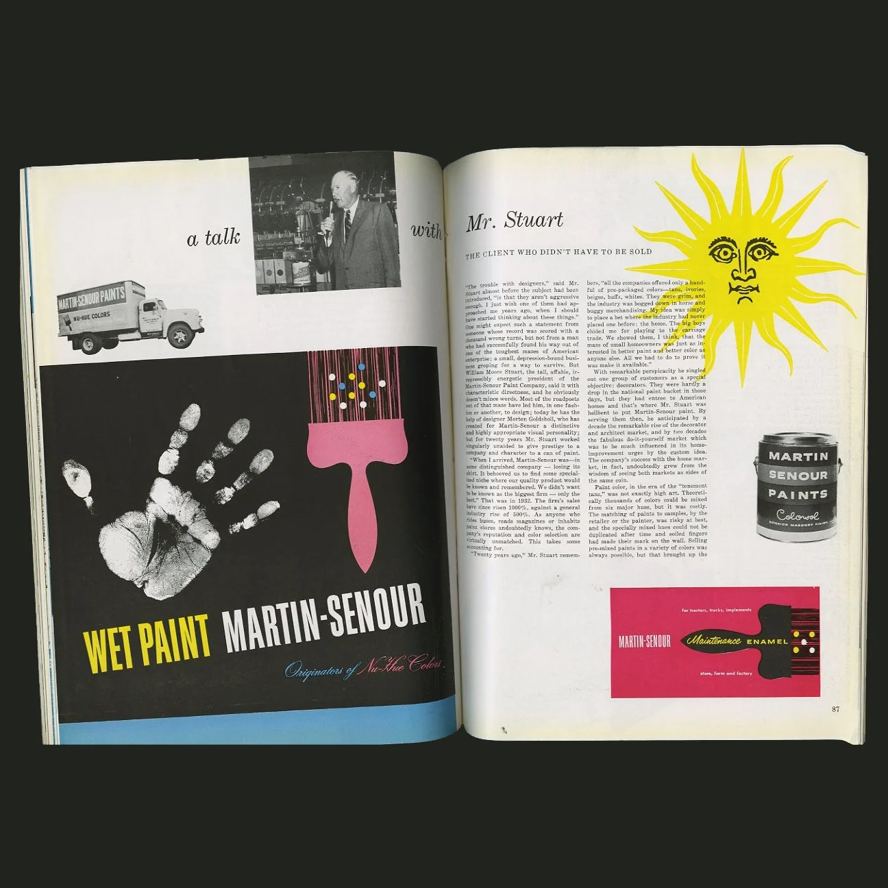 Image 7 of 18
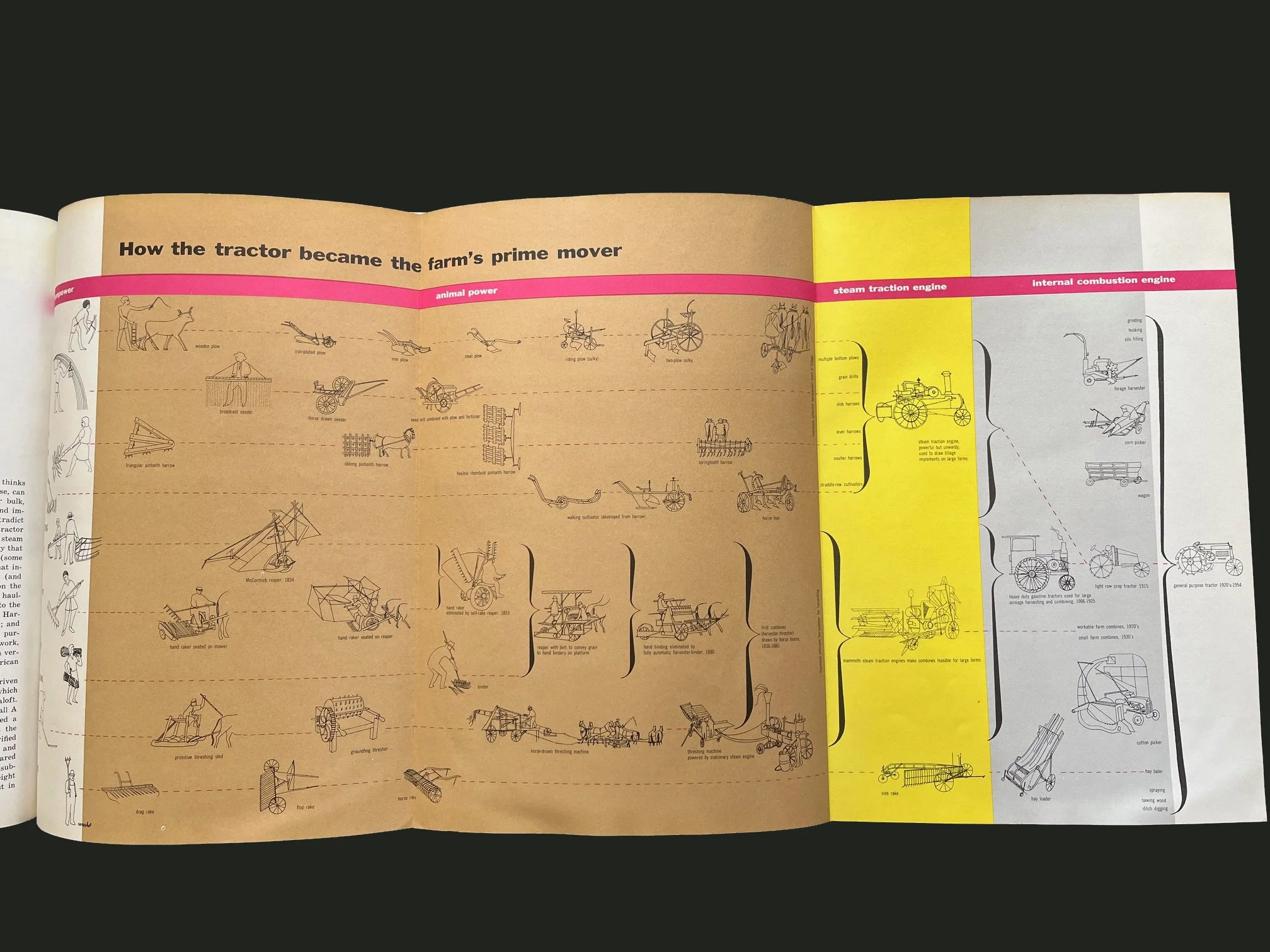 Image 8 of 18
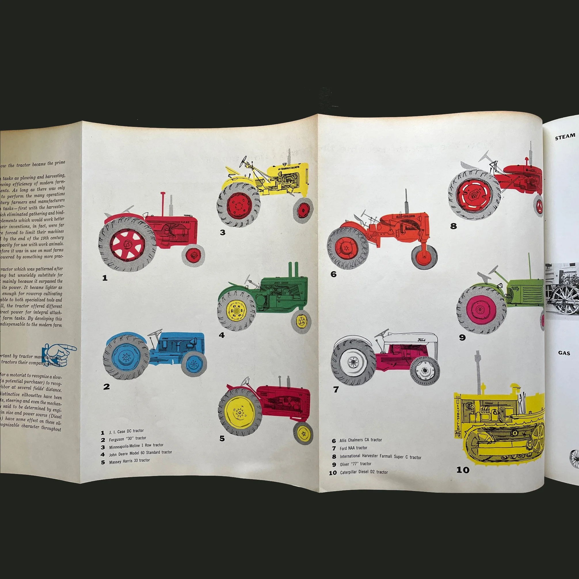 Image 9 of 18
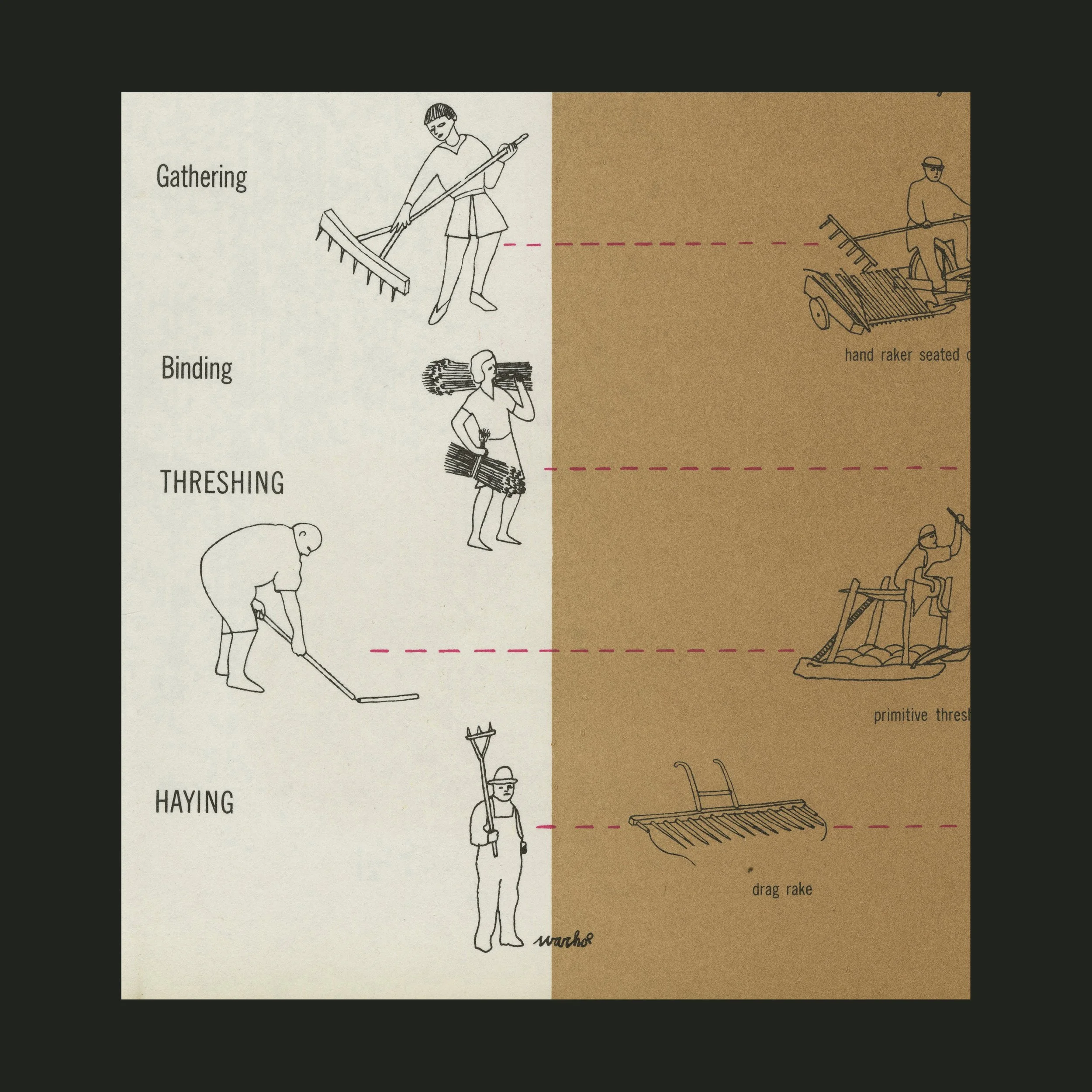 Image 10 of 18
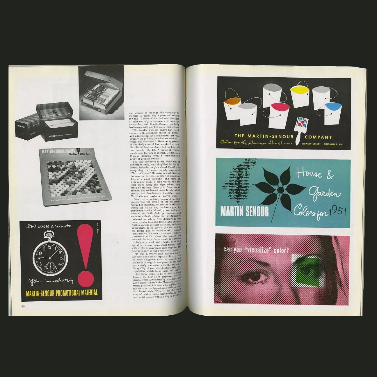 Image 11 of 18
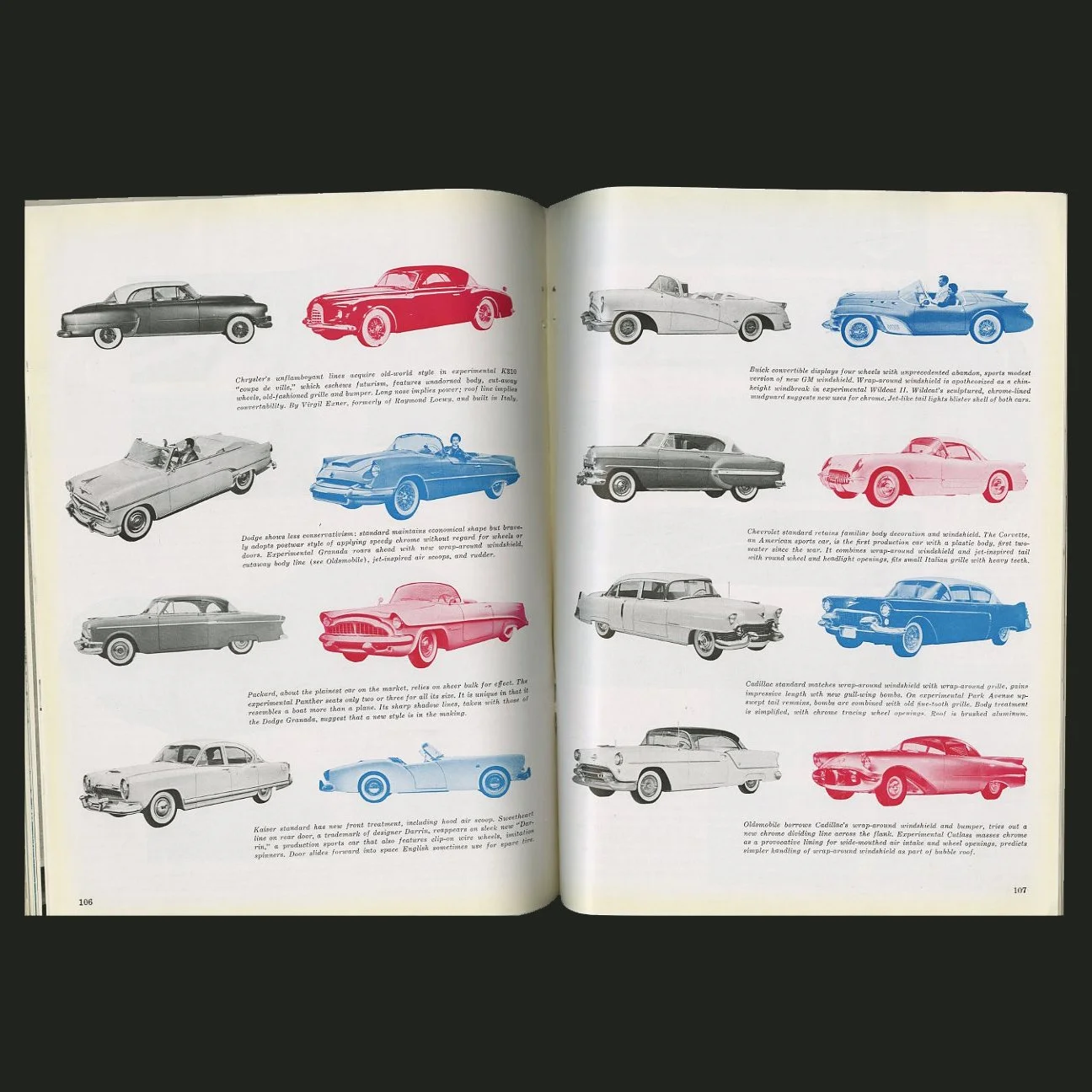 Image 12 of 18
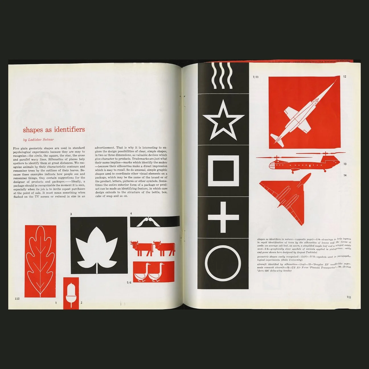 Image 13 of 18
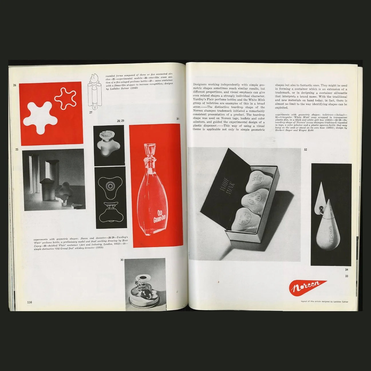 Image 14 of 18
 Image 15 of 18
 Image 16 of 18
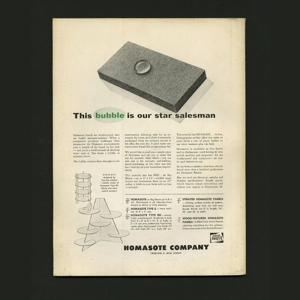 Image 17 of 18
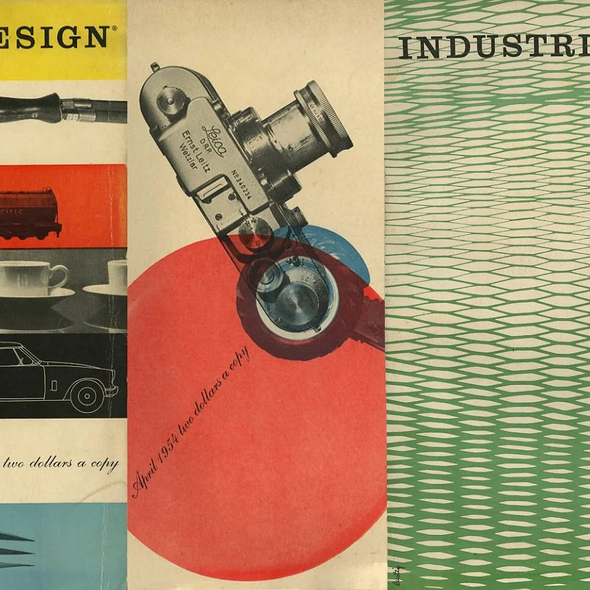 Image 18 of 18
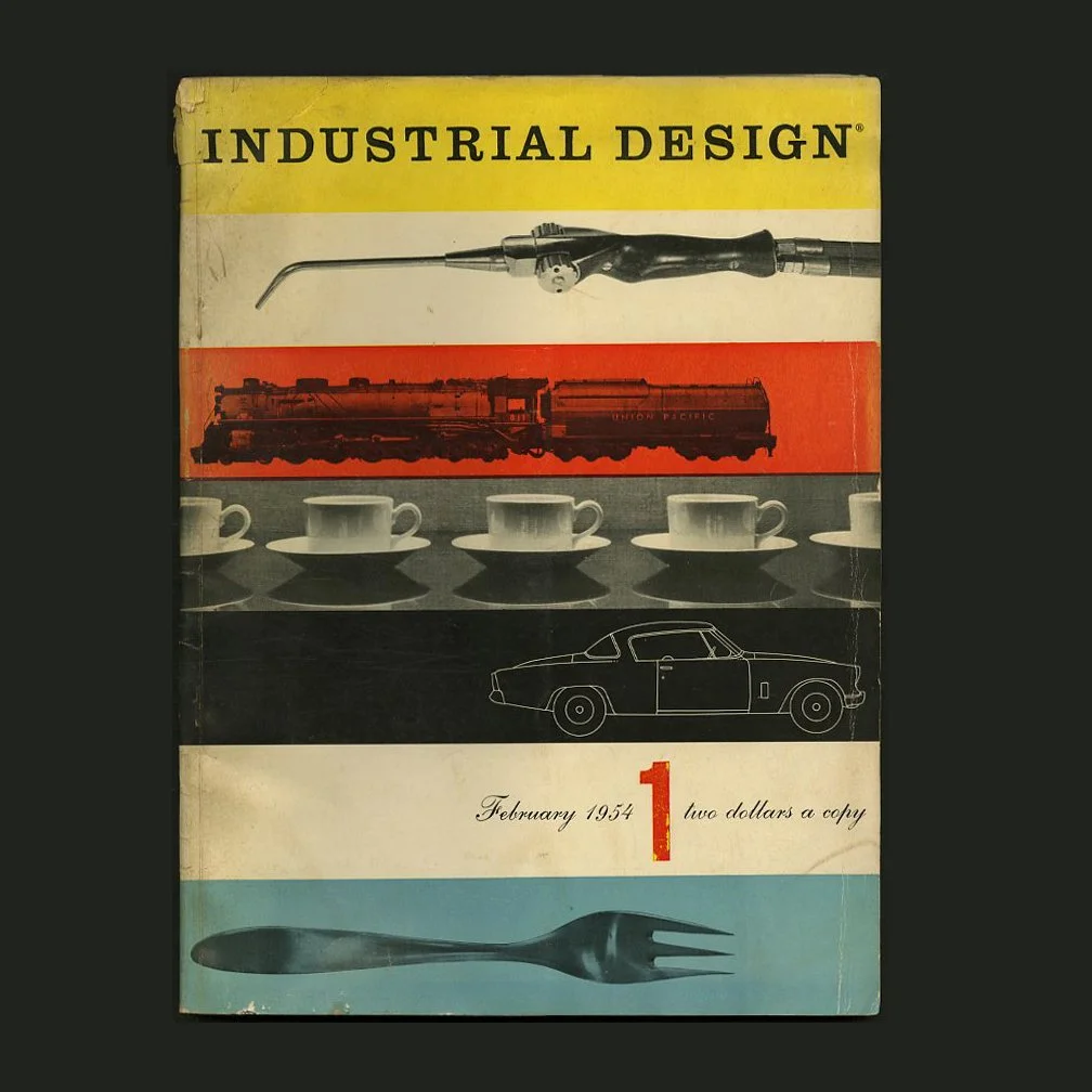
INDUSTRIAL DESIGN 1 – 3, February – June 1954. New York: Whitney Publications, Inc., Alvin Lustig [Art Director, Cover Designer].
INDUSTRIAL DESIGN 1 – 3
Volume 1, February – June 1954
Alvin Lustig [Art Director, Cover Designer],
Jane Fisk Mitarachi [Editor]
Offered here as a set: the first three issues of Publisher Charles Whitney’s Industrial Design — each enlivened by Alvin Lustig’s cover designs and art direction.
INDUSTRIAL DESIGN 1. New York: Whitney Publications, Inc., Volume 1, Number 1, February 1954. Original Edition. Side-stitched perfect bound wrappers. 152 pp. Illustrated articles and advertisements. Multiple paper stocks. Elaborate graphic design throughout. Cover and editorial design by Alvin Lustig. Wrappers lightly worn and soiled with the spine crown chipped. Textblock slightly way and a bit of tackiness but no apparent moisture damage, so a nearly very good copy.
INDUSTRIAL DESIGN 2. New York: Whitney Publications, Inc., Volume 1, Number 2, April 1954. Original Edition. Side-stitched perfect bound wrappers. 136 pp. Illustrated articles and advertisements. Multiple paper stocks. Elaborate graphic design throughout. Cover and editorial design by Alvin Lustig. Wrappers lightly worn, with a crease to the lower edge of the rear panel, a very good copy.
INDUSTRIAL DESIGN 3. New York: Whitney Publications, Inc., Volume 1, Number 3, June 1954. Original Edition. Side-stitched perfect bound wrappers. 130 pp. Illustrated articles and advertisements. Multiple paper stocks. Elaborate graphic design throughout. Cover and editorial design by Alvin Lustig. Wrappers with trivial wear, a nearly fine copy.
[3] 9 x 12 magazines with 130, 136 and 152 pages and illustrated throughout and printed on different stocks, including fold-out pages and an amazing variety of editorial content. Here is what the publishers wanted this magazine to accomplish: "A bi-monthly review of form and technique in designing for industry. Published for active industrial designers and the design executives throughout industry who are concerned with product design, development and marketing."
Here is former ID editor Ralph Caplan's recounting the magazines birth: "Fifty years ago, the publisher Charlie Whitney ran into Henry Dreyfuss. 'Henry,' he said, 'I'm about to publish a magazine for industrial designers.' 'Wonderful,' Henry replied. 'There are 14 of us.' Caplan remembered, "I.D. was not begun as a magazine for industrial designers, but as a magazine for anyone who had a stake in design and cared about it. This allowed a great deal of editorial latitude."
Lustig served as Art Director for the first three issue. Lustig is known for his expertise in virtually all the design disciplines, which he seamlessly integrated into his life. He designed record albums, magazines (notably the format and some covers of Industrial Design), advertisements, commercial catalogs, annual reports and office spaces and textiles.
The inaugural issue of INDUSTRIAL DESIGN celebrated all the best of modern American industrial design. Includes many examples of furniture, ceramics, housewares, appliances, automobiles, buildings, radios, projectors, televisions, and many other objects designed for the burgeoning postwar middle class.
Contents include:
Power Tools: The Newest Appliance
The Studebaker Story by John Freeman
Design: Means for Survival by Richard Neutra: presents an excerpt from his 1954 book Survival Through Design [New York: Oxford University Press, 1954] in which Neutra attempts to stimulate creative controversy and to make a lasting contribution to design criticism. ... a book to be read by anyone interested in society and civilization in a hectic, industrialized age.
Five Photographs by Andreas Feininger
What's So Special About Plastics?
Who's Who in Distinguished Design by Robert Osborn and Thomas Hess
Package from Scandinavia
Handles for Time
The Iron Horse by John Pile
Bayer's Geo-Graphics: A 4-page article on Herbert Bayer's WORLD GEOGRAPHIC ATLAS published by the Container Corporation of America in 1953 -- a triumph of the Bauhaus ideology of clarity put into practice. Bayer supervised a team of three designers over a four-year period in order to produce this volume for the CCA's 25th anniversary in 1953. CCA Chairman Walter Paepcke wanted Bayer to produce an atlas that reflected the new geopolitical realities of post-WWII life. In order to achieve this lofty goal, Bayer travelled throughout Europe searching out suitable maps and data, producing a re-examination of the classic atlas with Bauhaus clarity and concision. Jan Van Der Mack noted Bayers "fascination with the shape of the earth resulted in an extensive use of pictorial and diagrammatic representations in the section of geomorphology" (Cohen p.237).
Bartrev: A Company Design Program
Planned Expansion by George Nelson: a 4-page article with 32 images dealing with the growing pains experienced by the Howard Miller Clock Company in Zeeland, Michigan as they expanded into the housewares market. Essential reading. RIP Howard Miller, 1925 – 2026
Tom Lamb the Handle Man
Design in the Company: Where, What, How? by Arthur N. Beckar
Symbols as Identifiers by Ladislav Sutnar: a 6-page article designed by Sutnar. An excellent piece of work, in terms of both form and content, naturally. “The lack of discipline in our present-day urban industrial environment has produced a visual condition, characterized by clutter, confusion and chaos," wrote Allon Shoener, the curator of the exhibition Ladislav Sutnar: Visual Design in Action, which originated at the Contemporary Arts Center in Cincinnati in 1961. "There is an urgent need for communication based upon precision and clarity. This is the area in which Ladislav Sutnar excels.
Raymor: 25 Years a Pioneer: profile of Richards-Morgenthau Irving Richards, a driving force in bringing contemporary style in furniture and other home products to the American mass market, was an entrepreneur who, starting in the 1930s, sought out designers and manufacturers to make home products, which he promoted and distributed. He was best known for tabletop and accessories, including American Modern Dinnerware, but also sold furniture, including designs by Russel Wright. He was among the first to import Scandinavian contemporary furniture, including the Omnibus wall unit. "Richards brought contemporary design in home furnishings and accessories to the average person in America."
Design as Communication by George Nelson: 5-page article
Shapes of Identifiers by Ladislav Sutnar: a 6-page article designed by Sutnar. Ladislav Sutnar was a progenitor of the current practice of information graphics, the lighter of a torch that is carried today by Edward Tufte and Richard Saul Wurman, among others. For a wide range of American businesses, Sutnar developed graphic systems that clarified vast amounts of complex information, transforming business data into digestible units. He was the man responsible for putting the parentheses around American telephone area-code numbers when they were first introduced.”
The Black Box by John Pile
The Designer's Stake in the Changing American Market by Stanley Wellisz
What is Happening to the Office? by Eric Larrabee. 10 pages that features furniture by George Nelson/Herman Miller, Knoll Associates, Jens Risom, and Donald Deskey for Globe Wernicke.
Plastics on the Table: a 10-page article on advances in plastics technology and how these advances are manifesting themselves on consumers dining room tables. Included are b/w images of many Russel Wright designs, both prototypes and production models.
A Talk with Mr. Stuart of Martin-Senour: Morton Goldsholl: gets some well-deserved praise for his art-direction of the Martin-Senour Paint Company. Goldsholl has always been one of my favorite graphic designers, and his work has been criminally overlooked by design historians, possibly because he was based in Chicago instead of New York.
Prime Mover: The American Tractor. Features a 3-panel fold-out illustrated on both side by Andy Warhol. One side features a timeline showing “how the tractor became the farm’s prime mover. The other side features profiles of ten different tractors rendered in a bright Pop pallete. Wow.
Cars 1954
With Nothing But Wood: Japanese Architecture
Good Design: a two-page review of the 1953 show held at the Museum of Modern Art and the Merchandise Mart in Chicago. 10 contemporary household items are featured in black and white photos, including Gio Ponti's stainless flatware.
Machines that Make Music by Eric Larrabee: Giants of the music industry in 1954 were wondering how important "high-fidelity" really was. This 10-page article looks at Shapes for Sound, latest designs in a fast moving time when the HI-FI craze was taking off. Many pages of photos accompanied by detailed narrative, summed up as "Technical advances will make HI-FI of the future easier to make, install, and sell."
Herman Miller: the inside back cover is a two-color full-page add for the Herman Miller Furniture Company designed by Irving Harper (the George Nelson Associate who is credited with the majority of the nelson Howard Miller Clock designs). The ad features both Nelson’s and Charles Eames’ furniture.
Toledo Rescaled
A is for Ansul
Ghosts on Film
Inventions, Trademarks or Writing by Walter Derenberg
Office Furniture : ten pages by Eric Larrabee that features furniture by George Nelson/Herman Miller, Knoll Associates, Jens Risom, and Donald Deskey for Globe Wernicke.
REdesign: Linex and Leica
Curad Dispenser
Johnson and Johnson Dispenser
Schick Shaver
Roses in the Street by Roberto Mango
A talk with Donald Dailey
What Do people Want in a Bathroom?
The Latest Mutation by William C. Renwick
Design Review: furniture, ceramics, housewares, appliances, automobiles, radios, projectors, televisions, and many other objects
Includes a two-color full-page ad for the Herman Miller Furniture Company designed by Irving Harper (the George Nelson Associate who is credited with the majority of the Nelson Howard Miller Clock designs). The ad features Nelson's Executive Office Group furniture. Also a full-page Herbert Matter ad for Knoll.
Regular features include Contributors' Profiles, Letters, News, Editorial, Technics, Design Review, and Manufacturers Literature.
In DESIGN LITERACY (Second Edition, Allworth Press), Steven Heller wrote an essay describing the historical significance of Alvin Lustig's short tenure as Industrial Design's Art Director: "A design icon doesn't come along every day. To be so considered it must not only transcend its function and stand the test of time, but also must represent the time in which it was produced. The cover of Industrial Design, Vol. 1 No.1, February 1954, was not just the emblem of a new publishing venture, but a testament to one man's modernism; one of the last works created by Alvin Lustig (1915-1955), who suffered an untimely death from diabetes in 1955 at the age of forty-five."
"Despite failing vision, Lustig was deeply involved in the design of the first two and nominally with the third issues of the magazine as art editor, art director, and art consultant, respectively. He saw his role as the framer of ideas that were visual in nature. Although he never had the chance to develop his basic design concepts further, he left behind a modern design icon -- the cover -- and a format that continued to define the magazine for years after."
"Industrial Design was the brainchild of publisher Charles Whitney, who also published the successful Interiors. In 1953 he was convinced by his friend and advisor George Nelson that the time was right to introduce a specialized periodical devoted to practitioners of this burgeoning field. Interiors was already featuring its own industrial design column that had evolved into a discrete section, which Whitney realized had commercial potential as a spinoff. Interiors was also so beautifully designed that Industrial Design could have no less the visual panache of a coffee table book/magazine, replete with foldouts and slipsheets, not unlike the legendary design magazine Portfolio, published between 1949 and 1951. To accomplish this an eminent art director was sought. This was the age of great magazine art directors -- including Alexey Brodovitch, Alexander Liberman, Otto Storch, Cipe Pineles, and Alan Hurlburt -- and Whitney fervently believed that a magazine's design would be the deciding factor in its success. Hence Lustig was entrusted with considerable authority to design the magazine as he saw fit."
"On the editorial side, however, Whitney decided to take a calculated risk by promoting two young Interiors associate editors to co-editors of Industrial Design. Jane Fisk (now Jane Thompson of the architectural firm Thompson & Wood in Cambridge) and Deborah Allen may have been inexperienced in the field of industrial design but nevertheless had a clear plan to introduce a distinctly journalistic sensibility into professional publishing that emphasized criticism and analysis rather than the puff pieces common to the genre. As it turned out, this became a point of philosophical contention between the designer and editors."
"If they had a choice the editors would have preferred an art director who, as Thompson explained, "would have been in the trenches with us," a team player with journalistic instincts rather than a distant presence with a formalist sensibility. Because Lustig designed the initial dummy and subsequent two issues in his own studio and returned with the completed layouts to the editorial offices he had made certain assumptions about the presentation of content that were often inconsistent with the editors' vision. "We did not want the words to be gray space, we wanted them to have meaning," recalled Thompson about wanting more spontaneous design responses to the material. But instead of being journalistically intuitive, Lustig imposed his formal preconceptions, and designed the magazine as he would a book."
"Blocks of text type were indeed used as gray matter to frame an abundance of precisely silhouetted photographs. But if there was a problem it was more in the editors' minds than Lustig's design. While it was not as journalistically paced as say, a Life magazine, it was respectfully, indeed elegantly neutral allowing, for a wide range of material to be presented without interference. Moreover, it was what Whitney wanted, so the editors reconciled themselves to building the magazine's editorial reputation through informative features written by authors not previously associated with trade publishing."
"Thompson nevertheless hated the first cover with its tight grid and silhouetted photographs. Instead she wanted to disrupt the design purity with a few well composed coverlines. She further favored a conceptual method of intersecting photography, resulting in an editorial idea, not a pure design. Lustig thought coverlines would sully the design and intersecting ideas would be too contrived. Years later, Thompson grudgingly admitted that maybe Lustig's judgment was wiser: "He wanted to make a strong simple statement, which he believed (perhaps erroneously since Industrial Design did not have to compete on the newsstand) had to stand up against the covers of the elegant fashion magazines." Lustig's design set the standard for future covers, and his successor, Martin Rosensweig, continued to produce covers for a few years afterward that more rigidly adhered to the same formal practices."
"Despite these creative tensions, the early issues of Industrial Design reveal a shift in the nature of professional publishing from a trade to cultural orientation that was in no small way underscored by Lustig's classically modern design."
INDUSTRIAL DESIGN 1 – 3
Volume 1, February – June 1954
Alvin Lustig [Art Director, Cover Designer],
Jane Fisk Mitarachi [Editor]
Offered here as a set: the first three issues of Publisher Charles Whitney’s Industrial Design — each enlivened by Alvin Lustig’s cover designs and art direction.
INDUSTRIAL DESIGN 1. New York: Whitney Publications, Inc., Volume 1, Number 1, February 1954. Original Edition. Side-stitched perfect bound wrappers. 152 pp. Illustrated articles and advertisements. Multiple paper stocks. Elaborate graphic design throughout. Cover and editorial design by Alvin Lustig. Wrappers lightly worn and soiled with the spine crown chipped. Textblock slightly way and a bit of tackiness but no apparent moisture damage, so a nearly very good copy.
INDUSTRIAL DESIGN 2. New York: Whitney Publications, Inc., Volume 1, Number 2, April 1954. Original Edition. Side-stitched perfect bound wrappers. 136 pp. Illustrated articles and advertisements. Multiple paper stocks. Elaborate graphic design throughout. Cover and editorial design by Alvin Lustig. Wrappers lightly worn, with a crease to the lower edge of the rear panel, a very good copy.
INDUSTRIAL DESIGN 3. New York: Whitney Publications, Inc., Volume 1, Number 3, June 1954. Original Edition. Side-stitched perfect bound wrappers. 130 pp. Illustrated articles and advertisements. Multiple paper stocks. Elaborate graphic design throughout. Cover and editorial design by Alvin Lustig. Wrappers with trivial wear, a nearly fine copy.
[3] 9 x 12 magazines with 130, 136 and 152 pages and illustrated throughout and printed on different stocks, including fold-out pages and an amazing variety of editorial content. Here is what the publishers wanted this magazine to accomplish: "A bi-monthly review of form and technique in designing for industry. Published for active industrial designers and the design executives throughout industry who are concerned with product design, development and marketing."
Here is former ID editor Ralph Caplan's recounting the magazines birth: "Fifty years ago, the publisher Charlie Whitney ran into Henry Dreyfuss. 'Henry,' he said, 'I'm about to publish a magazine for industrial designers.' 'Wonderful,' Henry replied. 'There are 14 of us.' Caplan remembered, "I.D. was not begun as a magazine for industrial designers, but as a magazine for anyone who had a stake in design and cared about it. This allowed a great deal of editorial latitude."
Lustig served as Art Director for the first three issue. Lustig is known for his expertise in virtually all the design disciplines, which he seamlessly integrated into his life. He designed record albums, magazines (notably the format and some covers of Industrial Design), advertisements, commercial catalogs, annual reports and office spaces and textiles.
The inaugural issue of INDUSTRIAL DESIGN celebrated all the best of modern American industrial design. Includes many examples of furniture, ceramics, housewares, appliances, automobiles, buildings, radios, projectors, televisions, and many other objects designed for the burgeoning postwar middle class.
Contents include:
Power Tools: The Newest Appliance
The Studebaker Story by John Freeman
Design: Means for Survival by Richard Neutra: presents an excerpt from his 1954 book Survival Through Design [New York: Oxford University Press, 1954] in which Neutra attempts to stimulate creative controversy and to make a lasting contribution to design criticism. ... a book to be read by anyone interested in society and civilization in a hectic, industrialized age.
Five Photographs by Andreas Feininger
What's So Special About Plastics?
Who's Who in Distinguished Design by Robert Osborn and Thomas Hess
Package from Scandinavia
Handles for Time
The Iron Horse by John Pile
Bayer's Geo-Graphics: A 4-page article on Herbert Bayer's WORLD GEOGRAPHIC ATLAS published by the Container Corporation of America in 1953 -- a triumph of the Bauhaus ideology of clarity put into practice. Bayer supervised a team of three designers over a four-year period in order to produce this volume for the CCA's 25th anniversary in 1953. CCA Chairman Walter Paepcke wanted Bayer to produce an atlas that reflected the new geopolitical realities of post-WWII life. In order to achieve this lofty goal, Bayer travelled throughout Europe searching out suitable maps and data, producing a re-examination of the classic atlas with Bauhaus clarity and concision. Jan Van Der Mack noted Bayers "fascination with the shape of the earth resulted in an extensive use of pictorial and diagrammatic representations in the section of geomorphology" (Cohen p.237).
Bartrev: A Company Design Program
Planned Expansion by George Nelson: a 4-page article with 32 images dealing with the growing pains experienced by the Howard Miller Clock Company in Zeeland, Michigan as they expanded into the housewares market. Essential reading. RIP Howard Miller, 1925 – 2026
Tom Lamb the Handle Man
Design in the Company: Where, What, How? by Arthur N. Beckar
Symbols as Identifiers by Ladislav Sutnar: a 6-page article designed by Sutnar. An excellent piece of work, in terms of both form and content, naturally. “The lack of discipline in our present-day urban industrial environment has produced a visual condition, characterized by clutter, confusion and chaos," wrote Allon Shoener, the curator of the exhibition Ladislav Sutnar: Visual Design in Action, which originated at the Contemporary Arts Center in Cincinnati in 1961. "There is an urgent need for communication based upon precision and clarity. This is the area in which Ladislav Sutnar excels.
Raymor: 25 Years a Pioneer: profile of Richards-Morgenthau Irving Richards, a driving force in bringing contemporary style in furniture and other home products to the American mass market, was an entrepreneur who, starting in the 1930s, sought out designers and manufacturers to make home products, which he promoted and distributed. He was best known for tabletop and accessories, including American Modern Dinnerware, but also sold furniture, including designs by Russel Wright. He was among the first to import Scandinavian contemporary furniture, including the Omnibus wall unit. "Richards brought contemporary design in home furnishings and accessories to the average person in America."
Design as Communication by George Nelson: 5-page article
Shapes of Identifiers by Ladislav Sutnar: a 6-page article designed by Sutnar. Ladislav Sutnar was a progenitor of the current practice of information graphics, the lighter of a torch that is carried today by Edward Tufte and Richard Saul Wurman, among others. For a wide range of American businesses, Sutnar developed graphic systems that clarified vast amounts of complex information, transforming business data into digestible units. He was the man responsible for putting the parentheses around American telephone area-code numbers when they were first introduced.”
The Black Box by John Pile
The Designer's Stake in the Changing American Market by Stanley Wellisz
What is Happening to the Office? by Eric Larrabee. 10 pages that features furniture by George Nelson/Herman Miller, Knoll Associates, Jens Risom, and Donald Deskey for Globe Wernicke.
Plastics on the Table: a 10-page article on advances in plastics technology and how these advances are manifesting themselves on consumers dining room tables. Included are b/w images of many Russel Wright designs, both prototypes and production models.
A Talk with Mr. Stuart of Martin-Senour: Morton Goldsholl: gets some well-deserved praise for his art-direction of the Martin-Senour Paint Company. Goldsholl has always been one of my favorite graphic designers, and his work has been criminally overlooked by design historians, possibly because he was based in Chicago instead of New York.
Prime Mover: The American Tractor. Features a 3-panel fold-out illustrated on both side by Andy Warhol. One side features a timeline showing “how the tractor became the farm’s prime mover. The other side features profiles of ten different tractors rendered in a bright Pop pallete. Wow.
Cars 1954
With Nothing But Wood: Japanese Architecture
Good Design: a two-page review of the 1953 show held at the Museum of Modern Art and the Merchandise Mart in Chicago. 10 contemporary household items are featured in black and white photos, including Gio Ponti's stainless flatware.
Machines that Make Music by Eric Larrabee: Giants of the music industry in 1954 were wondering how important "high-fidelity" really was. This 10-page article looks at Shapes for Sound, latest designs in a fast moving time when the HI-FI craze was taking off. Many pages of photos accompanied by detailed narrative, summed up as "Technical advances will make HI-FI of the future easier to make, install, and sell."
Herman Miller: the inside back cover is a two-color full-page add for the Herman Miller Furniture Company designed by Irving Harper (the George Nelson Associate who is credited with the majority of the nelson Howard Miller Clock designs). The ad features both Nelson’s and Charles Eames’ furniture.
Toledo Rescaled
A is for Ansul
Ghosts on Film
Inventions, Trademarks or Writing by Walter Derenberg
Office Furniture : ten pages by Eric Larrabee that features furniture by George Nelson/Herman Miller, Knoll Associates, Jens Risom, and Donald Deskey for Globe Wernicke.
REdesign: Linex and Leica
Curad Dispenser
Johnson and Johnson Dispenser
Schick Shaver
Roses in the Street by Roberto Mango
A talk with Donald Dailey
What Do people Want in a Bathroom?
The Latest Mutation by William C. Renwick
Design Review: furniture, ceramics, housewares, appliances, automobiles, radios, projectors, televisions, and many other objects
Includes a two-color full-page ad for the Herman Miller Furniture Company designed by Irving Harper (the George Nelson Associate who is credited with the majority of the Nelson Howard Miller Clock designs). The ad features Nelson's Executive Office Group furniture. Also a full-page Herbert Matter ad for Knoll.
Regular features include Contributors' Profiles, Letters, News, Editorial, Technics, Design Review, and Manufacturers Literature.
In DESIGN LITERACY (Second Edition, Allworth Press), Steven Heller wrote an essay describing the historical significance of Alvin Lustig's short tenure as Industrial Design's Art Director: "A design icon doesn't come along every day. To be so considered it must not only transcend its function and stand the test of time, but also must represent the time in which it was produced. The cover of Industrial Design, Vol. 1 No.1, February 1954, was not just the emblem of a new publishing venture, but a testament to one man's modernism; one of the last works created by Alvin Lustig (1915-1955), who suffered an untimely death from diabetes in 1955 at the age of forty-five."
"Despite failing vision, Lustig was deeply involved in the design of the first two and nominally with the third issues of the magazine as art editor, art director, and art consultant, respectively. He saw his role as the framer of ideas that were visual in nature. Although he never had the chance to develop his basic design concepts further, he left behind a modern design icon -- the cover -- and a format that continued to define the magazine for years after."
"Industrial Design was the brainchild of publisher Charles Whitney, who also published the successful Interiors. In 1953 he was convinced by his friend and advisor George Nelson that the time was right to introduce a specialized periodical devoted to practitioners of this burgeoning field. Interiors was already featuring its own industrial design column that had evolved into a discrete section, which Whitney realized had commercial potential as a spinoff. Interiors was also so beautifully designed that Industrial Design could have no less the visual panache of a coffee table book/magazine, replete with foldouts and slipsheets, not unlike the legendary design magazine Portfolio, published between 1949 and 1951. To accomplish this an eminent art director was sought. This was the age of great magazine art directors -- including Alexey Brodovitch, Alexander Liberman, Otto Storch, Cipe Pineles, and Alan Hurlburt -- and Whitney fervently believed that a magazine's design would be the deciding factor in its success. Hence Lustig was entrusted with considerable authority to design the magazine as he saw fit."
"On the editorial side, however, Whitney decided to take a calculated risk by promoting two young Interiors associate editors to co-editors of Industrial Design. Jane Fisk (now Jane Thompson of the architectural firm Thompson & Wood in Cambridge) and Deborah Allen may have been inexperienced in the field of industrial design but nevertheless had a clear plan to introduce a distinctly journalistic sensibility into professional publishing that emphasized criticism and analysis rather than the puff pieces common to the genre. As it turned out, this became a point of philosophical contention between the designer and editors."
"If they had a choice the editors would have preferred an art director who, as Thompson explained, "would have been in the trenches with us," a team player with journalistic instincts rather than a distant presence with a formalist sensibility. Because Lustig designed the initial dummy and subsequent two issues in his own studio and returned with the completed layouts to the editorial offices he had made certain assumptions about the presentation of content that were often inconsistent with the editors' vision. "We did not want the words to be gray space, we wanted them to have meaning," recalled Thompson about wanting more spontaneous design responses to the material. But instead of being journalistically intuitive, Lustig imposed his formal preconceptions, and designed the magazine as he would a book."
"Blocks of text type were indeed used as gray matter to frame an abundance of precisely silhouetted photographs. But if there was a problem it was more in the editors' minds than Lustig's design. While it was not as journalistically paced as say, a Life magazine, it was respectfully, indeed elegantly neutral allowing, for a wide range of material to be presented without interference. Moreover, it was what Whitney wanted, so the editors reconciled themselves to building the magazine's editorial reputation through informative features written by authors not previously associated with trade publishing."
"Thompson nevertheless hated the first cover with its tight grid and silhouetted photographs. Instead she wanted to disrupt the design purity with a few well composed coverlines. She further favored a conceptual method of intersecting photography, resulting in an editorial idea, not a pure design. Lustig thought coverlines would sully the design and intersecting ideas would be too contrived. Years later, Thompson grudgingly admitted that maybe Lustig's judgment was wiser: "He wanted to make a strong simple statement, which he believed (perhaps erroneously since Industrial Design did not have to compete on the newsstand) had to stand up against the covers of the elegant fashion magazines." Lustig's design set the standard for future covers, and his successor, Martin Rosensweig, continued to produce covers for a few years afterward that more rigidly adhered to the same formal practices."
"Despite these creative tensions, the early issues of Industrial Design reveal a shift in the nature of professional publishing from a trade to cultural orientation that was in no small way underscored by Lustig's classically modern design."