Gebrauchsgraphik
May 1935
Professor H.K. Frenzel [Editor]
Berlin: Gebrauchsgraphik, [Vol. 12, No. 2]. Parallel texts in German and English. Quarto. Side stitched and perfect bound printed wrappers. 78 pp. Illustrated articles and trade advertisements. Multiple paper stocks. Elaborate graphic design throughout. Cover by Joseph Binder. Wrappers lightly worn with thumb creases, so a very good or better copy.
9.25 x 12.25 vintage magazine with 76 pages of editorial content plus trade advertisements. Gebrauchsgraphik utilized the latest printing and press technologies and often included custom colors, bound-in samples and advertising fold-outs, foil stamps, die-cuts and other special finishing effects.
Contents
Advertising Means of the North German Lloyd by H. K. Frenzel: 14 pages with 34 examples [8 in color] of publicity materials for the cruise ships including work by Trafton, Kuck, Allen Saalburg, Tobey, Feldtmann, Skarbina, Muriel King, Ritscher, Frau v. Reppert-Bismarck, L. S. Hunner and H. Hoffman
New Graphic Art in Switzerland by Traugott Schalcher: 18 pages with approx. 50 black-and-white examples including work by Otto Baumberger, Paul Boesch, Gebr. Fretz, Hans Finsler, Hilfiker, Imboden, Egon Prisnitz, Herbert Matter and Edmund Welf among others -- some designs uncredited
Six Humorous Talents: Emmerich Huber, Adolf E. Wuttke [Khaki], Sidney D. Banks [Carlton Studio, London], Reinhold Escher, Wilmar Riegenring and Kurt W. Rocken by H. K. Frenzel
Advertising in Finland by Dr. Anitra Karsten: 8 pages with 34 b/w illustrations including window displays, chocolate wrappers, magazine advertising, posters and folders
Marktanalytisches Archiv
Steven Heller wrote “. . . a short homage—for no other reason than I’m reminded of his work—to Vienna-born artist and designer Joseph Binder (1898–1972). He came of age when poster artists were stars. Or, as his wife Carla Binder recalled when I spoke to her in 1986, “Binder was alive during the age of Bernhard, Defke, Hadank. Elegant! And they were socially in contact with all their large accounts. They were acquaintances, friends. They were not just given an assignment” they were trusted with great responsibilities.
“Binder had always done posters on the side to make extra income. “Returning from the war in 1918 he was asked by Bernd Steiner, an excellent poster designer, [to work with him],” noted Carla, then in her late 90s.
”Still, Binder wanted to be a painter. He had studied painting for four years in his native Vienna at the Kunstgewerbeschule under professor Berthold Loeffler. “Loeffler gave Binder a fantastic critique for his graduation certificate,” recalled his widow. “And in 1926 the States Prize of Austria went to Binder.”
”Between 1933 and 1935 he visited the United States as a guest lecturer at the Chicago Art Institute and the Minneapolis School of Art. His work was represented in poster exhibitions in New York and Tokyo, and he was recognized by the Art Directors Club New York and the Museum of Modern Art. In 1936 Binder emigrated to New York and in 1944 became an American citizen.
”Binder had two studios in New York in the mid-1940s. One was for painting and the other for commercial work. “He had to walk a mile to go from one to the other,” noted Earnest W. Watson in American Artist (February 1944).
”The decision to have two studios—the physical separation of fine and commercial arts—wrote Watson, was typical of Binder’s relationship to his art forms. The former was “miles apart” from those of the poster designer. The poster represented a “faster tempo of modern living,” which has brought about a new streamline style. As it happens, his painting was non-representational color field work, while his posters were minimal reductions in representational form.
“Binder usually reduces naturalistic expressions to the minimum, his idea being that the greater the simplification … the quicker the recognition of the poster’s intention and the more powerful its impact.” For Joseph Binder, reduction was a shorthand way to express an idea.
“Binder’s influence upon American design has been considerable,” added Watson, “not alone through the example of his printed designs but through teaching and lecturing.” There was a time when his brand of pictorial modernism was the state of the art.”
” Founded in 1923 by Professor H. K. Frenzel, Gebrauchsgraphik was the leading voice of the Avant-Garde influence on the European Commercial Art and Advertising industries before World War II. In the thirties, all roads led through Berlin, and Gebrauchsgraphik spotlighted all of the aesthetic trends fermenting in Europe -- Art Deco and Surrealism from Paris, Constructivism from Moscow, Futurist Fascism from Rome, De Stijl and Dutch typography from Amsterdam, and of course the spreading influence of the Dessau Bauhaus. A journal that was truly international, presented in both German and English.
Gebrauchsgraphik was the leading voice of the Avant-Garde influence on the European Commercial Art and Advertising industries before World War II. In the thirties, all roads led through Berlin, and Gebrauchsgraphik spotlighted all of the aesthetic trends fermenting in Europe -- Art Deco and Surrealism from Paris, Constructivism from Moscow, Futurist Fascism from Rome, De Stijl and Dutch typography from Amsterdam, and of course the spreading influence of the Dessau Bauhaus. A journal that was truly international in scope , all articles and cutlines are presented in both German and English.
The thirties were the Golden Age for European Poster Art and Gebrauchsgraphik was in the perfect place to showcase all the latest and greatest trends and rising artists for the rest of the world. Gebrauchsgraphik was an incredibly influential journal and agenda setter, most notably to a young man in Brooklyn named Paul Rand. According to his biographical notes, Rand's exposure to Gebrauchsgraphik in the early thirties created his desire to become a Commercial Artist. The rest is history.
Gebrauchsgraphik utilized the latest printing and press technologies and often included custom colors, bound-in samples and advertising fold-outs, foil stamps, die-cuts and other special finishing effects.
Founded in 1923 by Professor H. K. Frenzel, Gebrauchsgraphik was the leading voice of the Avant-Garde influence on the European Commercial Art and Advertising industries before World War II. In the thirties, all roads led through Berlin, and Gebrauchsgraphik spotlighted all of the aesthetic trends fermenting in Europe -- Art Deco and Surrealism from Paris, Constructivism from Moscow, Futurist Fascism from Rome, De Stijl and Dutch typography from Amsterdam, and of course the spreading influence of the Dessau Bauhaus. A journal that was truly international, presented in both German and English.
Gebrauchsgraphik was in the perfect place to showcase all the latest and greatest European trends and rising artists for the rest of the world. Gebrauchsgraphik was an incredibly influential journal and agenda setter, most notably to a young man in Brooklyn named Paul Rand. According to his biographical notes, Rand's exposure to Gebrauchsgraphik in the early thirties created his desire to become a Commercial Artist. The rest is history.
* Design Historian and all-around mensch Steven Heller on H.K. Frenzel: “This is not the anniversary of H.K. Frenzel's birth (1882) or death (1937) but it is the commemoration of both, decades much too late.
“While researching another project through scores of issues of his historic magazine, Gebrauchsgraphik: International Advertising Art, I came across a benignly covered edition from November 1937.
“Do the math . . . that was four years after the rise to power of the Nazis in Germany, where Dr. Frenzel's magazine began publishing in 1924. This issue had many advertisements for Black Letter typefaces and an ad for ALA (Allgemeine Anzeigen Gesellschaft), which was the German advertising society to promote German newspaper and periodical advertising in Germany, which served as the Nazis' own advertising. The magazine also had features on a host of "sanctioned" German gebrauchsgraphikers, who belonged to the Reich Chamber of Commercial Arts.
“Dr. Frenzel was not pleased with the Nazification (Gleichschaltung ) of his magazine, which had never taken an overt political stand. In 1937 Frenzel died of a "bug" he caught while in Italy. Although he had recovered, seemingly it was more virulent than the doctors had thought-or so the story goes. Nonetheless, rumors quickly surfaced that he took his own life.
“The memorial article in the November 1937 issue by E. Hölscher begins, "Our late friend H.K. Frenzel would certainly not have wished that an attempt should be made in the following lines devoted to his memory to give renewed expression to the profound and general dismay caused by his unexpected decease. He himself was much too optimistic and interested in the present to indulge willingly in melancholy thoughts for any length of time, and even beyond the circle of his more intimate friends the grief and sympathy even among those who had only met him once were so really heartfelt and genuine that they require no further confirmation as evidence of general respect which he enjoyed."
“And yet, his admirers were moved to celebrate how the magazine-his creation-"on which he worked with absolute devotion until the lasts days of his life, has been subjected to certain changes in the course of fourteen years." Meaning over the last four the Nazi dictates against modern and culturally un-German content was verbotten.
“Frenzel wrote "The works reproduced by me in Gebrauchsgraphik are entirely in accordance with the idea I have adopted as the policy of my periodical. I wish to circumscribe a circle covering what can be regarded as good present-day graphic art. If I were to take to publishing only what satisfies me completely I should have to adopt a certain policy, and the periodical would no longer reflect the present state of graphic art."
“True to his word, Frenzel published many approaches from all over the world. The common denominator was quality. Whether modern or classical, comic or serious, experimental or traditional, he maintained a level that set the standard. With the Nazis in power, his circle had been excruciatingly tightened, his standard had dropped, his life was not worth living.”
Gebrauchsgraphik
May 1935
Professor H.K. Frenzel [Editor]
Berlin: Gebrauchsgraphik, [Vol. 12, No. 2]. Parallel texts in German and English. Quarto. Side stitched and perfect bound printed wrappers. 78 pp. Illustrated articles and trade advertisements. Multiple paper stocks. Elaborate graphic design throughout. Cover by Joseph Binder. Wrappers lightly worn with thumb creases, so a very good or better copy.
9.25 x 12.25 vintage magazine with 76 pages of editorial content plus trade advertisements. Gebrauchsgraphik utilized the latest printing and press technologies and often included custom colors, bound-in samples and advertising fold-outs, foil stamps, die-cuts and other special finishing effects.
Contents
Advertising Means of the North German Lloyd by H. K. Frenzel: 14 pages with 34 examples [8 in color] of publicity materials for the cruise ships including work by Trafton, Kuck, Allen Saalburg, Tobey, Feldtmann, Skarbina, Muriel King, Ritscher, Frau v. Reppert-Bismarck, L. S. Hunner and H. Hoffman
New Graphic Art in Switzerland by Traugott Schalcher: 18 pages with approx. 50 black-and-white examples including work by Otto Baumberger, Paul Boesch, Gebr. Fretz, Hans Finsler, Hilfiker, Imboden, Egon Prisnitz, Herbert Matter and Edmund Welf among others -- some designs uncredited
Six Humorous Talents: Emmerich Huber, Adolf E. Wuttke [Khaki], Sidney D. Banks [Carlton Studio, London], Reinhold Escher, Wilmar Riegenring and Kurt W. Rocken by H. K. Frenzel
Advertising in Finland by Dr. Anitra Karsten: 8 pages with 34 b/w illustrations including window displays, chocolate wrappers, magazine advertising, posters and folders
Marktanalytisches Archiv
Steven Heller wrote “. . . a short homage—for no other reason than I’m reminded of his work—to Vienna-born artist and designer Joseph Binder (1898–1972). He came of age when poster artists were stars. Or, as his wife Carla Binder recalled when I spoke to her in 1986, “Binder was alive during the age of Bernhard, Defke, Hadank. Elegant! And they were socially in contact with all their large accounts. They were acquaintances, friends. They were not just given an assignment” they were trusted with great responsibilities.
“Binder had always done posters on the side to make extra income. “Returning from the war in 1918 he was asked by Bernd Steiner, an excellent poster designer, [to work with him],” noted Carla, then in her late 90s.
”Still, Binder wanted to be a painter. He had studied painting for four years in his native Vienna at the Kunstgewerbeschule under professor Berthold Loeffler. “Loeffler gave Binder a fantastic critique for his graduation certificate,” recalled his widow. “And in 1926 the States Prize of Austria went to Binder.”
”Between 1933 and 1935 he visited the United States as a guest lecturer at the Chicago Art Institute and the Minneapolis School of Art. His work was represented in poster exhibitions in New York and Tokyo, and he was recognized by the Art Directors Club New York and the Museum of Modern Art. In 1936 Binder emigrated to New York and in 1944 became an American citizen.
”Binder had two studios in New York in the mid-1940s. One was for painting and the other for commercial work. “He had to walk a mile to go from one to the other,” noted Earnest W. Watson in American Artist (February 1944).
”The decision to have two studios—the physical separation of fine and commercial arts—wrote Watson, was typical of Binder’s relationship to his art forms. The former was “miles apart” from those of the poster designer. The poster represented a “faster tempo of modern living,” which has brought about a new streamline style. As it happens, his painting was non-representational color field work, while his posters were minimal reductions in representational form.
“Binder usually reduces naturalistic expressions to the minimum, his idea being that the greater the simplification … the quicker the recognition of the poster’s intention and the more powerful its impact.” For Joseph Binder, reduction was a shorthand way to express an idea.
“Binder’s influence upon American design has been considerable,” added Watson, “not alone through the example of his printed designs but through teaching and lecturing.” There was a time when his brand of pictorial modernism was the state of the art.”
” Founded in 1923 by Professor H. K. Frenzel, Gebrauchsgraphik was the leading voice of the Avant-Garde influence on the European Commercial Art and Advertising industries before World War II. In the thirties, all roads led through Berlin, and Gebrauchsgraphik spotlighted all of the aesthetic trends fermenting in Europe -- Art Deco and Surrealism from Paris, Constructivism from Moscow, Futurist Fascism from Rome, De Stijl and Dutch typography from Amsterdam, and of course the spreading influence of the Dessau Bauhaus. A journal that was truly international, presented in both German and English.
Gebrauchsgraphik was the leading voice of the Avant-Garde influence on the European Commercial Art and Advertising industries before World War II. In the thirties, all roads led through Berlin, and Gebrauchsgraphik spotlighted all of the aesthetic trends fermenting in Europe -- Art Deco and Surrealism from Paris, Constructivism from Moscow, Futurist Fascism from Rome, De Stijl and Dutch typography from Amsterdam, and of course the spreading influence of the Dessau Bauhaus. A journal that was truly international in scope , all articles and cutlines are presented in both German and English.
The thirties were the Golden Age for European Poster Art and Gebrauchsgraphik was in the perfect place to showcase all the latest and greatest trends and rising artists for the rest of the world. Gebrauchsgraphik was an incredibly influential journal and agenda setter, most notably to a young man in Brooklyn named Paul Rand. According to his biographical notes, Rand's exposure to Gebrauchsgraphik in the early thirties created his desire to become a Commercial Artist. The rest is history.
Gebrauchsgraphik utilized the latest printing and press technologies and often included custom colors, bound-in samples and advertising fold-outs, foil stamps, die-cuts and other special finishing effects.
Founded in 1923 by Professor H. K. Frenzel, Gebrauchsgraphik was the leading voice of the Avant-Garde influence on the European Commercial Art and Advertising industries before World War II. In the thirties, all roads led through Berlin, and Gebrauchsgraphik spotlighted all of the aesthetic trends fermenting in Europe -- Art Deco and Surrealism from Paris, Constructivism from Moscow, Futurist Fascism from Rome, De Stijl and Dutch typography from Amsterdam, and of course the spreading influence of the Dessau Bauhaus. A journal that was truly international, presented in both German and English.
Gebrauchsgraphik was in the perfect place to showcase all the latest and greatest European trends and rising artists for the rest of the world. Gebrauchsgraphik was an incredibly influential journal and agenda setter, most notably to a young man in Brooklyn named Paul Rand. According to his biographical notes, Rand's exposure to Gebrauchsgraphik in the early thirties created his desire to become a Commercial Artist. The rest is history.
* Design Historian and all-around mensch Steven Heller on H.K. Frenzel: “This is not the anniversary of H.K. Frenzel's birth (1882) or death (1937) but it is the commemoration of both, decades much too late.
“While researching another project through scores of issues of his historic magazine, Gebrauchsgraphik: International Advertising Art, I came across a benignly covered edition from November 1937.
“Do the math . . . that was four years after the rise to power of the Nazis in Germany, where Dr. Frenzel's magazine began publishing in 1924. This issue had many advertisements for Black Letter typefaces and an ad for ALA (Allgemeine Anzeigen Gesellschaft), which was the German advertising society to promote German newspaper and periodical advertising in Germany, which served as the Nazis' own advertising. The magazine also had features on a host of "sanctioned" German gebrauchsgraphikers, who belonged to the Reich Chamber of Commercial Arts.
“Dr. Frenzel was not pleased with the Nazification (Gleichschaltung ) of his magazine, which had never taken an overt political stand. In 1937 Frenzel died of a "bug" he caught while in Italy. Although he had recovered, seemingly it was more virulent than the doctors had thought-or so the story goes. Nonetheless, rumors quickly surfaced that he took his own life.
“The memorial article in the November 1937 issue by E. Hölscher begins, "Our late friend H.K. Frenzel would certainly not have wished that an attempt should be made in the following lines devoted to his memory to give renewed expression to the profound and general dismay caused by his unexpected decease. He himself was much too optimistic and interested in the present to indulge willingly in melancholy thoughts for any length of time, and even beyond the circle of his more intimate friends the grief and sympathy even among those who had only met him once were so really heartfelt and genuine that they require no further confirmation as evidence of general respect which he enjoyed."
“And yet, his admirers were moved to celebrate how the magazine-his creation-"on which he worked with absolute devotion until the lasts days of his life, has been subjected to certain changes in the course of fourteen years." Meaning over the last four the Nazi dictates against modern and culturally un-German content was verbotten.
“Frenzel wrote "The works reproduced by me in Gebrauchsgraphik are entirely in accordance with the idea I have adopted as the policy of my periodical. I wish to circumscribe a circle covering what can be regarded as good present-day graphic art. If I were to take to publishing only what satisfies me completely I should have to adopt a certain policy, and the periodical would no longer reflect the present state of graphic art."
“True to his word, Frenzel published many approaches from all over the world. The common denominator was quality. Whether modern or classical, comic or serious, experimental or traditional, he maintained a level that set the standard. With the Nazis in power, his circle had been excruciatingly tightened, his standard had dropped, his life was not worth living.”

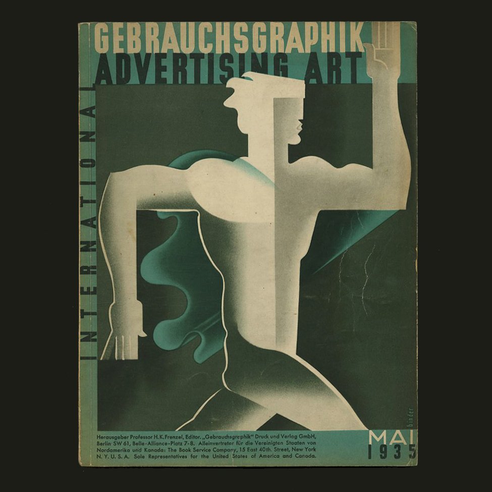 Image 1 of 14
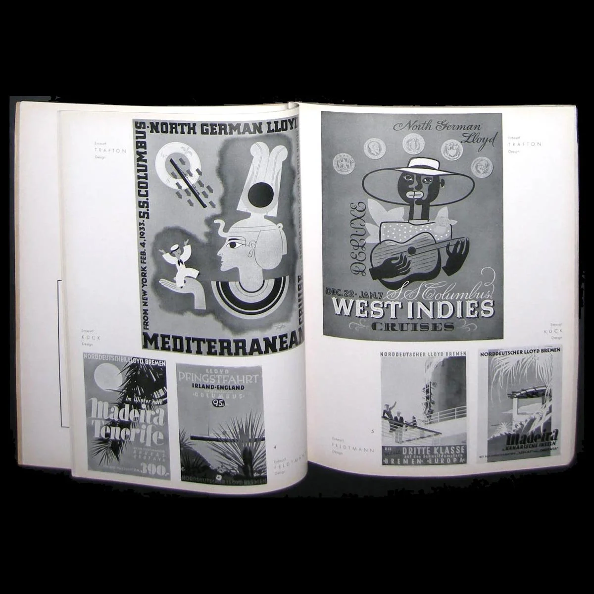 Image 2 of 14
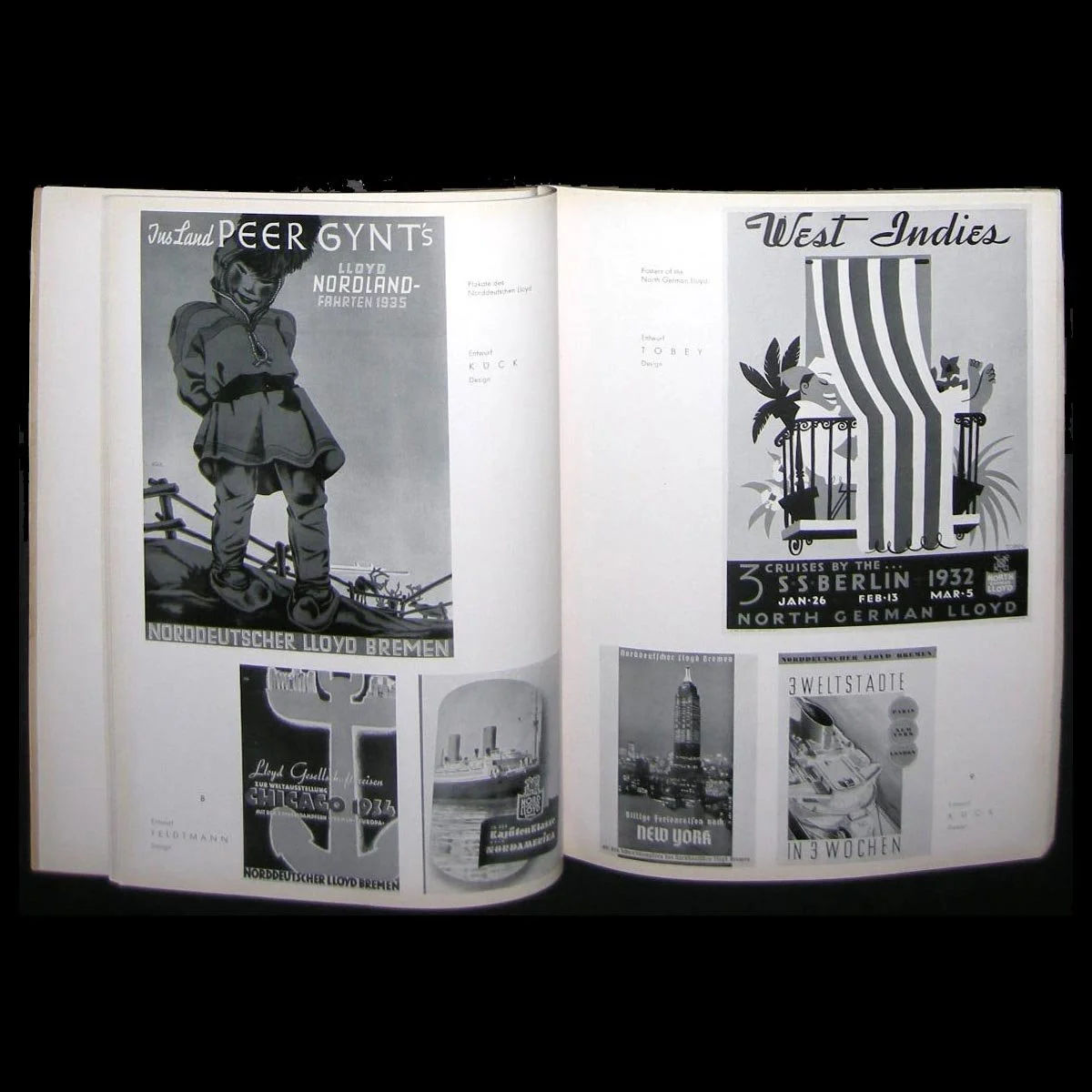 Image 3 of 14
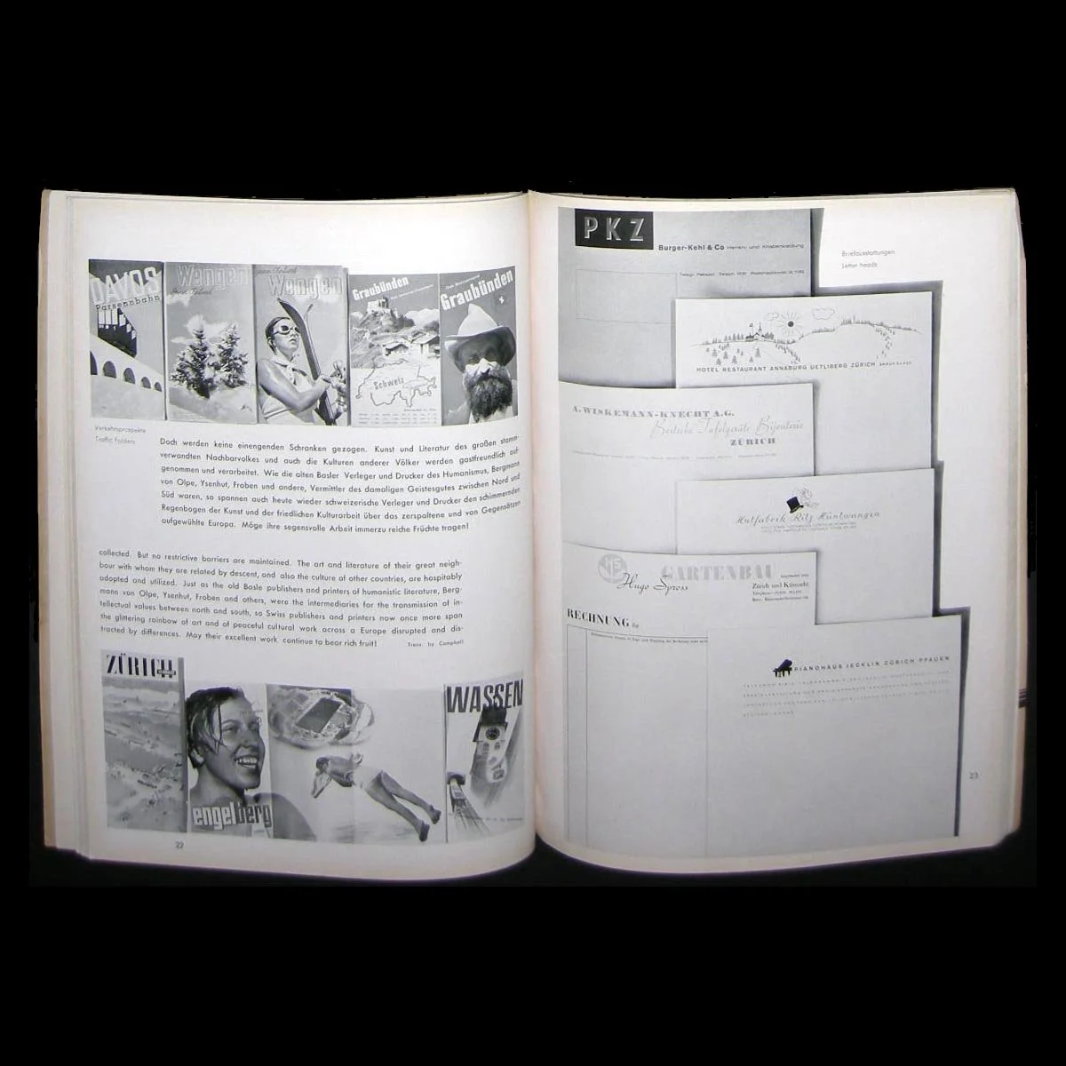 Image 4 of 14
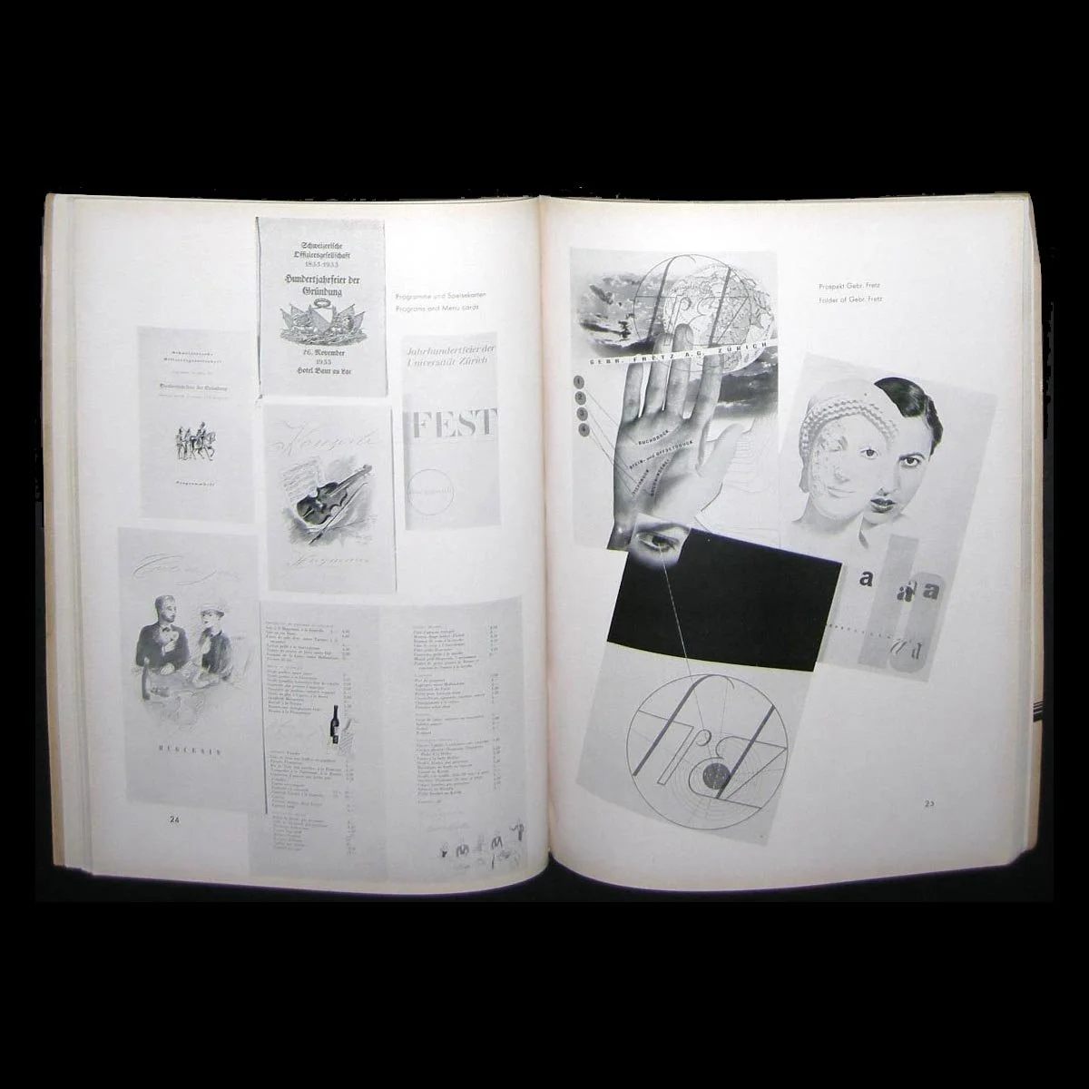 Image 5 of 14
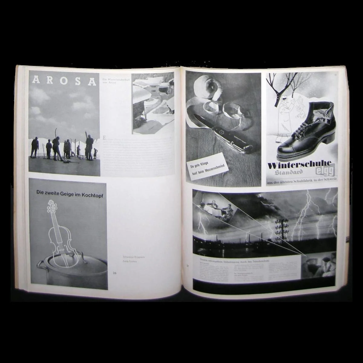 Image 6 of 14
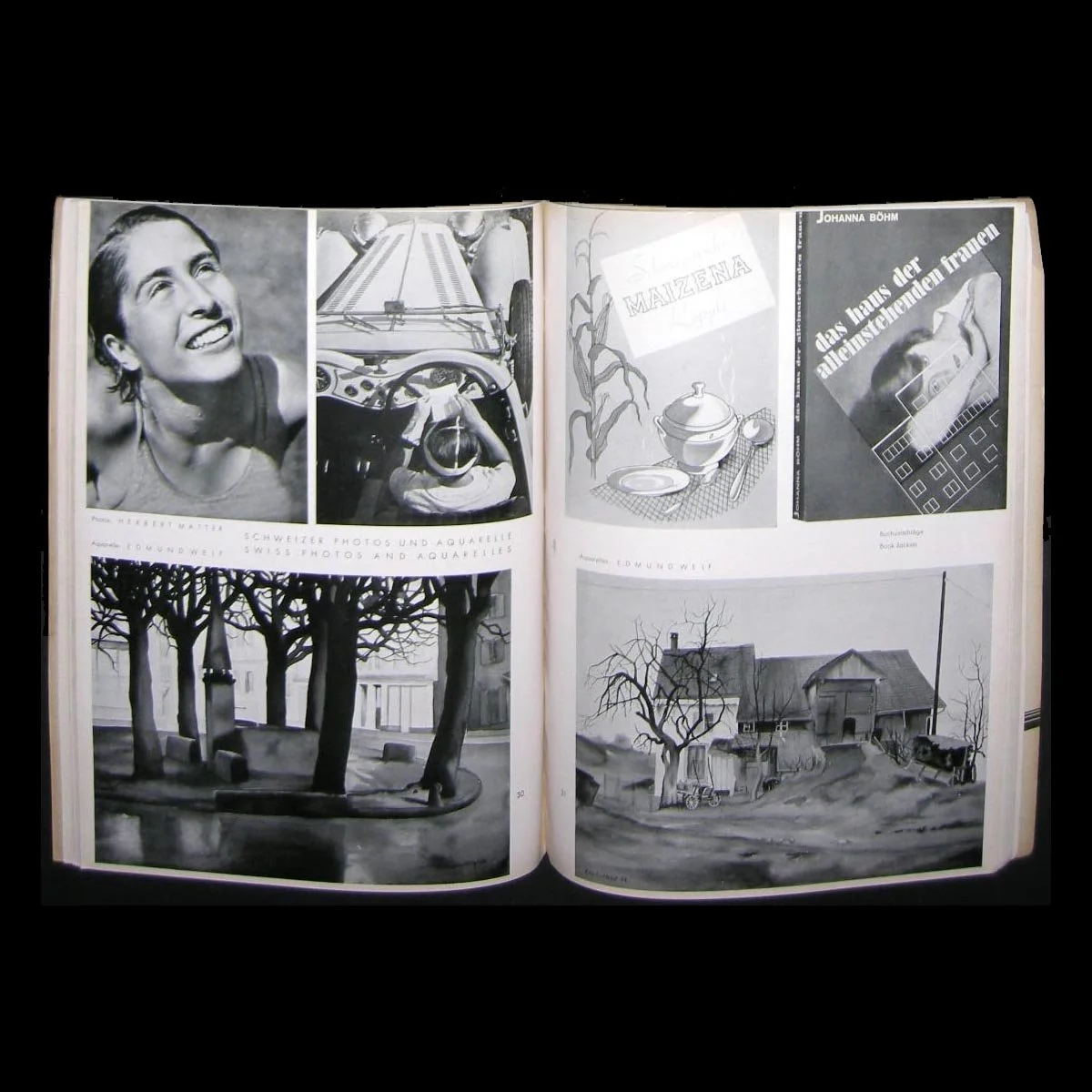 Image 7 of 14
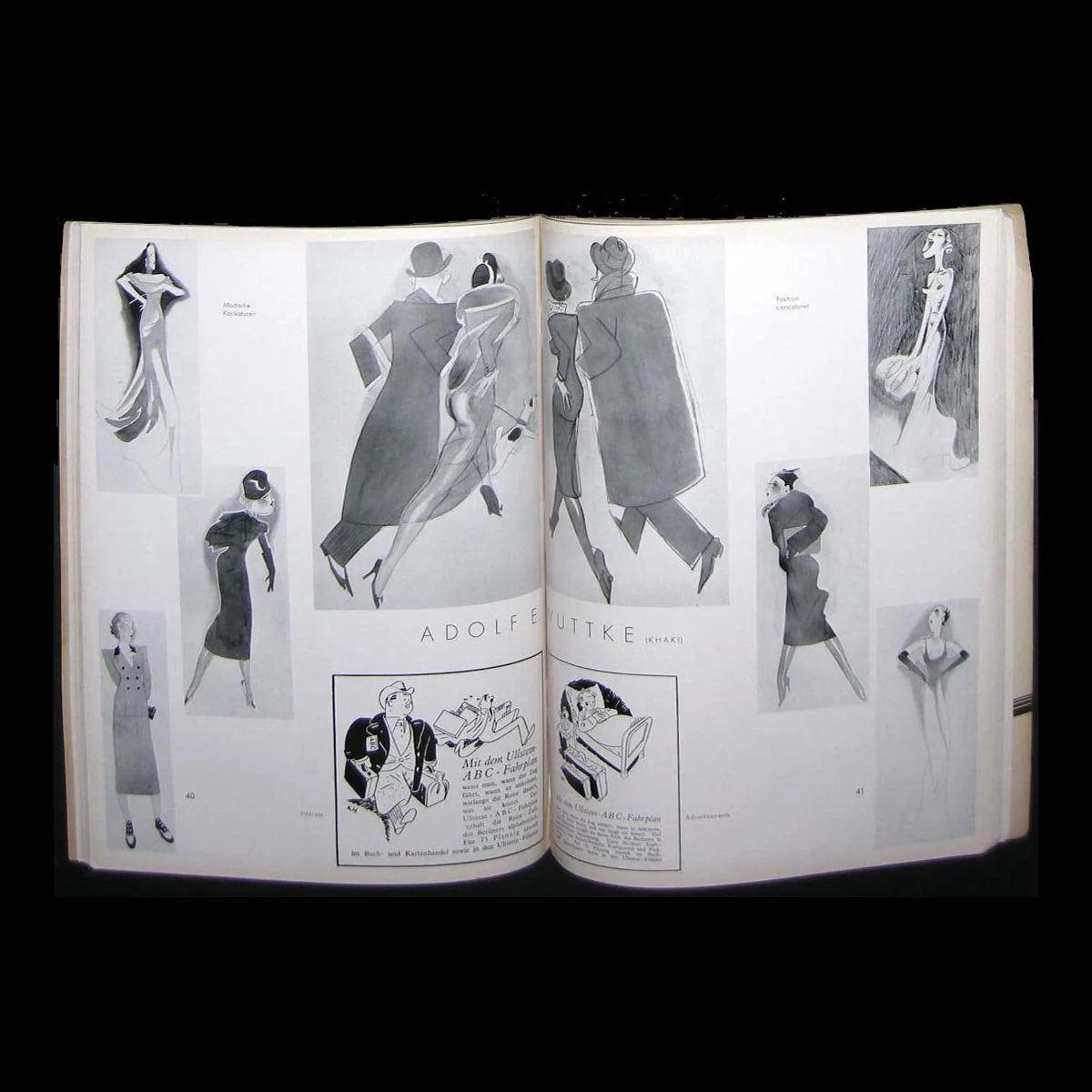 Image 8 of 14
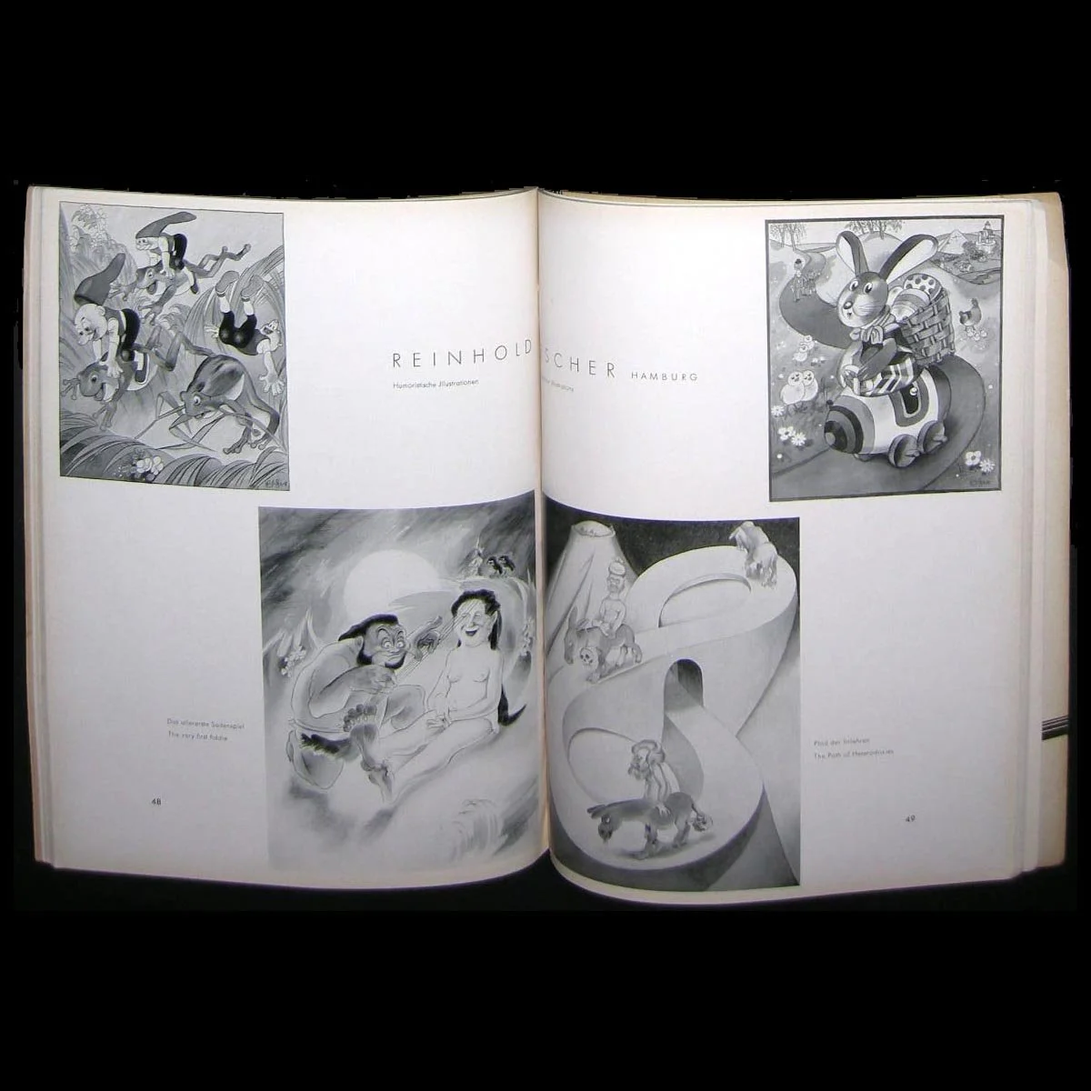 Image 9 of 14
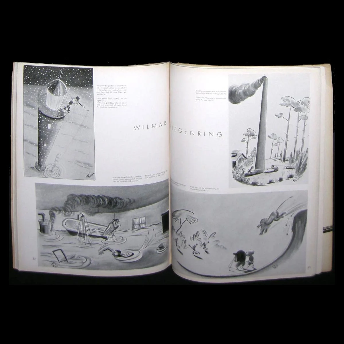 Image 10 of 14
 Image 11 of 14
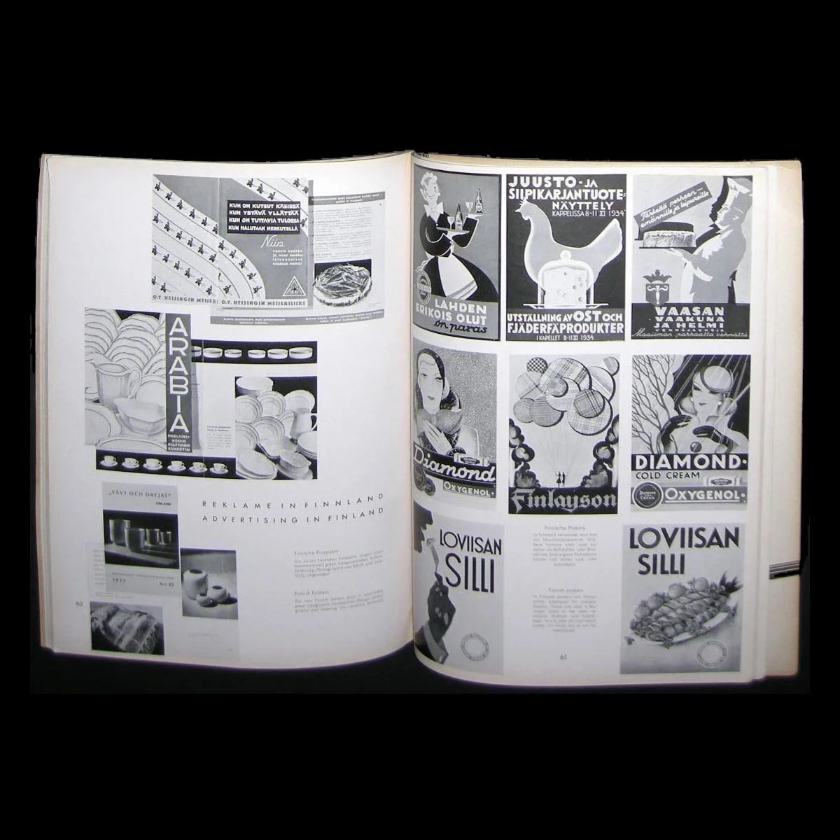 Image 12 of 14
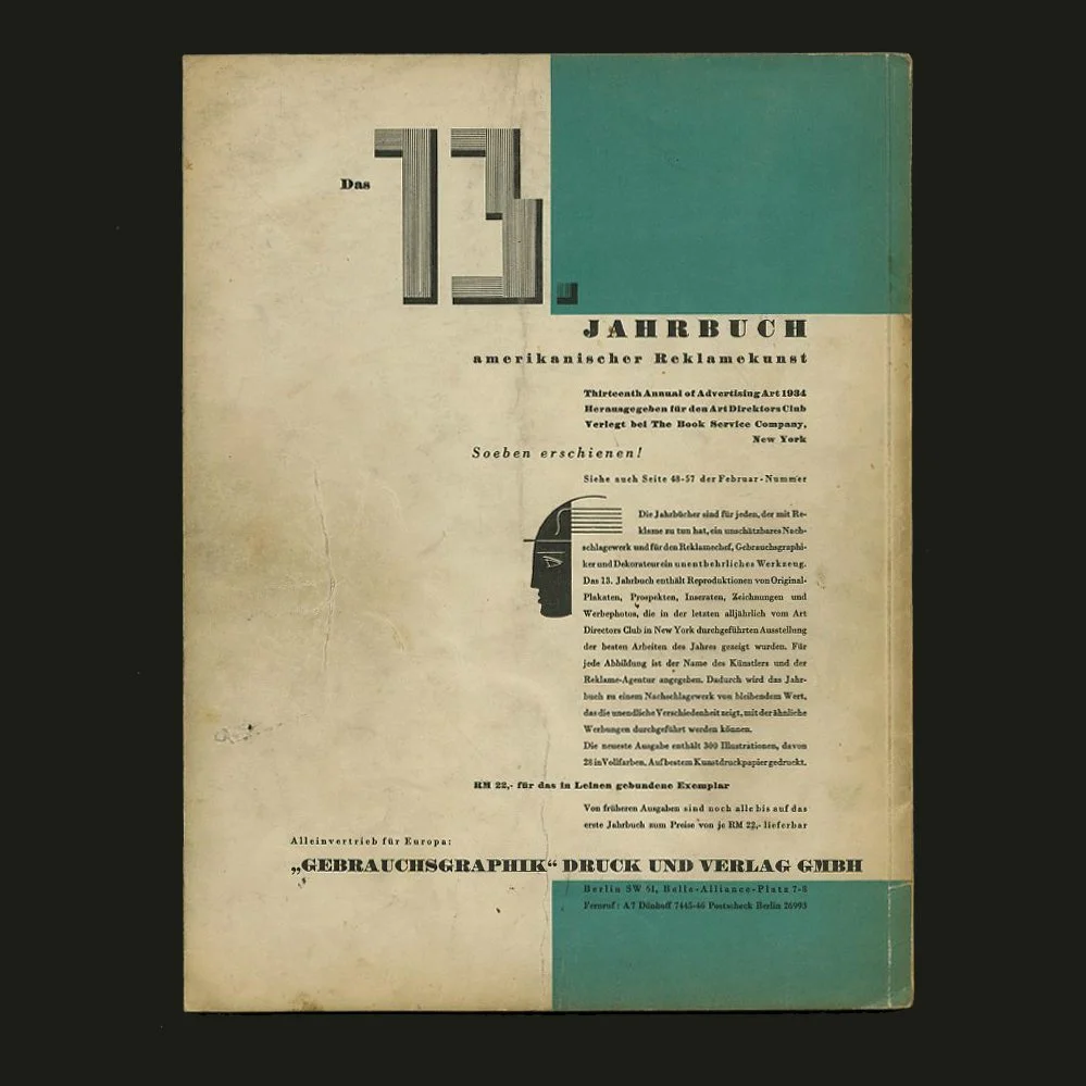 Image 13 of 14
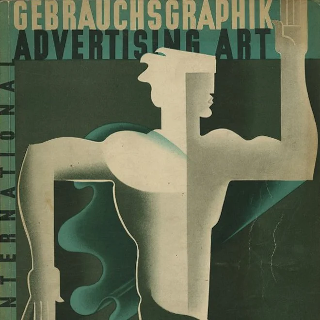 Image 14 of 14