Gebrauchsgraphik
International Advertising Art, February 1930
Professor H. K. Frenzel [Editor]
Berlin: Gebrauchsgraphik, February 1930. Original edition [Volume 7, Number 2]. Parallel texts in German and English. Quarto. Side stitched and perfect bound printed wrappers. [88] 40 pp. Illustrated articles and trade advertisements. Multiple paper stocks and printing effects, with elaborate graphic design throughout. Cover design by Prentis. Uncoated wrappers very mildly worn. Textblock bright and clean, so a nearly fine copy.
9.25 x 12.25 vintage magazine with 128 pages of editorial content and around 20 pages of advertising trade ads. Editorial Contents represent the best of European Art Deco Commercial and Advertising Art, Posters, Photography and Packaging circa 1937. The advertising shows the strong Bauhaus influences of Moholy-Nagy and Herbert Bayer, as well as echoes of El Lissitzky, Piet Zwart and Jan Tschichold's neue typografie.
Contents:
Reynaldo Luza: H. K. Frenzel. Fifteen pages and 45 black and white and color reproductions. Color reproductions courtesy of Draeger Fréres, Paris.
The Stuttgart Poster: H. K. Frenzel. Five pages and eight black and white poster reproductions.
Poster Art: Professor Hans Reich. Four pages and 8 black and white Stuttgart poster reproductions.
Poster Competition of the Advertising Committee of German Curtain-Weaving Factories: Walter Heurich Luigi. Four pages and four black and white reproductions.
Friedrich Wilhelm Gubitz, Commercial Artist (1786–1870).
Ernst Heig: Traugott Schalcher. Six pages and 21 black and white reproductions
Paul Urban. Six pages and 13 black and white book design reproductions.
Friedrich Binder. Six pages and 20 black and white poster reproductions.
An Hour with Silas Spitzer. Thirteen pages and 23 black and white book designs and artwork by Hans Schleger (Zero) and Anton Bruehl.
Hans Schleger Chats about New York.
Three posters by bi (Ignat Barcian), Bucharest.
Der Reklameball 1930: decorations by Otto Arpke, Walter Reimer, Max Hertwig, Jupp Wiertz, and others .
And more, including multiple full page ads for the latest typefaces!
Reynaldo Luza y Argaluza ( Lima, Peru, 1893 – 1978) studied engineering and architecture at the Catholic University of Louvain, where his studies were interrupted by the outbreak of World War I. He returned to Peru and continued to study architecture at the School of Engineering in Lima for an additional year, but abandoned the career before completing the degree. It was at this moment that he began his career as an illustrator for local magazines such as Colónidas, Variedades, Cultura, and Monos y Monadas. In 1918, Luza y Argaluza moved to New York City, where he would begin a successful career as an illustrator working for magazines such as Vogue, Vanity Fair, and Harper’s Bazaar.
By 1921, Luza became Harper's Bazaar chief fashion illustrator. Although Luza was originally hired to work for Harper's New York City office, in 1922 he relocated to Paris, where he produced illustrations for various editions of the magazine. While in France, Luza worked closely with some of the most important fashion designers, illustrators, and artists of the time, including designers like Paul Poiret, Jean Patou, the House of Worth, Coco Chanel, Madeleine Vionnet, Edward Molyneux, Elsa Schiaparelli, Lucien Lelong, Cristóbal Balenciaga, and artists such as Salvador Dalí, Carl Erickson, Max Ernst, and Man Ray. In 1937, the government of Peru appointed Luza, together with Elena and Victoria Izcue, as artistic directors of the Peruvian pavilion for the 1937 Exposition Internationale des Arts et Techniques dans la Vie Moderne in Paris. However, due to war hostilities in 1939, Luza returned to New York City, where he continued his work for Harper's. That year he collaborated again with the previously mentioned Izcue sisters, in order to design the Peruvian pavilion for the 1939–40 New York World's Fair.
In 1940, Luza traveled across South America for several months. The trip reconnected the artist with his cultural origins, and sparked creativity. Once back in New York, he prepared a fashion collection presented in November of that year at the luxury department store Bonwit Teller's. Virginia Pope, who was considered the most influential fashion journalist during the period, wrote for The New York Times about Luza's collection:
"An interesting new liaison was established yesterday afternoon between North and South America —the catalyst on this occasion was fashion … the costumes, vibrant with color, lent themselves in an extraordinary manner to translations into the idiom of New York fashions."
This collection was a turning point in Luza's career. In 1940, Luza shifted to working on fashion and textile design, drawing inspiration from Peru's ancient cultures. He introduced in his design practice what he called “The Colors of the Andes,” which was a chromatic palette that reflected the nature and colors of South America.
In the 1940s and 1950s, textile designs were receiving a certain attention, mostly because textile production was being promoted and was vital in the role of recovery for the economies of the Americas after World War II. When Luza started to design fabrics, he would utilize recovered motifs that he found in ancient Peruvian textiles, which he collected. He reinterpreted them in his "The Colors of the Andes" chromatic palette. His choice of colors, the hue vibrancy, and the historical precision of many of his designs can also be interpreted as Luza's longing for his homeland, and its artistic and cultural traditions.
It was around this time that he also ventured into interior design. In 1941, Nelson A. Rockefeller, then Coordinator of Inter-American Affairs, commissioned Luza to design the United States pavilion for an exhibition in Guatemala; and later, in 1943, he designed the interiors for the Peruvian embassy in Washington D.C. During his time in New York, he designed movie costumes, including those for the 1944 movie The Bridge of San Luis Rey.
In 1950, Luza permanently relocated to Lima, Peru, where he focused on interior and fabric design, becoming the preeminent 1950s and 60s Peruvian interior designer. Despite his experienced work as a designer in the 1940s and 50s, Luza, a skillful artist, kept working on multiple mediums such as drawing, painting, and photography. He regularly exhibited his work as a portraitist, which gained renown in New York and Peru high society circles. Inspired by the majestic ruins of ancient Peruvian cultures and the beauty of the rocky desert Peruvian coast, from the 1950s until his death in March 1978, he also engaged in landscape painting giving him a prominent place among local artists. — Jorge F. Rivas Pérez, PhD
Gebrauchsgraphik was the leading voice of the Avant-Garde influence on the European Commercial Art and Advertising industries before World War II. In the thirties, all roads led through Berlin, and Gebrauchsgraphik spotlighted all of the aesthetic trends fermenting in Europe -- Art Deco and Surrealism from Paris, Constructivism from Moscow, Futurist Fascism from Rome, De Stijl and Dutch typography from Amsterdam, and of course the spreading influence of the Dessau Bauhaus. A journal that was truly international in scope , all articles and cutlines are presented in both German and English.
The thirties were the Golden Age for European Poster Art and Gebrauchsgraphik was in the perfect place to showcase all the latest and greatest trends and rising artists for the rest of the world. Gebrauchsgraphik was an incredibly influential journal and agenda setter, most notably to a young man in Brooklyn named Paul Rand. According to his biographical notes, Rand's exposure to Gebrauchsgraphik in the early thirties created his desire to become a Commercial Artist. The rest is history.
Gebrauchsgraphik utilized the latest printing and press technologies and often included custom colors, bound-in samples and advertising fold-outs, foil stamps, die-cuts and other special finishing effects.
Founded in 1923 by Professor H. K. Frenzel, Gebrauchsgraphik was the leading voice of the Avant-Garde influence on the European Commercial Art and Advertising industries before World War II. In the thirties, all roads led through Berlin, and Gebrauchsgraphik spotlighted all of the aesthetic trends fermenting in Europe -- Art Deco and Surrealism from Paris, Constructivism from Moscow, Futurist Fascism from Rome, De Stijl and Dutch typography from Amsterdam, and of course the spreading influence of the Dessau Bauhaus. A journal that was truly international, presented in both German and English.
Gebrauchsgraphik was in the perfect place to showcase all the latest and greatest European trends and rising artists for the rest of the world. Gebrauchsgraphik was an incredibly influential journal and agenda setter, most notably to a young man in Brooklyn named Paul Rand. According to his biographical notes, Rand's exposure to Gebrauchsgraphik in the early thirties created his desire to become a Commercial Artist. The rest is history.
* Design Historian and all-around mensch Steven Heller on H.K. Frenzel: “This is not the anniversary of H.K. Frenzel's birth (1882) or death (1937) but it is the commemoration of both, decades much too late.
“While researching another project through scores of issues of his historic magazine, Gebrauchsgraphik: International Advertising Art, I came across a benignly covered edition from November 1937.
“Do the math . . . that was four years after the rise to power of the Nazis in Germany, where Dr. Frenzel's magazine began publishing in 1924. This issue had many advertisements for Black Letter typefaces and an ad for ALA (Allgemeine Anzeigen Gesellschaft), which was the German advertising society to promote German newspaper and periodical advertising in Germany, which served as the Nazis' own advertising. The magazine also had features on a host of "sanctioned" German gebrauchsgraphikers, who belonged to the Reich Chamber of Commercial Arts.
“Dr. Frenzel was not pleased with the Nazification (Gleichschaltung ) of his magazine, which had never taken an overt political stand. In 1937 Frenzel died of a "bug" he caught while in Italy. Although he had recovered, seemingly it was more virulent than the doctors had thought-or so the story goes. Nonetheless, rumors quickly surfaced that he took his own life.
“The memorial article in the November 1937 issue by E. Hölscher begins, "Our late friend H.K. Frenzel would certainly not have wished that an attempt should be made in the following lines devoted to his memory to give renewed expression to the profound and general dismay caused by his unexpected decease. He himself was much too optimistic and interested in the present to indulge willingly in melancholy thoughts for any length of time, and even beyond the circle of his more intimate friends the grief and sympathy even among those who had only met him once were so really heartfelt and genuine that they require no further confirmation as evidence of general respect which he enjoyed."
“And yet, his admirers were moved to celebrate how the magazine-his creation-"on which he worked with absolute devotion until the lasts days of his life, has been subjected to certain changes in the course of fourteen years." Meaning over the last four the Nazi dictates against modern and culturally un-German content was verbotten.
“Frenzel wrote "The works reproduced by me in Gebrauchsgraphik are entirely in accordance with the idea I have adopted as the policy of my periodical. I wish to circumscribe a circle covering what can be regarded as good present-day graphic art. If I were to take to publishing only what satisfies me completely I should have to adopt a certain policy, and the periodical would no longer reflect the present state of graphic art."
“True to his word, Frenzel published many approaches from all over the world. The common denominator was quality. Whether modern or classical, comic or serious, experimental or traditional, he maintained a level that set the standard. With the Nazis in power, his circle had been excruciatingly tightened, his standard had dropped, his life was not worth living.”
Gebrauchsgraphik
International Advertising Art, February 1930
Professor H. K. Frenzel [Editor]
Berlin: Gebrauchsgraphik, February 1930. Original edition [Volume 7, Number 2]. Parallel texts in German and English. Quarto. Side stitched and perfect bound printed wrappers. [88] 40 pp. Illustrated articles and trade advertisements. Multiple paper stocks and printing effects, with elaborate graphic design throughout. Cover design by Prentis. Uncoated wrappers very mildly worn. Textblock bright and clean, so a nearly fine copy.
9.25 x 12.25 vintage magazine with 128 pages of editorial content and around 20 pages of advertising trade ads. Editorial Contents represent the best of European Art Deco Commercial and Advertising Art, Posters, Photography and Packaging circa 1937. The advertising shows the strong Bauhaus influences of Moholy-Nagy and Herbert Bayer, as well as echoes of El Lissitzky, Piet Zwart and Jan Tschichold's neue typografie.
Contents:
Reynaldo Luza: H. K. Frenzel. Fifteen pages and 45 black and white and color reproductions. Color reproductions courtesy of Draeger Fréres, Paris.
The Stuttgart Poster: H. K. Frenzel. Five pages and eight black and white poster reproductions.
Poster Art: Professor Hans Reich. Four pages and 8 black and white Stuttgart poster reproductions.
Poster Competition of the Advertising Committee of German Curtain-Weaving Factories: Walter Heurich Luigi. Four pages and four black and white reproductions.
Friedrich Wilhelm Gubitz, Commercial Artist (1786–1870).
Ernst Heig: Traugott Schalcher. Six pages and 21 black and white reproductions
Paul Urban. Six pages and 13 black and white book design reproductions.
Friedrich Binder. Six pages and 20 black and white poster reproductions.
An Hour with Silas Spitzer. Thirteen pages and 23 black and white book designs and artwork by Hans Schleger (Zero) and Anton Bruehl.
Hans Schleger Chats about New York.
Three posters by bi (Ignat Barcian), Bucharest.
Der Reklameball 1930: decorations by Otto Arpke, Walter Reimer, Max Hertwig, Jupp Wiertz, and others .
And more, including multiple full page ads for the latest typefaces!
Reynaldo Luza y Argaluza ( Lima, Peru, 1893 – 1978) studied engineering and architecture at the Catholic University of Louvain, where his studies were interrupted by the outbreak of World War I. He returned to Peru and continued to study architecture at the School of Engineering in Lima for an additional year, but abandoned the career before completing the degree. It was at this moment that he began his career as an illustrator for local magazines such as Colónidas, Variedades, Cultura, and Monos y Monadas. In 1918, Luza y Argaluza moved to New York City, where he would begin a successful career as an illustrator working for magazines such as Vogue, Vanity Fair, and Harper’s Bazaar.
By 1921, Luza became Harper's Bazaar chief fashion illustrator. Although Luza was originally hired to work for Harper's New York City office, in 1922 he relocated to Paris, where he produced illustrations for various editions of the magazine. While in France, Luza worked closely with some of the most important fashion designers, illustrators, and artists of the time, including designers like Paul Poiret, Jean Patou, the House of Worth, Coco Chanel, Madeleine Vionnet, Edward Molyneux, Elsa Schiaparelli, Lucien Lelong, Cristóbal Balenciaga, and artists such as Salvador Dalí, Carl Erickson, Max Ernst, and Man Ray. In 1937, the government of Peru appointed Luza, together with Elena and Victoria Izcue, as artistic directors of the Peruvian pavilion for the 1937 Exposition Internationale des Arts et Techniques dans la Vie Moderne in Paris. However, due to war hostilities in 1939, Luza returned to New York City, where he continued his work for Harper's. That year he collaborated again with the previously mentioned Izcue sisters, in order to design the Peruvian pavilion for the 1939–40 New York World's Fair.
In 1940, Luza traveled across South America for several months. The trip reconnected the artist with his cultural origins, and sparked creativity. Once back in New York, he prepared a fashion collection presented in November of that year at the luxury department store Bonwit Teller's. Virginia Pope, who was considered the most influential fashion journalist during the period, wrote for The New York Times about Luza's collection:
"An interesting new liaison was established yesterday afternoon between North and South America —the catalyst on this occasion was fashion … the costumes, vibrant with color, lent themselves in an extraordinary manner to translations into the idiom of New York fashions."
This collection was a turning point in Luza's career. In 1940, Luza shifted to working on fashion and textile design, drawing inspiration from Peru's ancient cultures. He introduced in his design practice what he called “The Colors of the Andes,” which was a chromatic palette that reflected the nature and colors of South America.
In the 1940s and 1950s, textile designs were receiving a certain attention, mostly because textile production was being promoted and was vital in the role of recovery for the economies of the Americas after World War II. When Luza started to design fabrics, he would utilize recovered motifs that he found in ancient Peruvian textiles, which he collected. He reinterpreted them in his "The Colors of the Andes" chromatic palette. His choice of colors, the hue vibrancy, and the historical precision of many of his designs can also be interpreted as Luza's longing for his homeland, and its artistic and cultural traditions.
It was around this time that he also ventured into interior design. In 1941, Nelson A. Rockefeller, then Coordinator of Inter-American Affairs, commissioned Luza to design the United States pavilion for an exhibition in Guatemala; and later, in 1943, he designed the interiors for the Peruvian embassy in Washington D.C. During his time in New York, he designed movie costumes, including those for the 1944 movie The Bridge of San Luis Rey.
In 1950, Luza permanently relocated to Lima, Peru, where he focused on interior and fabric design, becoming the preeminent 1950s and 60s Peruvian interior designer. Despite his experienced work as a designer in the 1940s and 50s, Luza, a skillful artist, kept working on multiple mediums such as drawing, painting, and photography. He regularly exhibited his work as a portraitist, which gained renown in New York and Peru high society circles. Inspired by the majestic ruins of ancient Peruvian cultures and the beauty of the rocky desert Peruvian coast, from the 1950s until his death in March 1978, he also engaged in landscape painting giving him a prominent place among local artists. — Jorge F. Rivas Pérez, PhD
Gebrauchsgraphik was the leading voice of the Avant-Garde influence on the European Commercial Art and Advertising industries before World War II. In the thirties, all roads led through Berlin, and Gebrauchsgraphik spotlighted all of the aesthetic trends fermenting in Europe -- Art Deco and Surrealism from Paris, Constructivism from Moscow, Futurist Fascism from Rome, De Stijl and Dutch typography from Amsterdam, and of course the spreading influence of the Dessau Bauhaus. A journal that was truly international in scope , all articles and cutlines are presented in both German and English.
The thirties were the Golden Age for European Poster Art and Gebrauchsgraphik was in the perfect place to showcase all the latest and greatest trends and rising artists for the rest of the world. Gebrauchsgraphik was an incredibly influential journal and agenda setter, most notably to a young man in Brooklyn named Paul Rand. According to his biographical notes, Rand's exposure to Gebrauchsgraphik in the early thirties created his desire to become a Commercial Artist. The rest is history.
Gebrauchsgraphik utilized the latest printing and press technologies and often included custom colors, bound-in samples and advertising fold-outs, foil stamps, die-cuts and other special finishing effects.
Founded in 1923 by Professor H. K. Frenzel, Gebrauchsgraphik was the leading voice of the Avant-Garde influence on the European Commercial Art and Advertising industries before World War II. In the thirties, all roads led through Berlin, and Gebrauchsgraphik spotlighted all of the aesthetic trends fermenting in Europe -- Art Deco and Surrealism from Paris, Constructivism from Moscow, Futurist Fascism from Rome, De Stijl and Dutch typography from Amsterdam, and of course the spreading influence of the Dessau Bauhaus. A journal that was truly international, presented in both German and English.
Gebrauchsgraphik was in the perfect place to showcase all the latest and greatest European trends and rising artists for the rest of the world. Gebrauchsgraphik was an incredibly influential journal and agenda setter, most notably to a young man in Brooklyn named Paul Rand. According to his biographical notes, Rand's exposure to Gebrauchsgraphik in the early thirties created his desire to become a Commercial Artist. The rest is history.
* Design Historian and all-around mensch Steven Heller on H.K. Frenzel: “This is not the anniversary of H.K. Frenzel's birth (1882) or death (1937) but it is the commemoration of both, decades much too late.
“While researching another project through scores of issues of his historic magazine, Gebrauchsgraphik: International Advertising Art, I came across a benignly covered edition from November 1937.
“Do the math . . . that was four years after the rise to power of the Nazis in Germany, where Dr. Frenzel's magazine began publishing in 1924. This issue had many advertisements for Black Letter typefaces and an ad for ALA (Allgemeine Anzeigen Gesellschaft), which was the German advertising society to promote German newspaper and periodical advertising in Germany, which served as the Nazis' own advertising. The magazine also had features on a host of "sanctioned" German gebrauchsgraphikers, who belonged to the Reich Chamber of Commercial Arts.
“Dr. Frenzel was not pleased with the Nazification (Gleichschaltung ) of his magazine, which had never taken an overt political stand. In 1937 Frenzel died of a "bug" he caught while in Italy. Although he had recovered, seemingly it was more virulent than the doctors had thought-or so the story goes. Nonetheless, rumors quickly surfaced that he took his own life.
“The memorial article in the November 1937 issue by E. Hölscher begins, "Our late friend H.K. Frenzel would certainly not have wished that an attempt should be made in the following lines devoted to his memory to give renewed expression to the profound and general dismay caused by his unexpected decease. He himself was much too optimistic and interested in the present to indulge willingly in melancholy thoughts for any length of time, and even beyond the circle of his more intimate friends the grief and sympathy even among those who had only met him once were so really heartfelt and genuine that they require no further confirmation as evidence of general respect which he enjoyed."
“And yet, his admirers were moved to celebrate how the magazine-his creation-"on which he worked with absolute devotion until the lasts days of his life, has been subjected to certain changes in the course of fourteen years." Meaning over the last four the Nazi dictates against modern and culturally un-German content was verbotten.
“Frenzel wrote "The works reproduced by me in Gebrauchsgraphik are entirely in accordance with the idea I have adopted as the policy of my periodical. I wish to circumscribe a circle covering what can be regarded as good present-day graphic art. If I were to take to publishing only what satisfies me completely I should have to adopt a certain policy, and the periodical would no longer reflect the present state of graphic art."
“True to his word, Frenzel published many approaches from all over the world. The common denominator was quality. Whether modern or classical, comic or serious, experimental or traditional, he maintained a level that set the standard. With the Nazis in power, his circle had been excruciatingly tightened, his standard had dropped, his life was not worth living.”

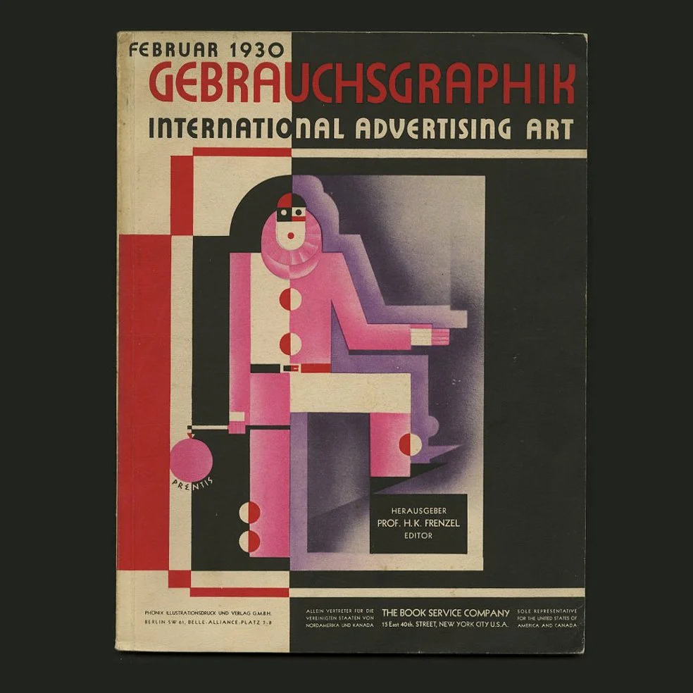 Image 1 of 15
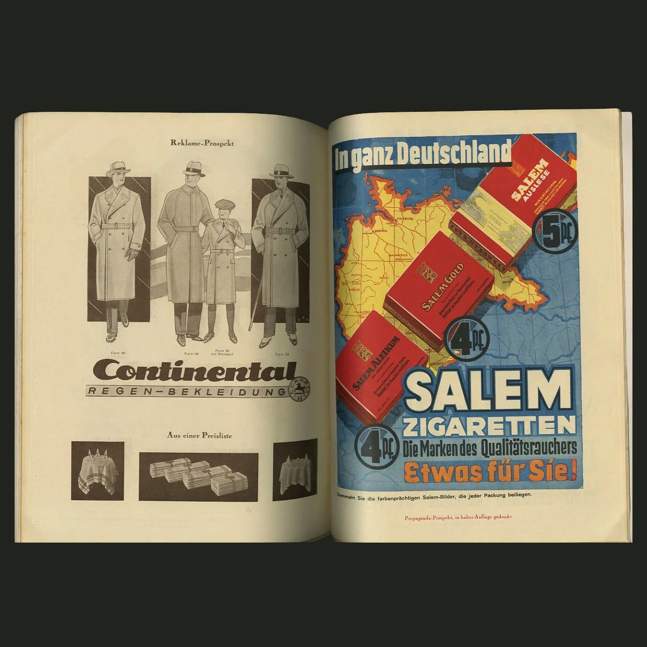 Image 2 of 15
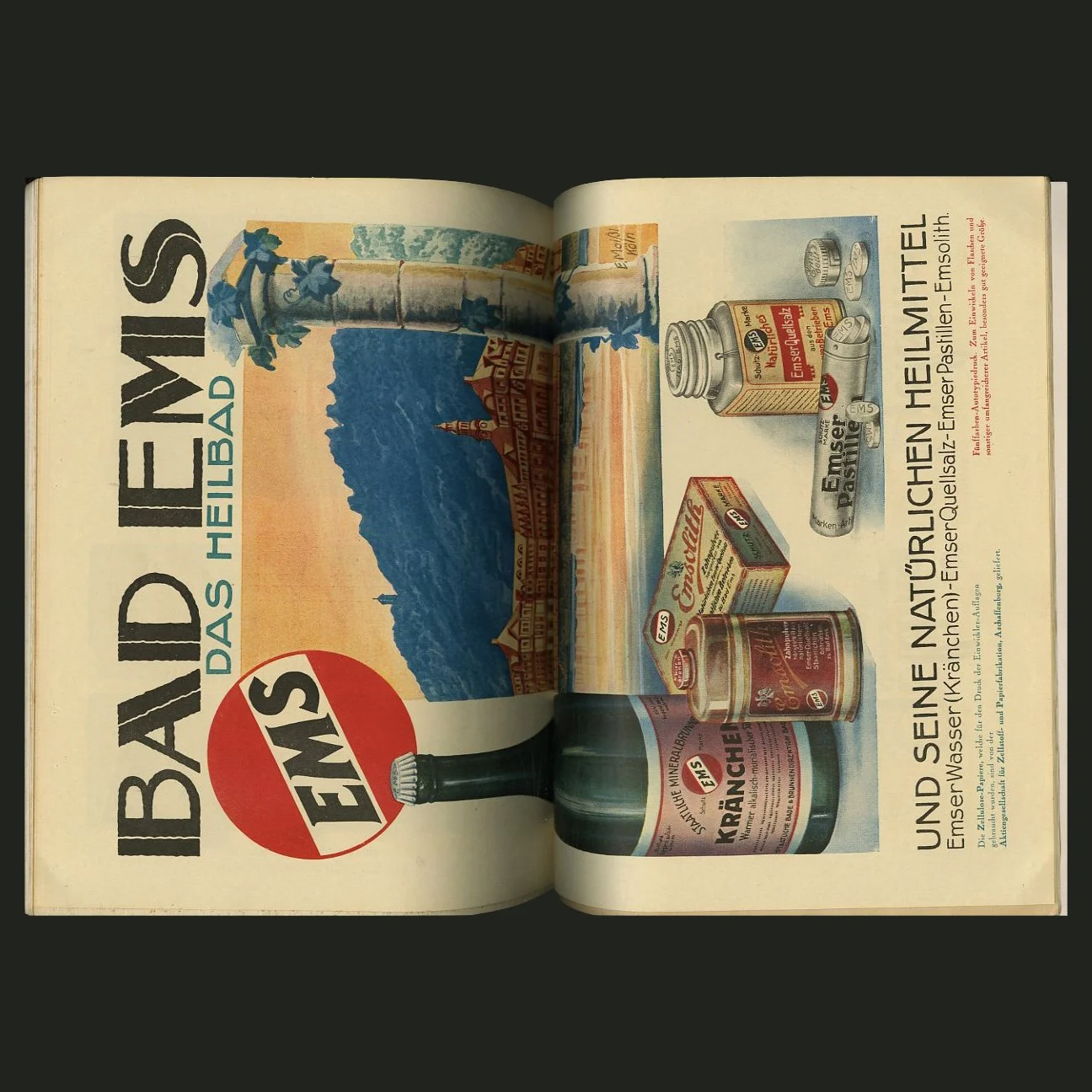 Image 3 of 15
 Image 4 of 15
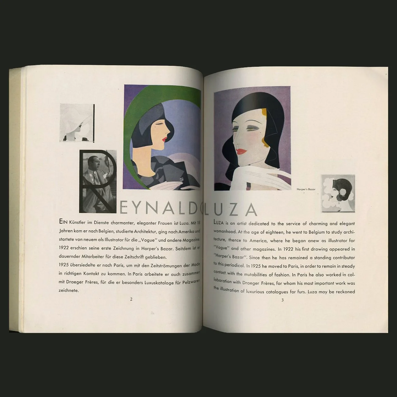 Image 5 of 15
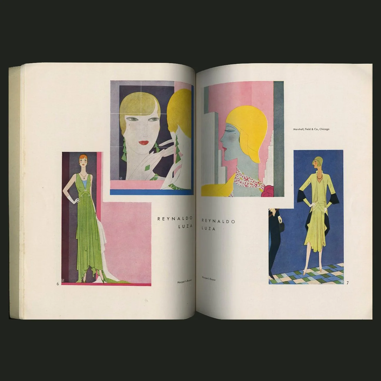 Image 6 of 15
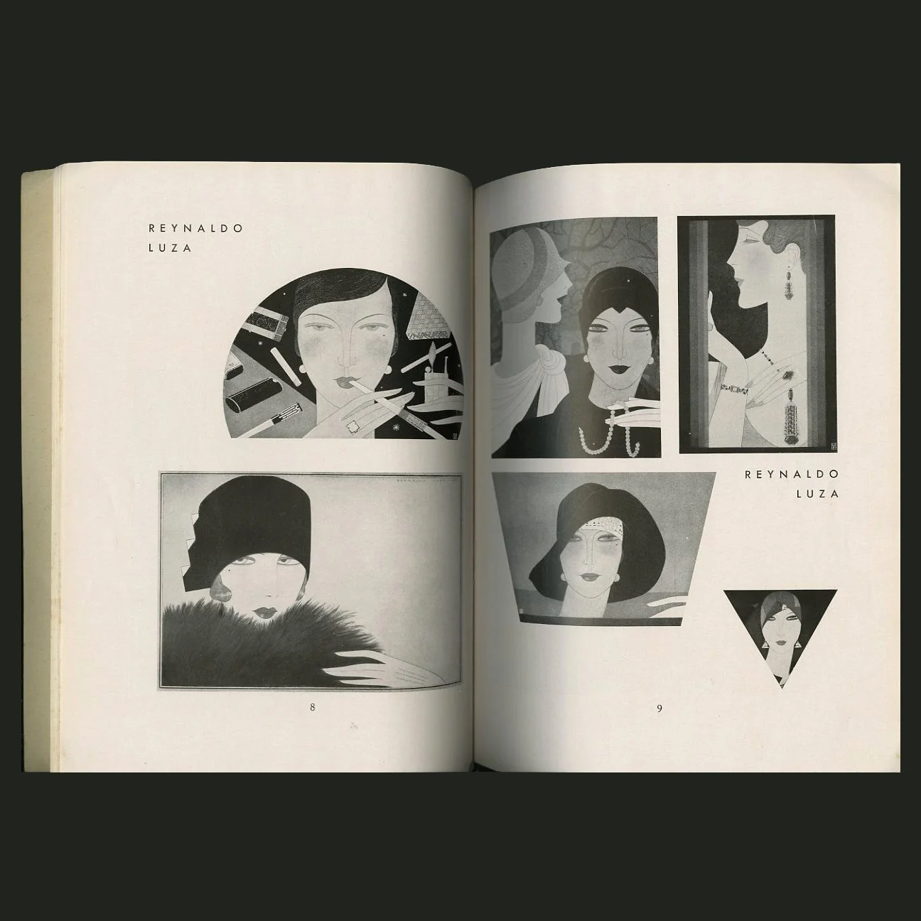 Image 7 of 15
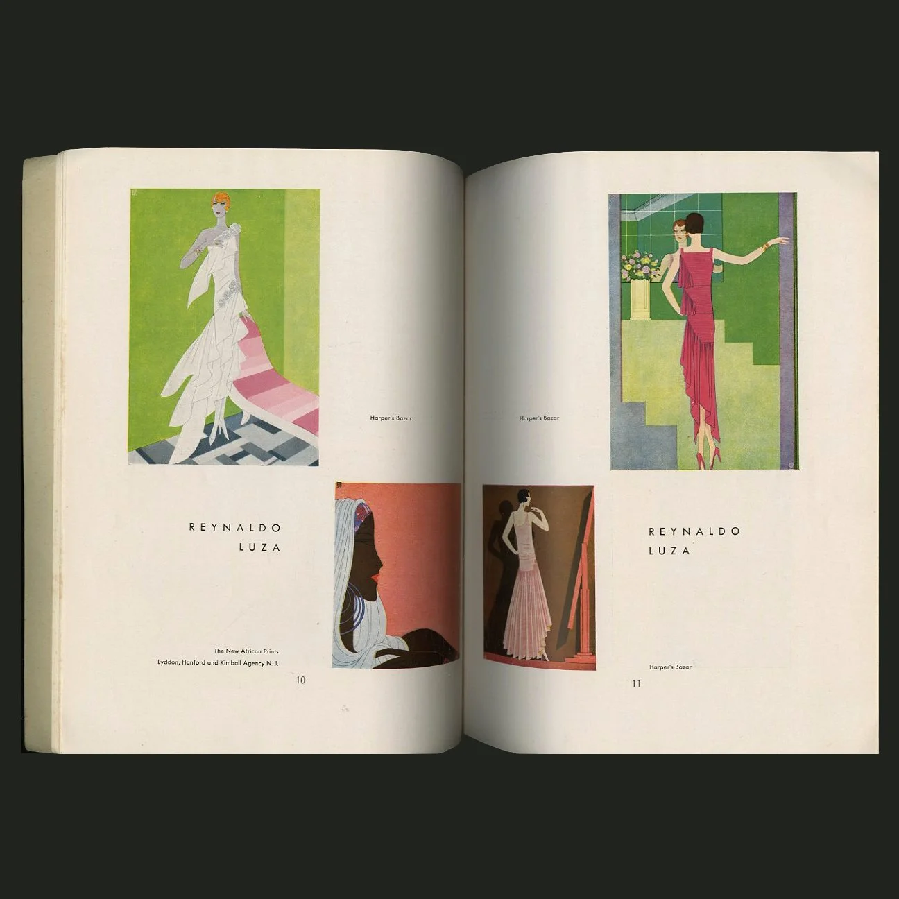 Image 8 of 15
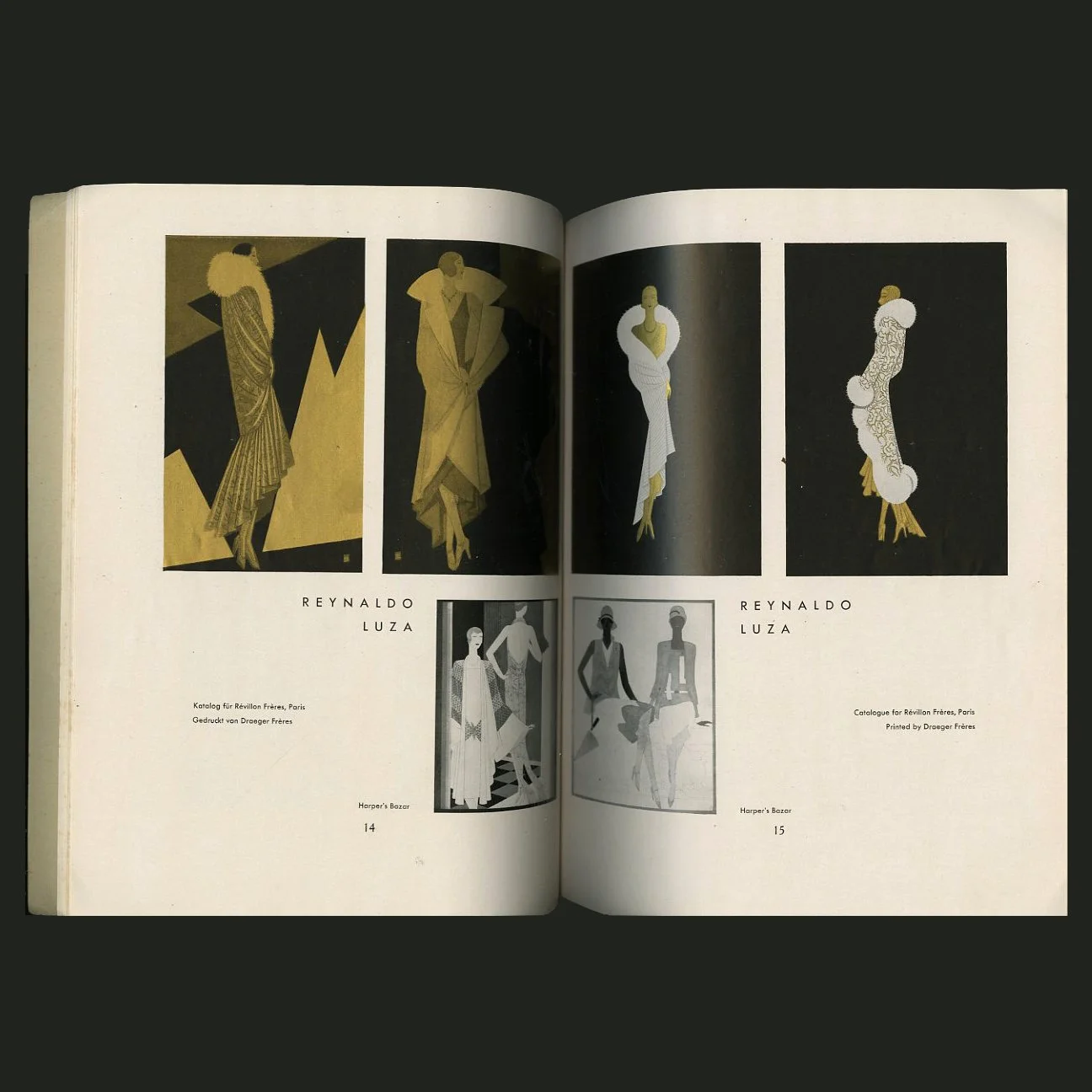 Image 9 of 15
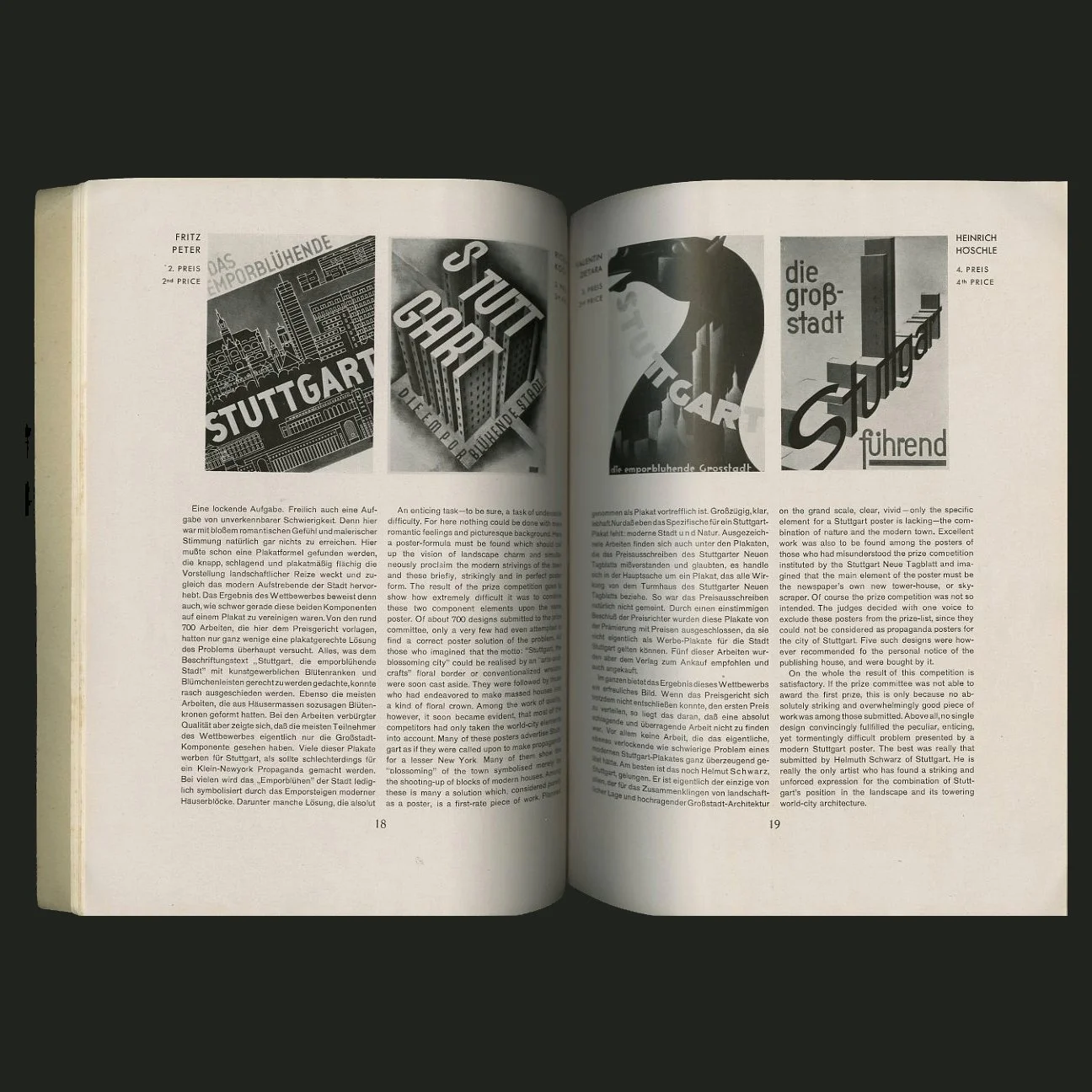 Image 10 of 15
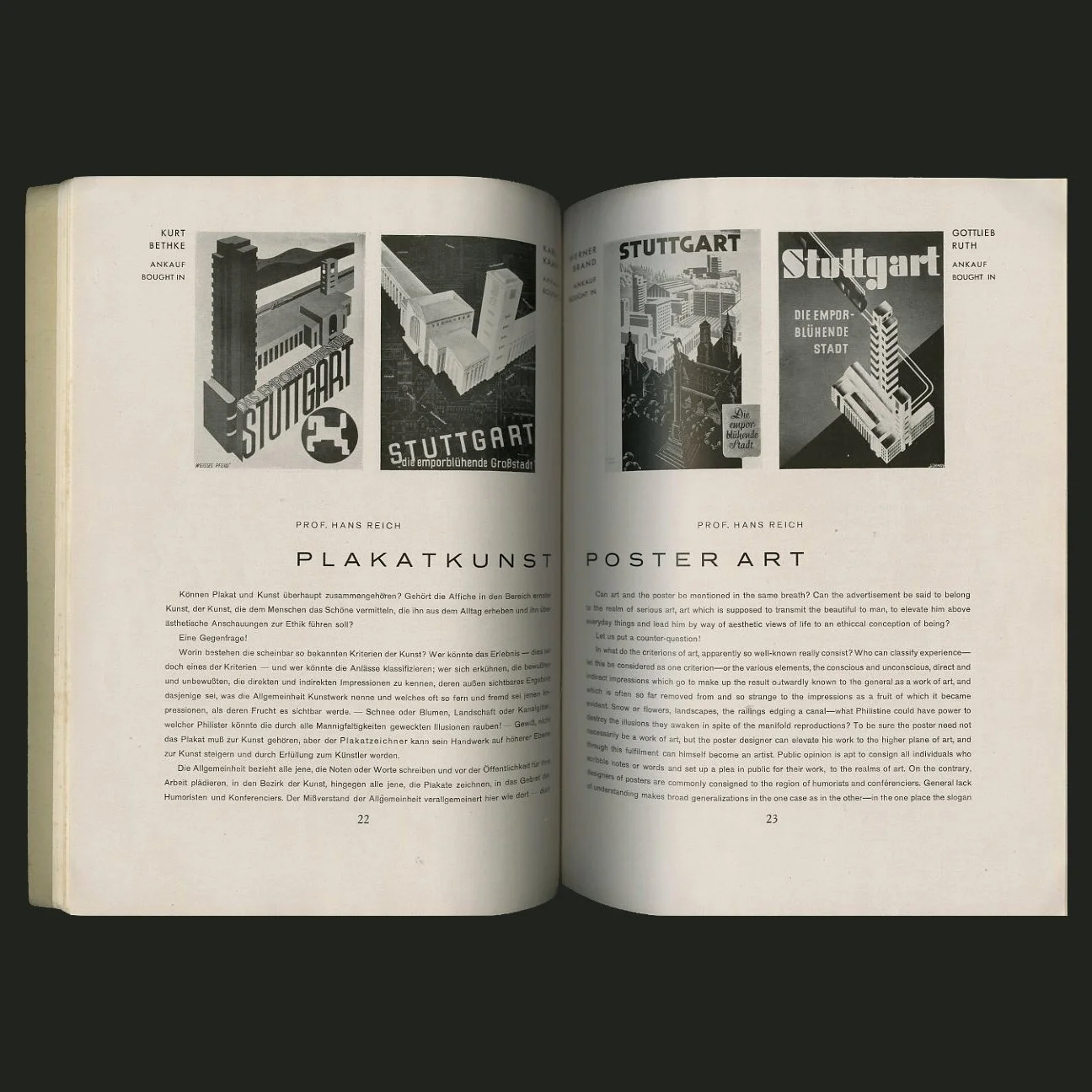 Image 11 of 15
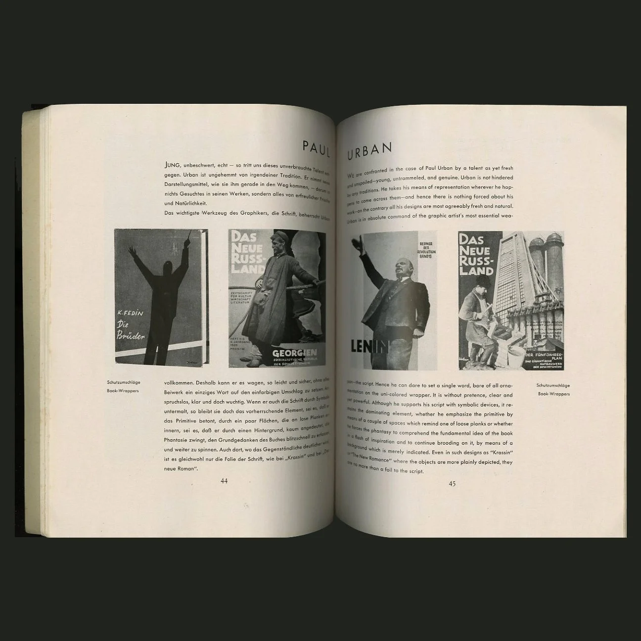 Image 12 of 15
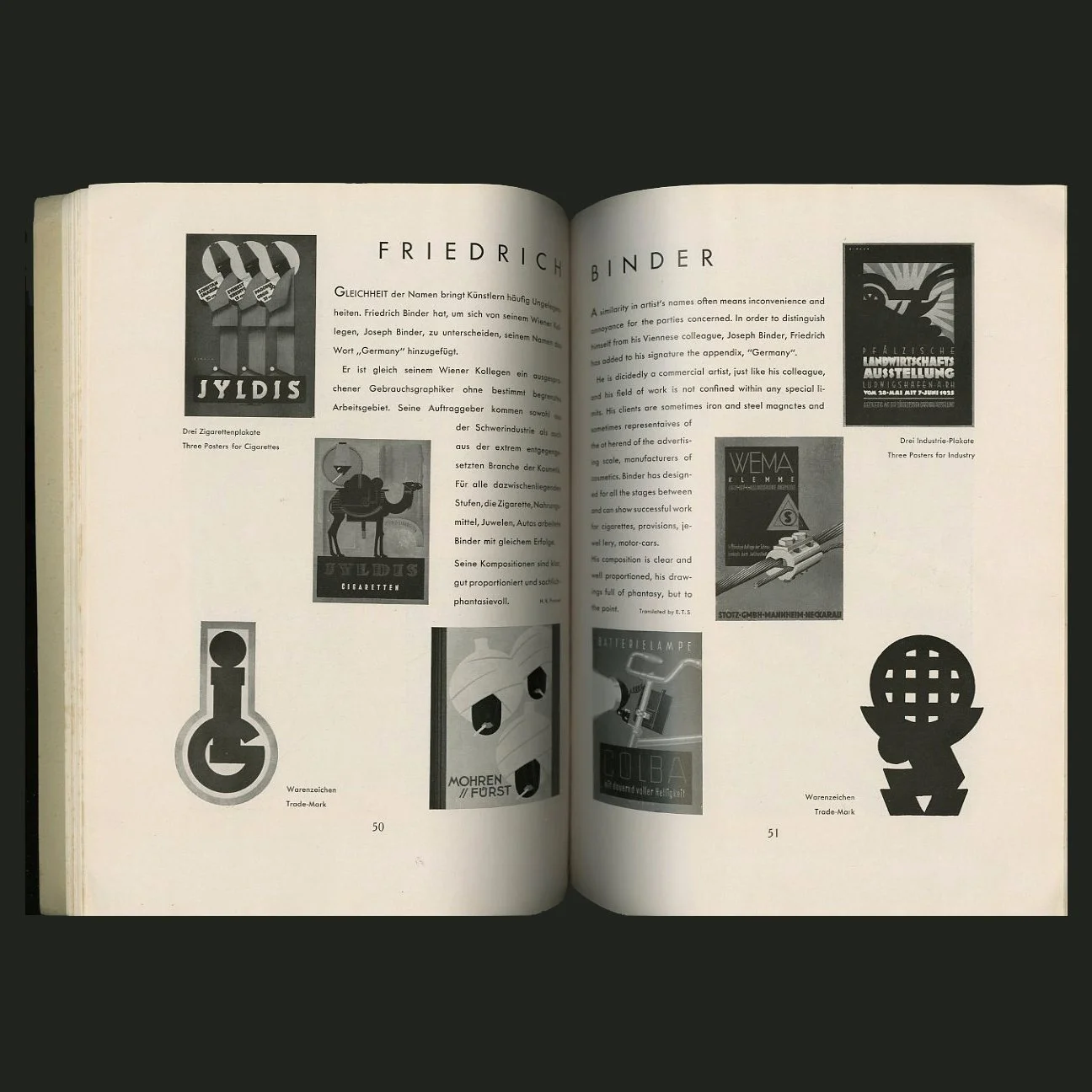 Image 13 of 15
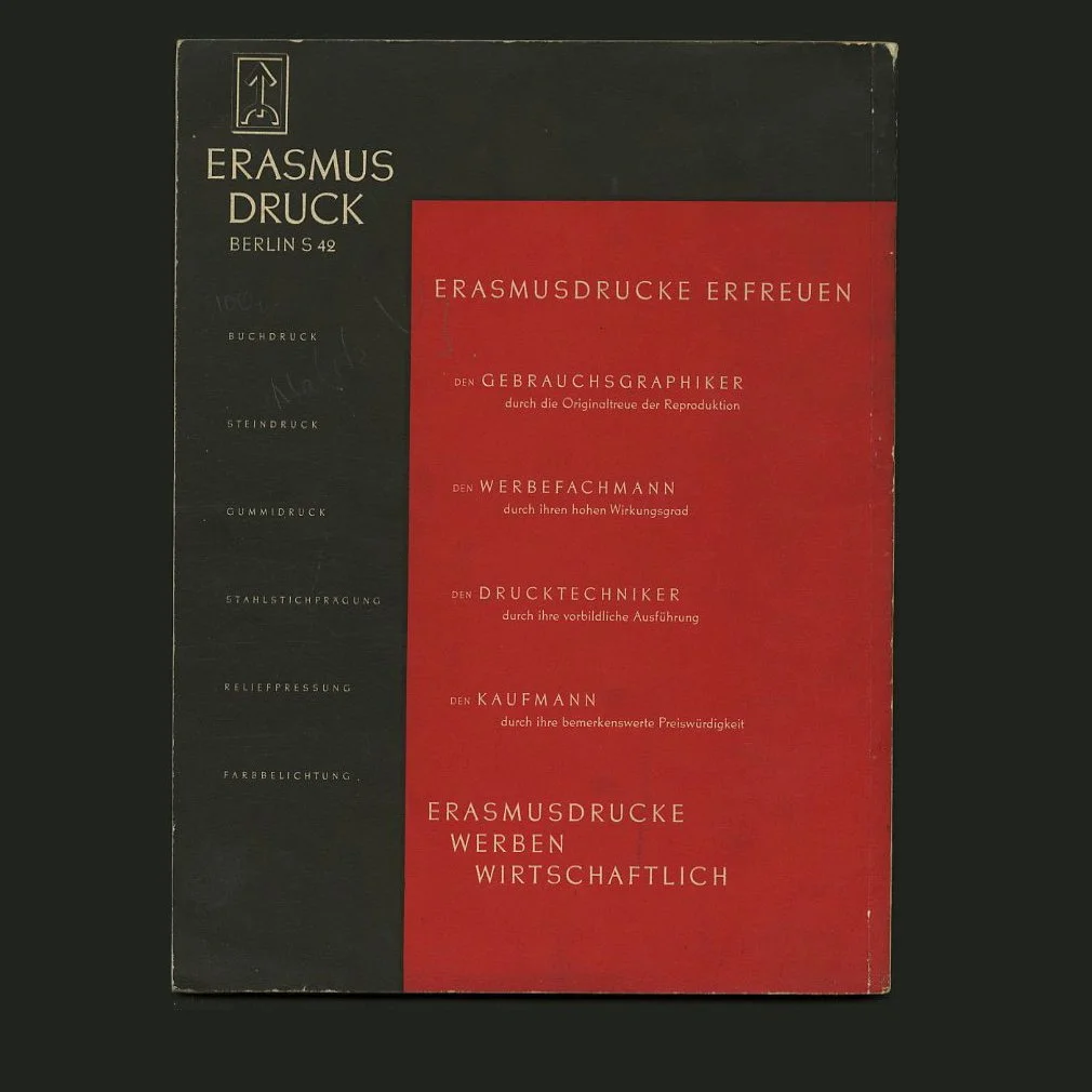 Image 14 of 15
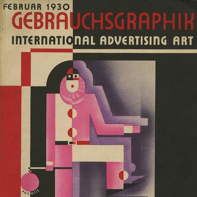 Image 15 of 15