CORPORATE DIVERSITY
SWISS GRAPHIC DESIGN AND ADVERTISING BY GEIGY 1940 – 1970
Andres Janser and Barbara Junod [Editors]
Zürich and Baden: Museum für Gestaltung and Lars Müller Publishing, 2009. First edition. Quarto. Paper covered flexible boards. Printed endpapers. 208 pp. Essays and 385 color and black and white examples. Covers faintly pushed, otherwise a fine copy.
8.5 x 10-inch book with 208 pages fully illustrated with color and black and white examples of the work from the in-house Graphic Design studio at J. R. Geigy AG. “The design studio at Geigy was crucial for the development and, subsequently, for the international reception of Swiss Style in graphic design,” explains Editor and Curator Andres Janser. This is the first comprehensive presentation of Geigy design, an important Swiss contribution to the international history of design.
“Geigy’s typography was as playful as it was controlled, and its design department was known for its use of scarce but strong visual elements, as well as bold colours – unsurprisingly, given that colours, in the form of fabric dyes, were some of Geigy’s most important products.” Geigy’s packaging, produced in the late 1950s, also broke new ground: “It promoted the company brand instead of the product brand, which was a revolutionary step at the time.”
In the 1960s, the chemical company had over 150 employees working solely on the firm’s advertising campaigns, packaging and exhibition stands. Its large design team, which included modernist pioneers such as Karl Gerstner and Herbert Leupin, worked in collaboration with Armin Hofmann’s renowned Allgemeine Gewerbeschule school in Basel. It became a real launch pad for many talented local creatives, including Fred Troller, who worked in Geigy’s New York bureau and went on to design posters for Exxon and American Airlines.
‘Geigy’s design team wanted to avoid a too narrow idea of style, and so focused on the idea of “corporate diversity” as the basic principle of the brand’s corporate identity,’ says Janser. And this is evident in the exhibition’s varied displays, which include Gerstner’s Geigy Heute, a book featuring infographics, bold colours and unjustified text (hardly known-of at the time); Victor Vasarely’s Mitin poster (1947) with colourful tartan and typography; and Max Schmid’s packaging for the Pertofran antidepressant (1962), with a black and white ball-and-chain design that the user had to break to open the box. With their asymmetrical designs, sans-serif typography and block colours, the brand’s Swiss Style advertising and packaging have inspired generations of designers.
The studio of the former J. R. Geigy AG, the so-called "Geigy-Propaganda", was an exemplary example of a company-internal advertising department whose creations became world-famous for their consistency, independence and high level of graphic design. They also played an important role in the international spread of Swiss Style after the Second World War, particularly in the USA. They also contributed to the further development of the concept of corporate identity.
Under the leadership of Max Schmid, the studio employed Roland Aeschlimann, Karl Gerstner, Jörg Hamburger, Steff Geissbuhler, Andreas His, Toshihiro Katayama, and Nelly Rudin, among others. Freelance designers such as Michael Engelmann, Gottfried Honegger, Armin Hofmann, Herbert Leupin, Warja Lavater, Numa Rick, and Niklaus Stoecklin were also used. In the 1960s, the Basel office, especially George Giusti and Fred Troller, was involved in developing the studios of the subsidiaries in the United States and the United Kingdom, placing more emphasis on advertising. It is no coincidence that the name Geigy was mentioned in the same breath as Olivetti, Braun or IBM in the context of corporate communications. Research focused on the period from the founding of "Geigy Propaganda" (1941) to the merger of the Geigy Group with CIBA (1970). These were prosperous years in which advertising expenditure followed the increasing turnover of the chemical company. Despite the diversity of tasks and media (print, packaging, trade fair, film) as well as the international clientele, the advertising management strived for a uniform appearance, the so-called “Geigy style.” However, this was not characterized by uniformity, but by a flexible uniformity. There were no design guidelines at Geigy, but there was a clever personnel policy. The majority of the creative people employed here were graduates of the Basel General Vocational School. They held a similar view of design and the conviction that "good design = good business.”
CORPORATE DIVERSITY
SWISS GRAPHIC DESIGN AND ADVERTISING BY GEIGY 1940 – 1970
Andres Janser and Barbara Junod [Editors]
Zürich and Baden: Museum für Gestaltung and Lars Müller Publishing, 2009. First edition. Quarto. Paper covered flexible boards. Printed endpapers. 208 pp. Essays and 385 color and black and white examples. Covers faintly pushed, otherwise a fine copy.
8.5 x 10-inch book with 208 pages fully illustrated with color and black and white examples of the work from the in-house Graphic Design studio at J. R. Geigy AG. “The design studio at Geigy was crucial for the development and, subsequently, for the international reception of Swiss Style in graphic design,” explains Editor and Curator Andres Janser. This is the first comprehensive presentation of Geigy design, an important Swiss contribution to the international history of design.
“Geigy’s typography was as playful as it was controlled, and its design department was known for its use of scarce but strong visual elements, as well as bold colours – unsurprisingly, given that colours, in the form of fabric dyes, were some of Geigy’s most important products.” Geigy’s packaging, produced in the late 1950s, also broke new ground: “It promoted the company brand instead of the product brand, which was a revolutionary step at the time.”
In the 1960s, the chemical company had over 150 employees working solely on the firm’s advertising campaigns, packaging and exhibition stands. Its large design team, which included modernist pioneers such as Karl Gerstner and Herbert Leupin, worked in collaboration with Armin Hofmann’s renowned Allgemeine Gewerbeschule school in Basel. It became a real launch pad for many talented local creatives, including Fred Troller, who worked in Geigy’s New York bureau and went on to design posters for Exxon and American Airlines.
‘Geigy’s design team wanted to avoid a too narrow idea of style, and so focused on the idea of “corporate diversity” as the basic principle of the brand’s corporate identity,’ says Janser. And this is evident in the exhibition’s varied displays, which include Gerstner’s Geigy Heute, a book featuring infographics, bold colours and unjustified text (hardly known-of at the time); Victor Vasarely’s Mitin poster (1947) with colourful tartan and typography; and Max Schmid’s packaging for the Pertofran antidepressant (1962), with a black and white ball-and-chain design that the user had to break to open the box. With their asymmetrical designs, sans-serif typography and block colours, the brand’s Swiss Style advertising and packaging have inspired generations of designers.
The studio of the former J. R. Geigy AG, the so-called "Geigy-Propaganda", was an exemplary example of a company-internal advertising department whose creations became world-famous for their consistency, independence and high level of graphic design. They also played an important role in the international spread of Swiss Style after the Second World War, particularly in the USA. They also contributed to the further development of the concept of corporate identity.
Under the leadership of Max Schmid, the studio employed Roland Aeschlimann, Karl Gerstner, Jörg Hamburger, Steff Geissbuhler, Andreas His, Toshihiro Katayama, and Nelly Rudin, among others. Freelance designers such as Michael Engelmann, Gottfried Honegger, Armin Hofmann, Herbert Leupin, Warja Lavater, Numa Rick, and Niklaus Stoecklin were also used. In the 1960s, the Basel office, especially George Giusti and Fred Troller, was involved in developing the studios of the subsidiaries in the United States and the United Kingdom, placing more emphasis on advertising. It is no coincidence that the name Geigy was mentioned in the same breath as Olivetti, Braun or IBM in the context of corporate communications. Research focused on the period from the founding of "Geigy Propaganda" (1941) to the merger of the Geigy Group with CIBA (1970). These were prosperous years in which advertising expenditure followed the increasing turnover of the chemical company. Despite the diversity of tasks and media (print, packaging, trade fair, film) as well as the international clientele, the advertising management strived for a uniform appearance, the so-called “Geigy style.” However, this was not characterized by uniformity, but by a flexible uniformity. There were no design guidelines at Geigy, but there was a clever personnel policy. The majority of the creative people employed here were graduates of the Basel General Vocational School. They held a similar view of design and the conviction that "good design = good business.”

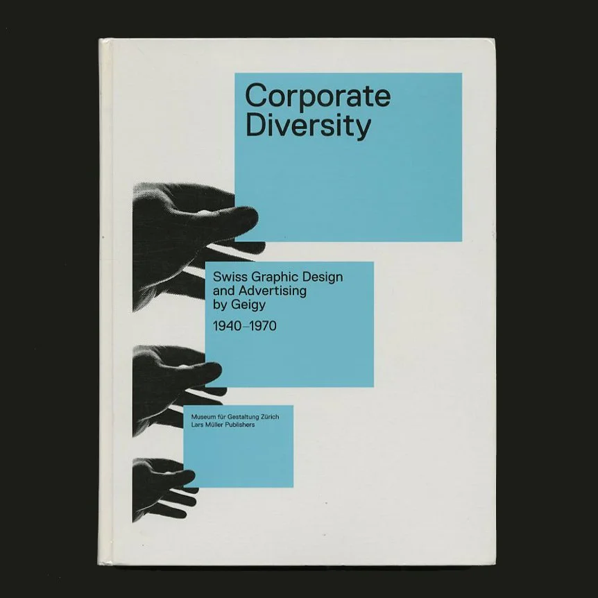 Image 1 of 9
 Image 2 of 9
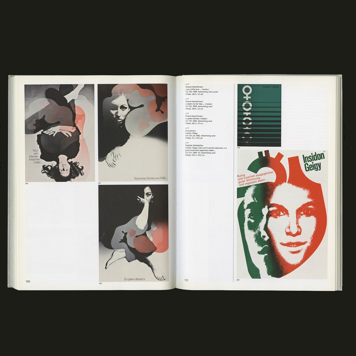 Image 3 of 9
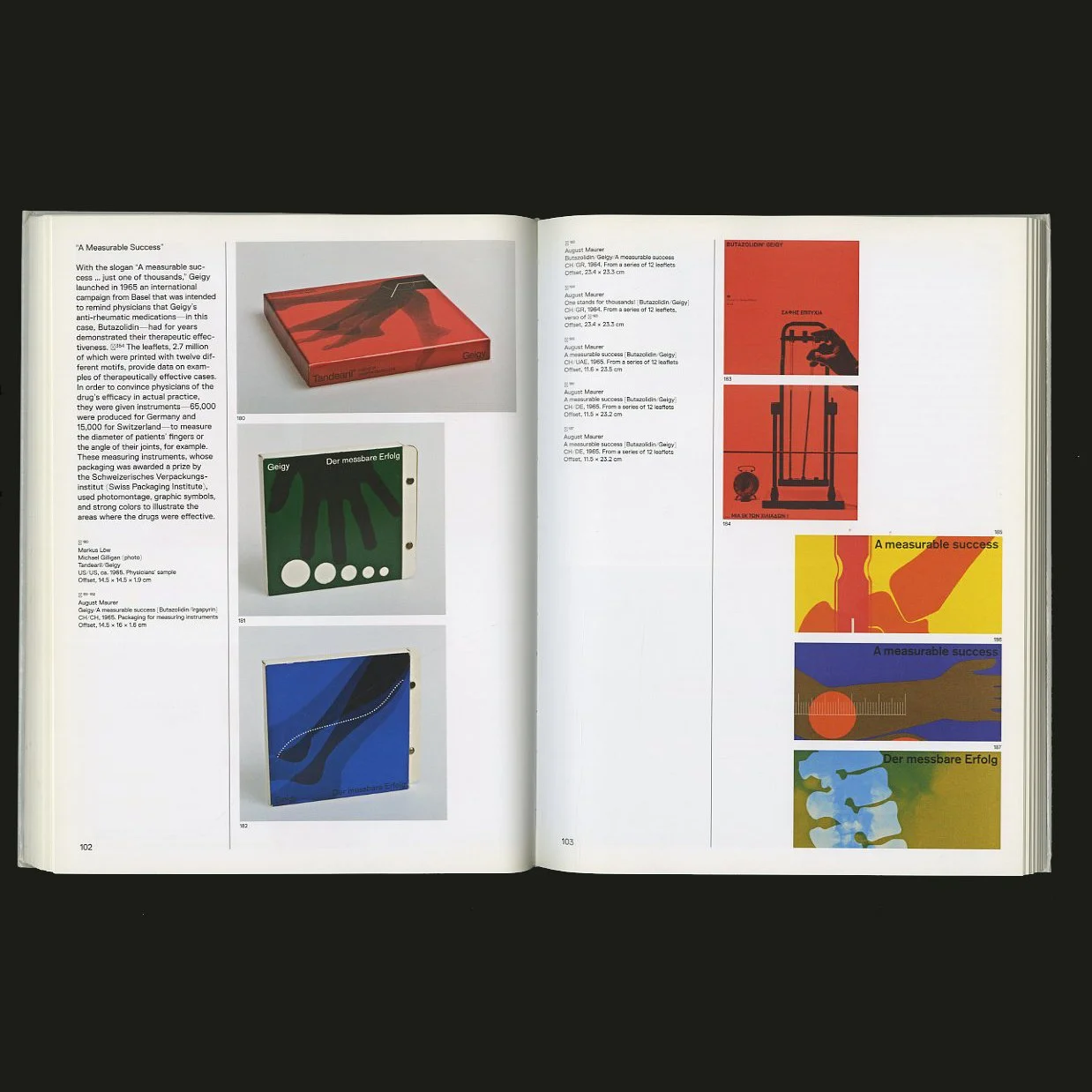 Image 4 of 9
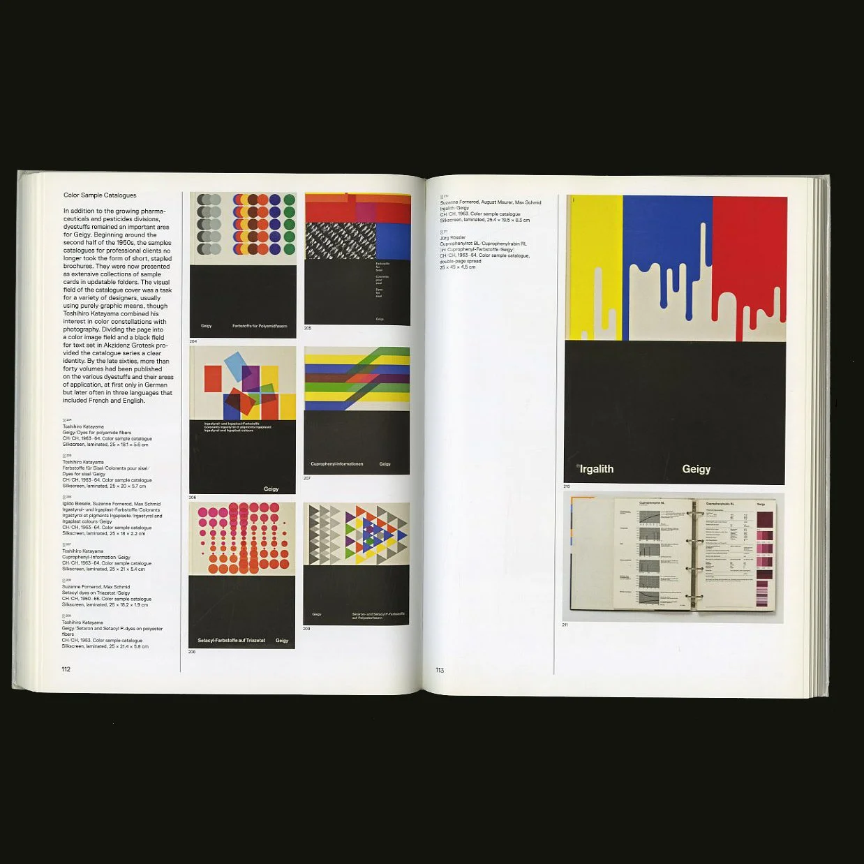 Image 5 of 9
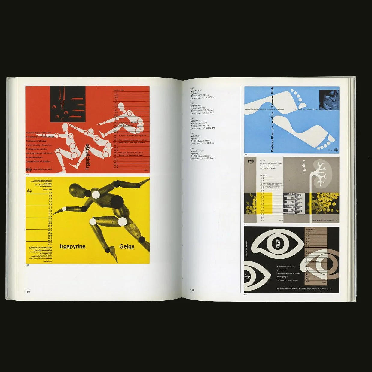 Image 6 of 9
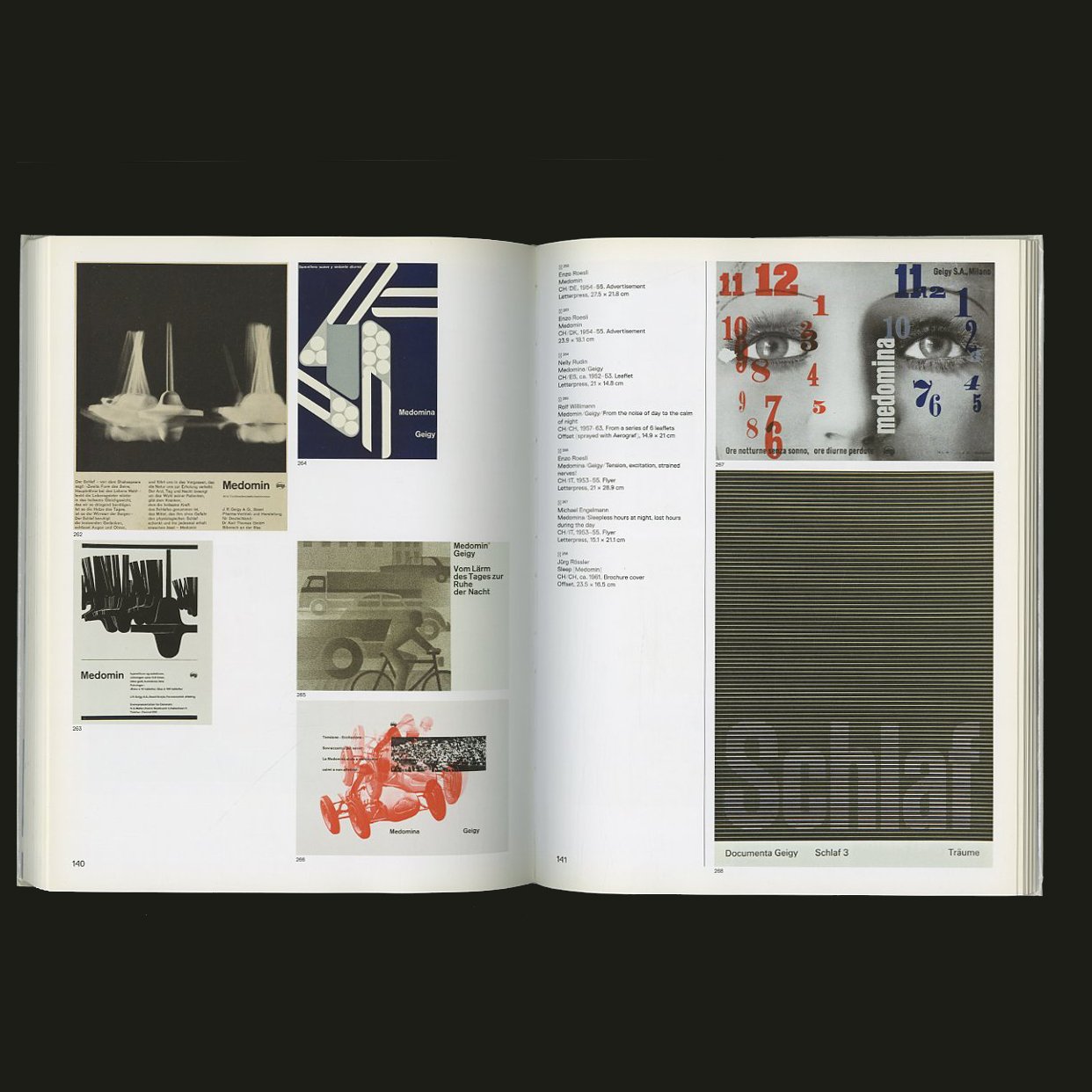 Image 7 of 9
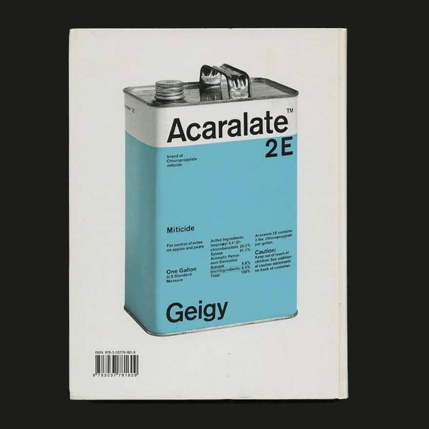 Image 8 of 9
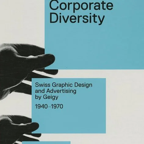 Image 9 of 9